I will forever think of Agate Crosner when the word “Agate” comes up in anything.
Gaming reference aside, this is my first eyeshadow palette from Singe Beauty. I love greens and this color story reminded me of the Oden’s Eye Merry Christmas Palette. Of course, the thought crossed my mind that I should probably not get this palette if it reminds me of something else, but I was too impatient to try and wait for the brand to release a color story that attracted me while being different enough to be unique to my makeup collection. Singe doesn’t do fast releases, so it could potentially take years for me to be interested in another palette of theirs (though Paisley Hoot is quite pretty). I wanted to see what kind of eyeshadow formula Angie chose, so having a lot of colors I liked was good enough for me.
I’d like to note that I’ve owned this palette since June, so this is far from a first impression. I’ve been using it every-so-often organically in the latter half of 2025. By now, I’ve used it enough to share my thoughts.
I’ll start by getting into the specifics of the eyeshadows.
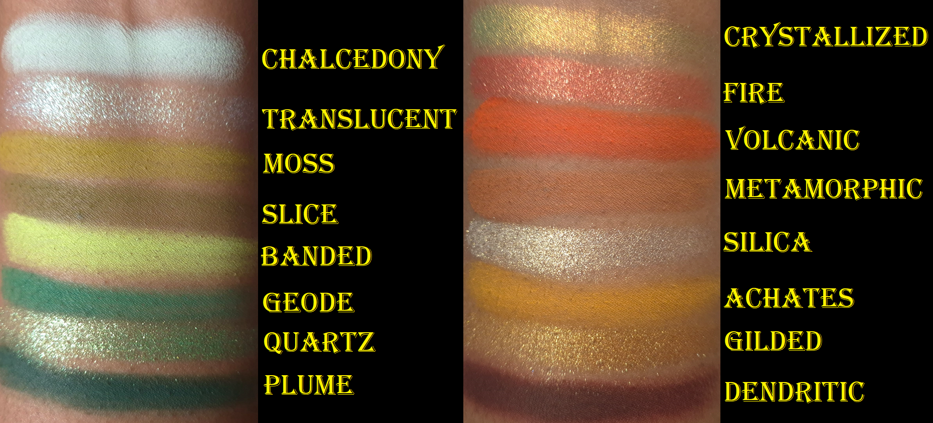
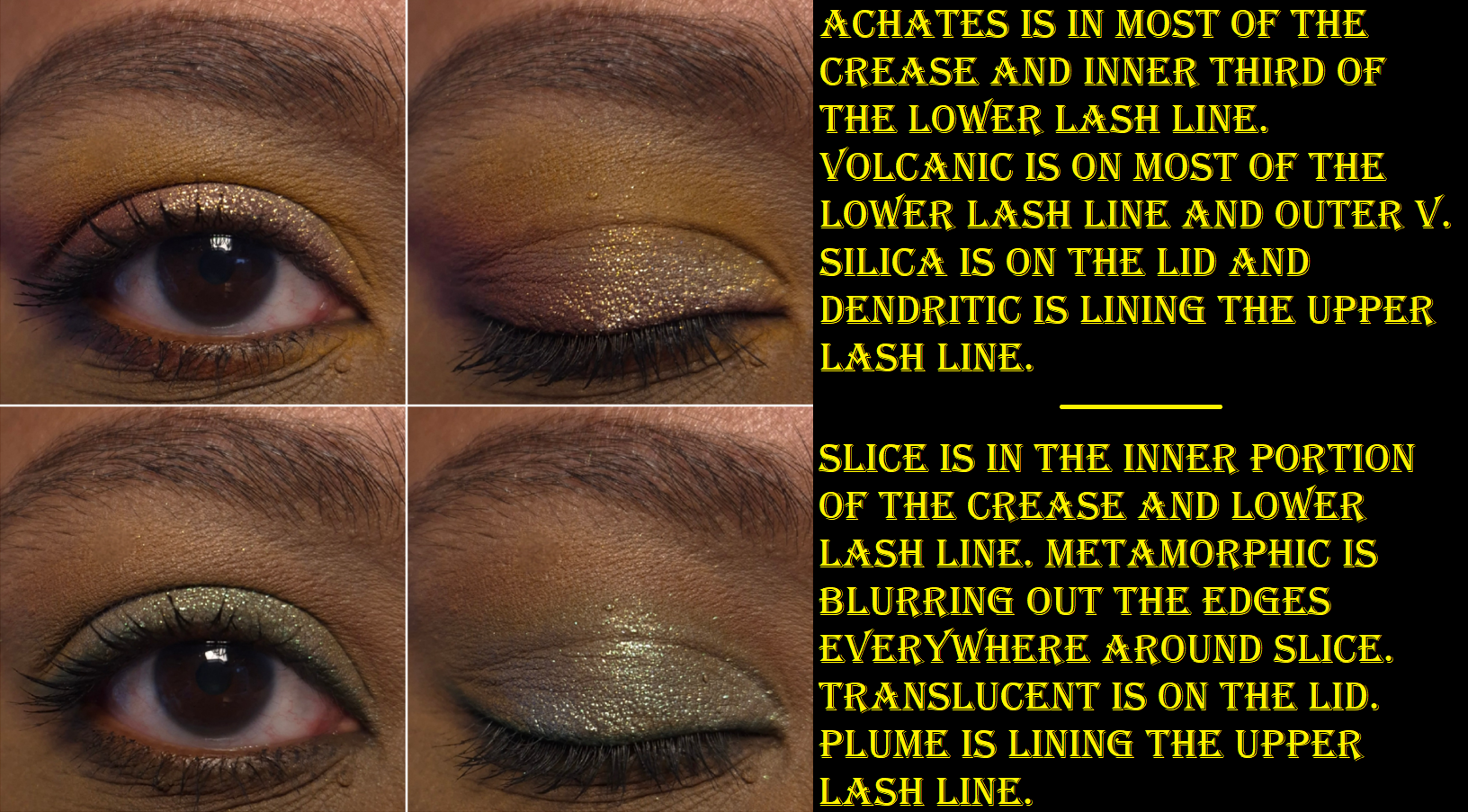
Achates and Metamorphic are very uncommon tones of orange and brown. I am shocked to say that they’re my favorite mattes in the palette, even above the greens! Achates reminds me of a higher quality version of the orange shade from the Juvia’s Place Nubian Glow Palette or a bit like Oromo from the Juvia’s Place Tribe Palette. I can’t recall where I’ve seen a shade like Metamorphic, but it reminds me of chocolate chip cookie dough. I can’t explain why!
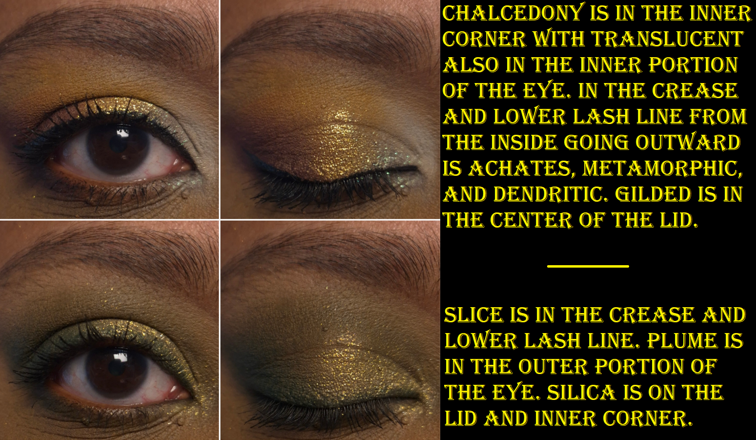
I usually rely on black eyeshadows to add depth and smokiness to the outer corners of my eyes, but Dendritic is such a beautiful rich brown that I feel perfectly happy just using this. It’s somehow soft and intense at the same time! Chalcedony is too light and thin, so I can see my skin through it unless I pack on a ridiculous amount of layers. I wish more of the pale mint tinge would show instead of it just looking white, but it doesn’t because of my skin tone. It would need to have more grey than white in the base for the green to show on me, like the shade Memory in the Urd palette from Oden’s Eye. Banded is not neon on my eyes, but I don’t mind that it’s an easier to wear kind of color. It’s thin as well, but I have an easier time with Banded than Chalcedony to hide my skin peeking through.
Moss, Slice, Geode, and Plume deserve recognition for being the kind of greens I use a lot. They just aren’t as uncommon, as they are similar to Melt Cosmetics greens, Oden’s Eye greens, the Coloured Raine Safari Palette and Juvia’s Place Tribe Palette. As for Volcanic, it’s not a shade I make a fuss for, but it goes well with the color story.
In summation, the mattes blend and layer nicely. It’s not a quick process, but it’s not tedious either. They have a semi-silky feeling, but they’re not creamy. The kickup is minimal. The pigmentation is high, but I still have to build up certain shades. Metaphorically, it’s as if someone took the old school Juvia’s Place formula (that I like way more than their current one) and combined it with Natasha Denona’s current matte formula (which is nice but still not a favorite). A few weeks ago, I reviewed my first palettes from Cosmic Brushes, Glaminatrix Cosmetics, and Wicked Widow. I can say, I definitely prefer Singe Beauty mattes over all of those.
The shimmers are impactful, but Quartz is super reflective and sparkly. The particle size is small enough to have a refined look to the eyeshadows, but not at the same level of high end and luxury brands, which is still fine. I don’t always want a blinging shimmer, or conversely a subtle satin, so this palette’s shimmers are great for the times when I’m in-between moods.
The consistency of the shimmers isn’t too thin or too thick. Quartz is the thickest. These eyeshadows feel a bit slick, but not enough to give me problems with creasing. In fact, it wasn’t until I was nearly finished with my final draft of this review that I learned Angie intentionally wanted shimmers on the thin and less emollient side so there wouldn’t be creasing. Translucent is the aptly named duochrome topper, which is bold, but not as intense as other indie brands’ more expensive eyeshadows. The same can be said for the multichrome, Chrystallized, which is pretty to look at in the pan, but not that shifty on my eyes. It’s ironic that it’s possibly one of the more expensive eyeshadows in the palette, yet its also one of my least favorites. Regarding the textures, I need to spray Translucent to combat the fallout and be able to apply a smooth and even amount to lids. Chrystallized is the hardest to pick up with my natural hair brushes, so it’s easier to apply with my finger. I admit that I haven’t used this palette with my Singe eye brushes, which are synthetic. They’re not in my container of brushes in rotation because I’m really behind on my Fude reviews. The Singe F03 is still in there though!
Silica is the “sparkly wet-looking topper,” that appears mostly gold in darker and warmer light, but I can see the mix of silver and gold in brighter settings. Examples of this are in the eyeshadow demo photos. Gilded is stunning, even though it’s a more “traditional” shimmer. The tone of this warm gold is just so flattering on my lids. Fire is a warm red with gold sparkles. So many brands make pink to gold eyeshadows, so it’s refreshing to see a twist. Reds aren’t my favorite for eyeshadow (unless it’s a rusty red-brown), but the shade is on the fringe of looking coral on my eyes, so I’m not opposed to it being in this palette.
When I think about the qualities of Agate Temptation, the phrase, “Jack of All Trades, Master of None,” comes to mind. This is a solidly good palette; it’s just not at a level that I could call phenomenal. These days, with the number of influencers that say everything is “amazing” or “my new holy grail,” something that has the rating of “really good” can still seem like it’s not worth anyone’s time. However, I like Agate Temptation enough to easily recommend it to anyone interested in buying it. These aren’t the world’s creamiest, most blinding, immaculately effortlessly blending eyeshadows on the market. These aren’t like my YSL or Prada eyeshadows, but I still enjoy using this palette. I don’t have Juvia’s Place Tribe or Coloured Raine Safari eyeshadows with me in Germany, but Agate Temptation gives me similar vibes and I get a nostalgic feeling when I use it. I’ve also been obsessed with the warm-mint chocolate chip eyeshadow combination I’ve seen others do, and I’ve enjoyed creating my variations of the look.
I see myself continuing to reach for this palette even after the review, which made it even more worth it to buy over some of the other palettes that I consider to be better performing. I know my criteria for judging a palette’s worth is largely centered around how much I love the formula. So, it’s strange to say these eyeshadows rank below my top ten favorite formulas, but still manages to be a purchase I’m glad to have made. The quality is good enough for me to enjoy working with the palette, and the mix of interesting neutrals with fun pops of color continue to entice me.
With the international shipping cost and fees in mind, I don’t know if this would have been worth it if I had to make the purchase directly from the Singe Beauty site. However, I am glad Angie continues to work with Monolith to provide products to the EU so that the prices aren’t double or triple what customers in the US pay. Also, for anyone interested in the rising cost of eyeshadow palettes, the ongoing debate whether a brand should focus on leaving out “special shades” to keep costs down, and how multichromes changed the trajectory of the indie community, I recommend watching Angie’s video How Multichromes Destroyed the Indie Makeup Pricepoint.
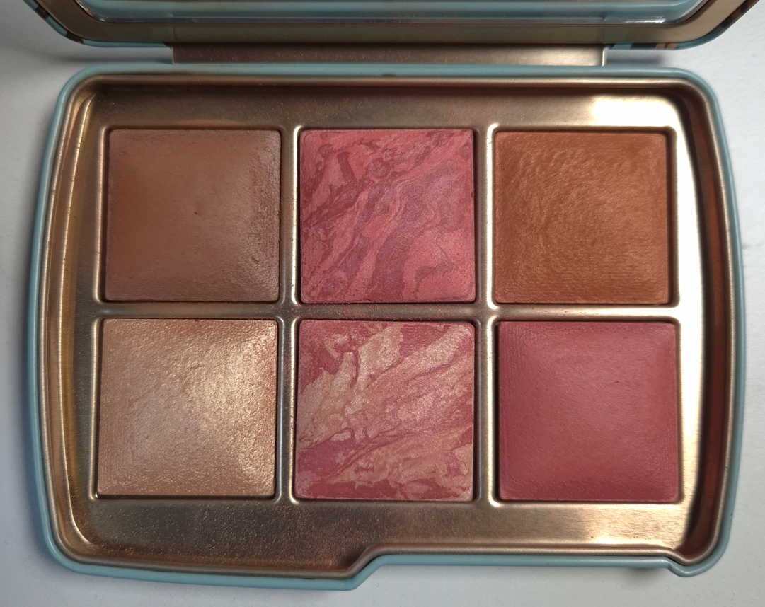
This is the first product I’ve ever purchased from Ilia. Nothing they made interested me until the release of their limited edition Ethereal Baked Face Palettes.* I didn’t buy one though because I didn’t like the packaging and I wasn’t a fan of the blush shades in the Deep palette. It would have cost $59 for four products (albeit smaller sizes), which on paper is a better deal than $36 for a single blush. However, if I didn’t like the formula, I would have technically wasted more money.
*Ilia brought back the face palettes in the US. They are still listed as limited edition, so I think they are planning to follow the Hourglass method: releasing curated palettes with powders in smaller sizes for the holidays, but having larger and more expensive individual powders in a permanent range.
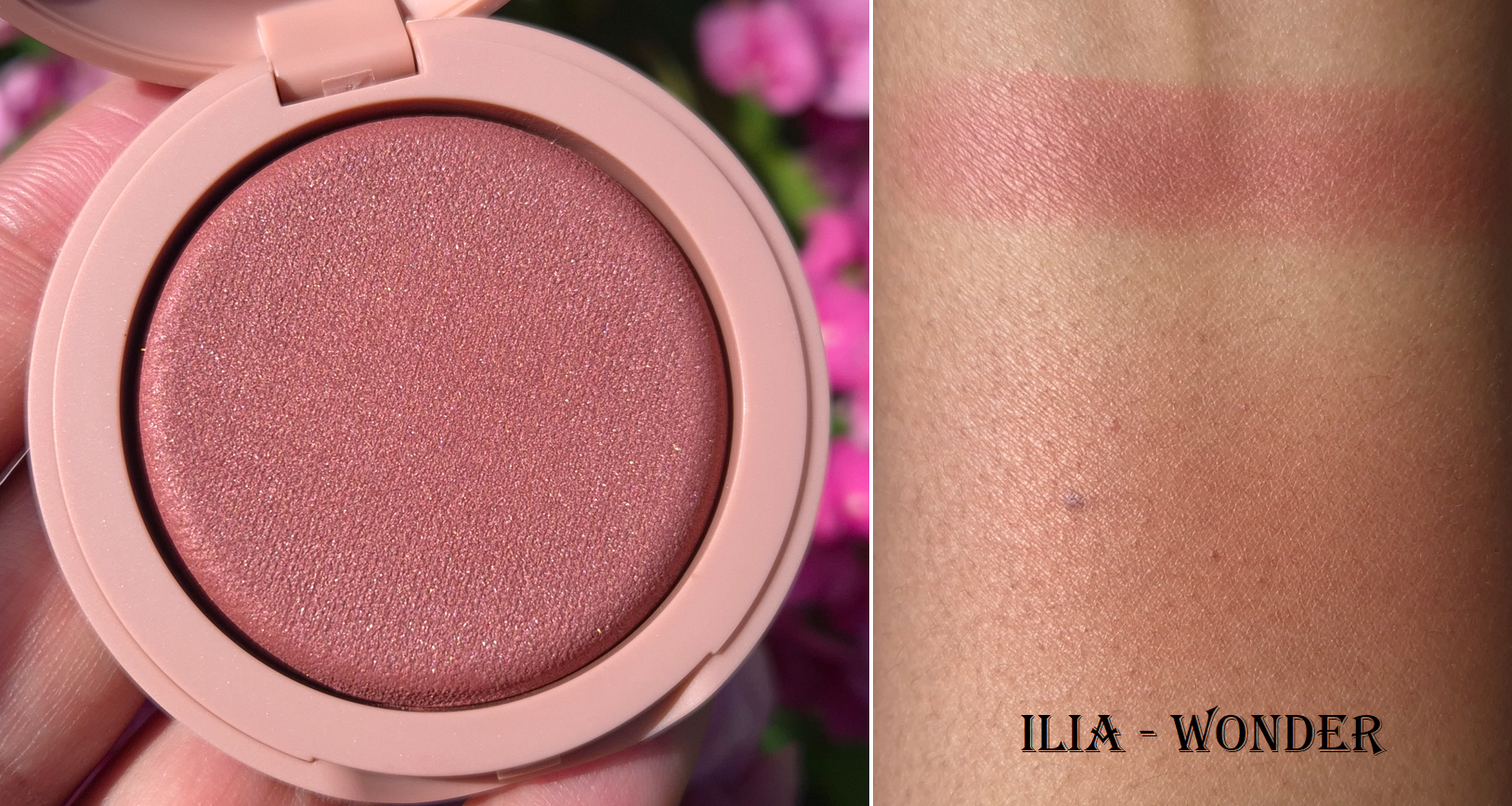
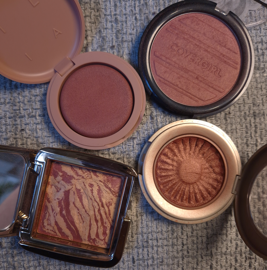
Ilia Soft Focus Blurring Blush in Wonder
Because this is a baked blush, I can’t help but want to compare it to Hourglass. Hourglass has blush finishes that are matte, shimmery (mica-sheen), more shimmery (with some larger shimmer specks), and high shine (practically metallic and could double as a highlighter or blush topper). The finish of Ilia’s blush is most similar to the subtlest of Hourglass’ blushes with a sheen, but Ilia’s has much more obvious mica that gives a pearlier look and it’s a little more reflective (but not enough to look metallic). I heard that most of the shades in this range have the cool-toned sheen except Pulse.
When I rub my finger into an Hourglass blush, it feels firm even though the powder itself is soft. When I rub an Ilia blush, there’s a hollow feeling as if it could fold under the pressure of my touch if I press too hard. There is only one other product I own that feels like this, and it’s the Fenty Demi Glow Light-Diffusing Highlighter. That one was actually prone to arriving to people broken during shipment and I recall even seeing a small crack in the first round of promo photos that were released. I don’t think the Ilia blushes are quite that fragile, but I handle mine carefully just in case.
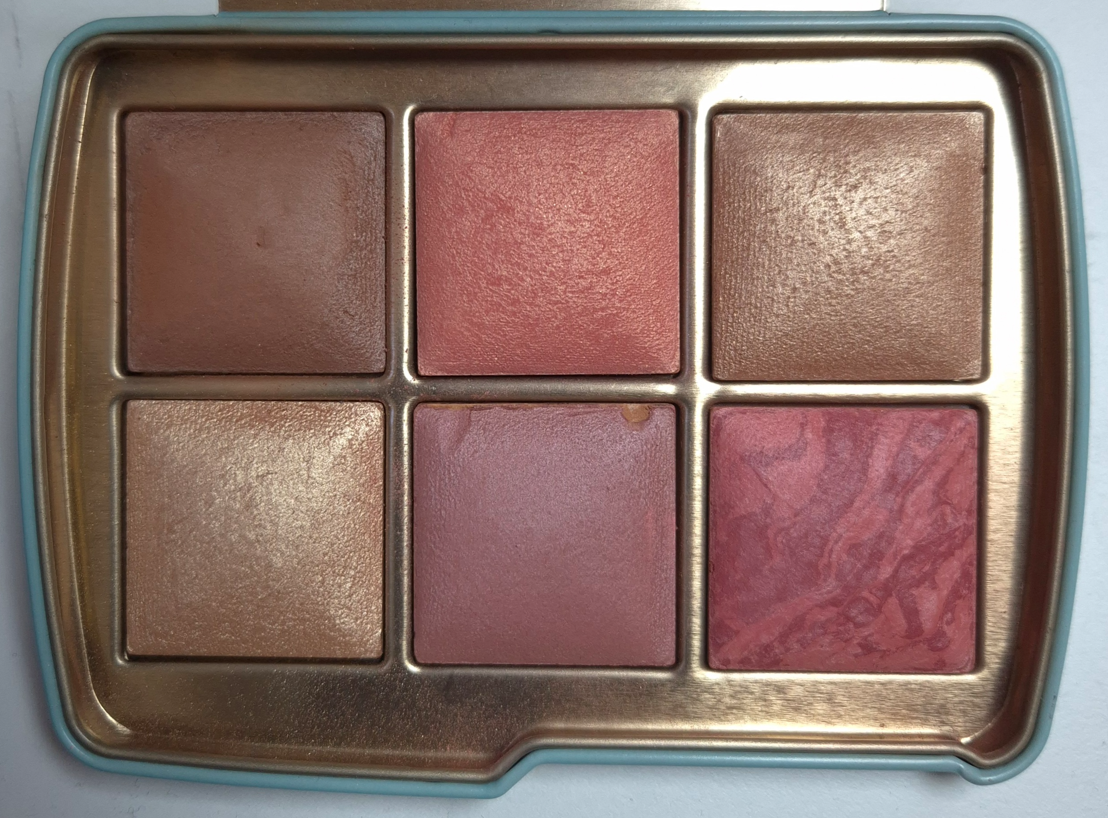
These photos demonstrate how the blush looks in cooler lighting vs warmer lighting.
I find the finish to be a little blurring, though only as much as a luminous product can be. I use my airy delicate brushes with it, and one tap or two picks up the perfect amount of product to cover a cheek. Wonder is a very pigmented blush, but because it’s so easy to blend out, I can still use denser brushes if I want. It’s just easier to control if I use something like the Sonia G Soft Cheek or Chikuhodo Z-8 with it.
What really makes this blush stand out is the tone. There are a few vibrant shades in the range, but most are desaturated colors, which was just the kind of thing I’ve been looking for. Breathless is the shade that drew my interest in this launch, but I feared that between the mica and color depth, it would probably look ashy on me. Wonder seemed like a darker version of that shade, so I picked it, and I am convinced that no other color in the current range could have suited me better. That being said, I could not figure out why I wasn’t in love. It’s pretty, flattering, and long-lasting on my skin. There’s no fragrance and it’s supposed to last two years (which is great coming from a brand that touts itself as being “clean.” I could find no faults with the formula, yet there were times I would apply it to my cheeks and think BareMinerals Kiss of Rose would look better. It wasn’t until I watched Alicia Archer’s video about Terracotta Tones that I realized Wonder being more of a pink-rose terracotta instead of an earthy orange/red type of terracotta made all the difference in the world. It’s a very pretty shade and it doesn’t look bad on me, but it’s that tiny bit less flattering.
I tried to pull a few shades for comparison that I thought might be most similar to Wonder. Ironically, the closest is Kiss of Rose, and I can see how that little bit of extra warmth makes me like it more.
So, unfortunately, this didn’t work out so well for me purely based on the color. However, the formula is nice enough that I still recommend it to anyone interested in this range of blushes. In fact, if the brand comes out with a true terracotta-brown shade or some other color I love (that also has a warm sheen), I would very likely buy it. It’s $10 less than Hourglass Ambient Lighting Blushes for the equivalent amount of product as well, though the light plastic and mirror-less Ilia packaging probably contributes to a large portion of that lower price. Some people might think it looks too cheap for the price, and I can understand that feeling. For me, the compact color and the shape of it is pleasing enough to make up for that because components shaped like bars of soap are very satisfying to me. I’m not sure why!
I hope this review has been helpful. Thank you for reading!
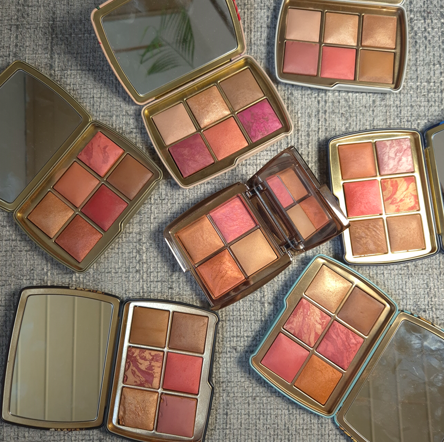
This is how the palettes looked after I rearranged some of the powders and posted the photo on Instagram. I made some drastic changes afterward, that I will discuss in this post.
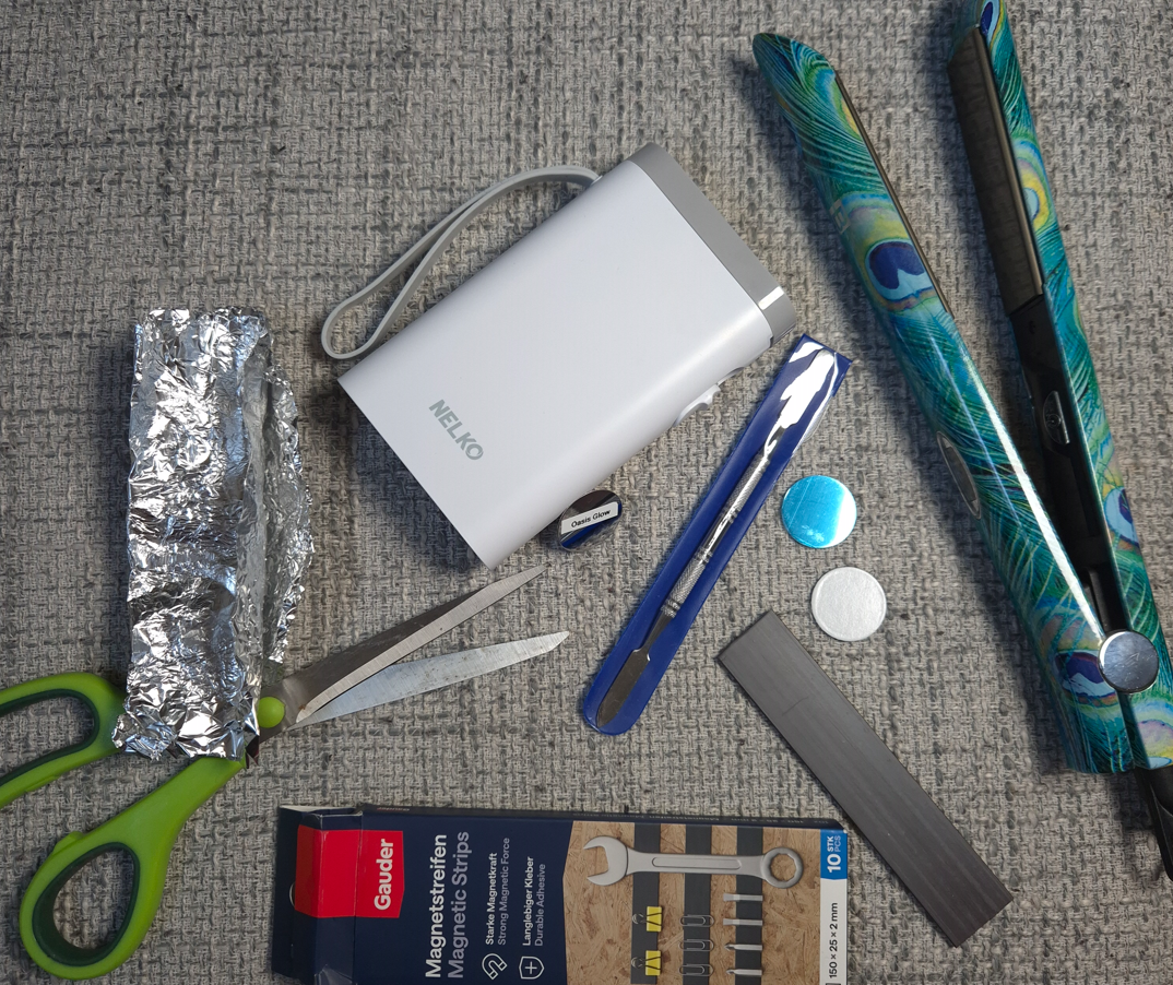
I did it! I summoned up the courage to do Round 2 of depotting and rearranging my Ambient Lighting Edit Palettes! This time, I had to do things old school because I left my Z-Palette branded Z-Potter behind in the US (and the brand only ships them within North America). I could try to look into purchasing a portable induction burner here, but I don’t depot often enough for it to be worth it.
I won’t be giving instructions on the depotting process because I wrote a very detailed post already in Round 1. Only a few aspects changed this time around: One was my heating tool, a titanium flat iron, that I set at around 310°F-340°F for the tin palettes and had to bump it all the way to 380°F with the plastic quad. Another change is that I sought out magnetic strips that are specifically intended to hold objects on a wall. I figured that should ensure the adhesive backing and magnetic grip are both strong enough for palettes that will always be laid flat anyway. Lastly, my husband bought me a label maker, so I could print and stick the shade names onto the metal stickers instead of writing everything by hand.
Since I hadn’t dealt with the plastic Hourglass palettes at the time of Round 1, I will give the warning here that they are much more difficult to depot than the tin ones. The plastic palettes have more glue and they are set way tighter/flush to the sides of the component. Meaning, it is even harder to wedge the cosmetic spatula between the tile and walls of the compact. I couldn’t get them out without scraping at least some of the edges. In addition, the bottom of the compact will be partly warped/melted because it requires so much heat. My husband thinks keeping the palettes at lower heat, but for a much longer amount of time might work too, but I didn’t have the patience to try that method.
This is an example of how the plastic palette looked once two shades were depotted (and you can see where I quit midway while attempting to depot a third). I used the aluminum foil between the plastic and my hair straightener to avoid dirtying the plates.
The first two customized palettes I’m going to show are the ones I said I would make in my Swan Palette and Dusk Quad review. The arrangements aren’t the exact same because I tried to avoid depotting the powders that I planned to keep within the same palettes anyway.
The “Panda” Palette (in Leopard Packaging that used to hold the Snake Palette shades)
Original Snake Palette vs Current Snake Palette
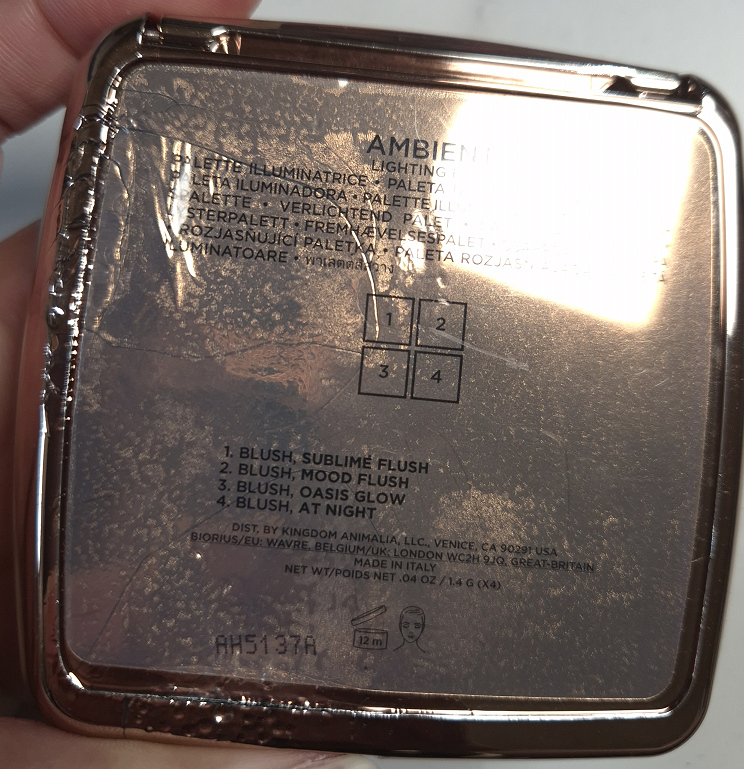
Solar Glow (Highlighter) – Fox At Night (Blush) – Dusk Quad, Permanent Shade Eternal Light (Finishing Powder) – Lotus, Permanent Shade Mood Flush (Blush) – Sculpture and Dusk Quad Mystic Flush (Blush) – Snake Solar Bronze (Bronzer) – Snake
This is my “main” palette, the one I intend to keep within easy reach in my makeup collection. It’s a bit of a shame that my perfect palette has the most dings and nicks from the depotting process. For some reason, the glue in the Fox palette was a silvery color. Hourglass usually uses a clear glue, unless the orange-yellow residue color isn’t from the tile. The glue under Amethyst Haze was thin, so it was easy to pop it out. I expected the same ease from the Solar Glow Highlighter, but it was so stuck in the pan that I not only dug into the powder, a few small pieces of terracotta/clay tile broke off the edge in the process. This was the first time I’d ever broken the actual tile, and the amount of glue was 5x thicker than what was under Amethyst Haze. It was such a thick layer and felt like silicone/rubber. It was also the strange silver color. As for At Night, that came from the plastic palette with such little space to place my cosmetic spatula, so damage was unavoidable. I dug a bit into the baked tile as well.
I already talked about my reason for choosing these shades in that Swan review, but for those who didn’t read it, they are essentially a mix of my favorite shades that suit me the best and I can wear them all year round.
The “Rabbit” Palette (in Fox Packaging)
Original Fox Palette vs Current Fox Palette
Mood Exposure (Blush) – 5 Holiday Palettes, Permanent Shade Lucid Glow (Blush as Highlighter) – Fox, Ghost Quad, Sunset Quad, Barney’s Volume III Desert Light (Finishing Powder) – Fox Canyon Heat (Blush) – Fox Luminous Coral (Blush) – Swan Bronze Fusion (Bronzer) – Fox
The original photo was taken on a sunnier day, so it looks a bit warmer. The second photo heavily relies on artificial light, as it has been cloudy all week. Please excuse those differences.
This palette is one that I will get more use from when I’m back to my winter shade. It comprises of some of my favorite powders that aren’t exactly deep skin friendly. Even though 4 out of 6 powders are from the Fox Palette, the addition of the two other blushes makes this the kind of color story I could envision Hourglass releasing as a “medium” palette in the future.
If I can get Oasis Glow out of this palette (and most likely put Lustrous Bronze Light instead), I will turn this into a completely unusable quad. I don’t want to throw the powders away, but I don’t need Radiant Light, Sublime Flush can look a bit ashy at times, and I can’t use Natural Bronze at all. Considering the standard packaging, it would be ideal to store my least used powders. I would then put the quad in my “makeup cemetery,” the box where I keep makeup I don’t use anymore, but don’t have the heart to toss out.
Initially, I just swapped out Luminous Coral for Amethyst Haze, but upon further reflection, I thought it would be cooler to make a blush-heavy palette. If I’m not sure if I want to wear the blushes from my main and winter palettes, I’m most likely going to find something I like in this one (especially if I’m in the mood for pink).
The New Lotus Palette (in Dragon Packaging)
Gilded Strobe Light (Highlighter) – Lotus Desert Flush (Blush) – Lotus Dim Light (Finishing Powder) – Swan, Leopard, Many Others, Permanent Radiant Rose Strobe Light (Highlighter) – Lotus Red 0 (Blush) – Lotus Solar Bronze (Bronzer) – Lotus
I only swapped out Eternal Light for Dim Light. Since Red 0 is one of my most intense Hourglass blushes, I wanted to have something in here to help tone the color down, other than Desert Flush. Plus, I didn’t want to alter Lotus too much. It’s one of the deepest color stories Hourglass has created, and I would like to keep it that way in my mind, especially since this isn’t a palette I reach for that often. I may as well not mess with the arrangement too much if there’s very little benefit in doing so.
The New Owl Palette (formerly Leopard Color Story)
Original Palette vs Current Palette
Dim Light (Finishing Powder) – Leopard, Swan, Many Others, Permanent Celestial Strobe Light (Highlighter) – Leopard Sun Beam (Blush) – Snake Burnished Glow (Blush) – Tiger Iridescent Rose (Blush) – Tiger, Leopard, Horse Lustrous Bronze Light – Leopard, Elephant
I can use most of the shades in here, but the chances are slim that I would actually want to pick them over my new versions of Snake, Fox, and Swan. Considering Owl never had its own color story, and I wanted this palette mainly for the packaging, I felt it was a good place to store less used products. I can store Owl away as if it’s just a collector piece.
Tiger (and technically Butterly) was the first Hourglass Palette that I made big changes to. It was the proof of concept that rearranging the powders could make me use them more. It may not look very used, but I took it traveling several times and this was my main face palette until the Snake Palette was released and I started to use that one more, specifically for the bronzer.
Although I removed Sunset Glow, which was my biggest reason for continuing to seek out this palette, I added my backup of Mood Flush which is one of my favorite shades. Plus, Infinite Strobe Light is technically a workable highlighter on me, and Sunset Flush can work as a highlighter too. So, I consider this a wild card palette. I don’t think I’ll have much of a reason to crack it open for a long time, but it still contains products I have enjoyed in the past and may feel the urge to use again in the future.
I should probably note that rather than putting magnetic strips on the tin directly, I could have just attached magnets to the bottom of the powder tiles and that would stick just fine to the metal bottom. The reason I didn’t do this is so that I could store the Hourglass powders in any empty magnetic palette I want (that’s deep enough of course). I figured that would give me more storage possibilities.
I hope you’ve found this post interesting! Which palette combination do you like the most? Have you tried depotting these powders too, or are you waiting for Hourglass to relaunch their custom quads and/or introduce custom palettes?
I don’t have a good opening paragraph. Let’s just get right to the review!
YSL Couture Mini Clutch in 830 Unexplored Garden
Just like the previous four quads I’ve reviewed, and the holiday one, I haven’t had issues with fading, creasing, fallout, nor any problems picking up product with my natural hair brushes. I don’t need to spray my brush to get the sparkly shadow to stick to my eyes or be intensified. The shadows adhere on the first go. They blend well and quickly.
I still consider this eyeshadow quality to be among the top three that I own. I can’t decide for certain which one is number one.
When it comes to this color story, I haven’t found it to be that versatile, but I just need to create one pretty eye look in order to be happy.
Shade 1 is in the designated topper eyeshadow area of this quad (the top left corner). It looks white in the pan, but the shimmer is actually a light green color that is beautiful!
Shade 2 is the typical one that’s usually too light to show up much on my skin. I use this shade between my brow and crease to keep that space open and looking clean, plus blurring and blending out edges of the crease shade.
I consider Shade 4 to be a soft matte army green color. It’s desaturated and adds depth to the look. It’s not too deep for me to use in the crease, but I wish it had a little more vibrancy.
Shade 3 looks warmer on my lids than I expected, especially considering I can see silver sparkles in it.
Overall, this color story is pretty, but it doesn’t excite me. These aren’t the tones of green that drive me wild. I knew I had these feelings, but because I love the YSL formula and have been impatiently waiting for a green palette by them, I still wanted to own this anyway.
For anyone curious, YSL’s Over Brun is still my favorite quad of the bunch, followed by Golden Lace in second place.
That’s all for today! It’s a quick review since my opinions aren’t different from what I’ve said about the previous quads. I hope the brand will continue to explore colorful options in the future.
None of these palettes are new within the world of indie eyeshadows, but this is the first time I’ve purchased anything from each of these brands. This was made possible thanks to the brands working with the European retailer, Monolith!
I hear so many great things about many more independently owned businesses, such as Blend Bunny, Bella Beaute Bar, Dede Signature, Whats Up Beauty, etc. I’m just waiting for a launch from them that’s so exciting that I can no longer resist giving them a try.
For now, I have the following to play with…
Cosmic Brushes Tis the Season Palette
I purchased this palette in December 2024.
I consider the Cosmic Brushes matte formula to be better than Beauty Bay’s, on par with the better of Colourpop’s formula, but it doesn’t quite top the best of BH Cosmetics’ formulas. The mattes are colorful, pigmented, a bit dry, and are blendable enough to layer well with the other shades, but I wouldn’t call them low effort. That can make it sound like they’re troublesome to blend, which they are not. It just takes a little more time and I think it’s because most of them are pressed pigments rather than regular eyeshadows. So, that’s the trade off for the extra pigment. I find it best to work slowly, use smaller and fluffier brushes, and apply in the order from light to dark when trying to build the eye looks. If issues still occur, I recommend trying a different eyeshadow primer.
The only matte I consider a real problem is Party, because for some reason it fades like crazy no matter how much I layer on. To be more precise, it darkens to an ashier grey-purple shade that’s a similar color depth level as my dark circles and skin discoloration, giving the illusion of it having faded to almost nothing. I had to keep packing on more of Party while taking photographs of my eye looks so that the purple tone could continue to be seen. I have a similar problem with Ribbon, but because that shade is so bright to start with, what lingers behind is still a lighter sort of grey. Switching eyeshadow primers did not help with this one. Building up about six to eight layers makes it visible for a few hours, but it’s really not even worth the effort for me as those are not the kind of purples I like anyway.
Even though the mattes generally aren’t bad, I’ve been too spoiled by more expensive eyeshadow brands and prefer to work with those over these. When it comes to indie brands that have a better balance between pigmentation and ease of use, I recommend Fantasy Cosmetica and Oden’s Eye.
Regarding the shimmer formula, I’m pleased that they have the kind of impact I expect from an indie brand. There’s no need to spray my brush in order to intensify the shine, but a shade like Baubles is on the flakier side and could benefit from a damp brush to minimize the fallout. Candle Light and Fairy Lights are a bit thick, but smooth out across the eyelid nicely. Decorations is also chunky, but the wettest of all the shadows is Celebrate. Festive is thick and stiffer than the others, but somehow isn’t dry feeling either. It reminds me of the way Sydney Grace eyeshadows feel. Tinsel feels similar to Festive, though slightly less stiff. Cranberries is the smoothest of the shadows, but it doesn’t have that much more slip or wetness than the others.
According to the brand, the special shades are Cranberries, “a multichrome that shifts from a cranberry red, to orange to green,” Fairy Lights, “a multichrome metallic that shifts from pastel purple to pink, to soft yellow,” and Tinsel, “a duochrome pink to gold metallic.” I agree with their assessment of Cranberries and Tinsel, but Fairy Lights acts like an iridescent purple and pink duochrome on my skin tone. And even though Candle Light is only described as a, “fiery orange metallic,” and Baubles as, “a reflective fuchsia purple metallic,” those two look dimensional and above ordinary to me.
Although the shimmer formulas are damp, I thankfully don’t have to deal with creasing per say, just that the shimmers don’t like to stay in the deepest line in the crease of my eye, so that’s the first place for the eyeshadow to go missing.
Using this palette brought back a lot of nostalgic feelings. It was like working with the kind of indie eyeshadows I used so often in the early years of my makeup journey. I like the colors in this palette, and if I got this in 2019, I think I’d have been much happier with this. But, now that I’ve been spoiled by buttery, creamy, soft, highly blendable and very expensive eyeshadows from Victoria Beckham Beauty, YSL, Pat Mcgrath, and more, I am most likely to only whip this palette out during the holiday season. Even though my beloved Oden’s Eye Merry Christmas Palette contains no purples, it’s at least a holiday palette that I use all year round.
I also want to add that I think this is one of those palettes that is good for the price. To get multichromes and duochromes for $39 is pretty great, but I don’t know how much the shipping from the UK factors into the cost for those that live in the US. From the EU retailer Monolith, this cost me a little over €48 ($56) from VAT, but no additional shipping costs since I ordered enough other things to reach the free shipping minimum.
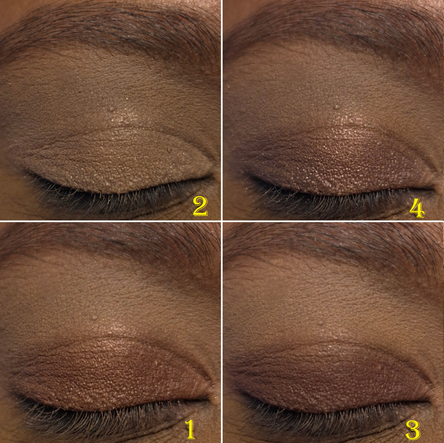
Glaminatrix Cosmetics Nocturnal Mini Palette
I bought this in October 2024.
These mattes are also quite stiff in the pans, but that doesn’t seem to effect the blend too much. I like the colors and tones, but the blues and purple are prone to changing color when I try to layer them and create a gradient. Shade mixing can be a good thing, just not when I want them to stay true to how they look in the pan. So, in order to have each individual shade be clearly recognizable in the photos, I couldn’t blend them as much as I wanted. Some of the eye looks I had to recreate a few times so they wouldn’t look like a muddy mess. Also, Gloom turns very dark on me as time goes on, to the point that it looks like a contour color on me. It going from grungy yellow-brown to an ashier kind of brown in spots can look really messy on my eyes without even trying to layer other shades with it. As for Fog, that color also darkens to more of my skin color, but if I can get it to show true to color for most of the day if I build up enough layers.
I should also note that despite these mattes being super pigmented, Shadow is even more so. I have to be very careful incorporating this into my looks. It can get out of hand quickly. I find it easier to do my crease shade and then put Shadow in the outer corner before adding the eyelid shimmer and topping a little bit of Shadow back on top. This is because Shadow doesn’t build on the shimmers as easily.
I like these mattes more than the ones from Cosmic Brushes, but I can understand why someone might disagree if the colors blending into one another or darkening is viewed as problematic. These remind me of Terra Moons mattes, but better. Despite considering these mattes to be nice enough to keep using, I still prefer to reach for easier formulas. Since living in Europe, I don’t do bold colorful looks as often, which is why the extra time needed to create these kind of looks isn’t worth it as much to me right now. However, this preference could change and in the times that I do want punchier colors, I am happy to have these options. I couldn’t resist the appeal of these tones of colors, and it cost me money to finally satisfy my curiosity. I at least paid less (€49) by getting this mini size version with 22mm eyeshadow pans.
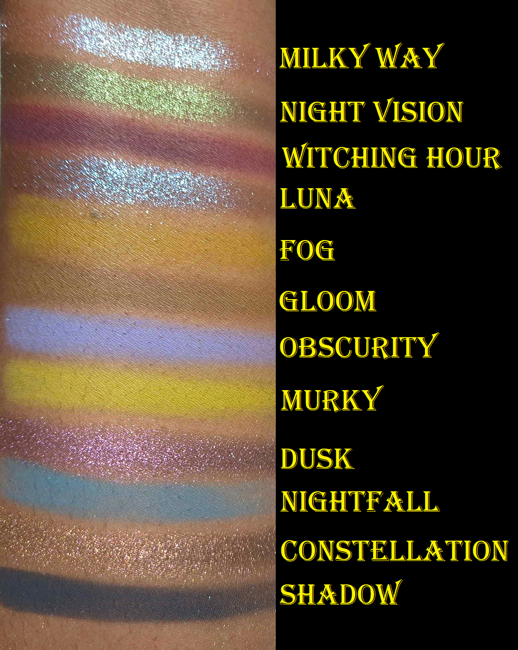
Milky Way and Luna are the flakier shimmers. Night Vision and Dusk are the smoothest ones while Constellation is smoother than the first two mentioned, but thicker than the latter two. All five of these are considered by the brand to be duochromes and are recommended to be used with glitter glue because of their thick texture. I haven’t found the need to use glitter glue with these, but I dampen my brush to minimize fallout.
My only gripe with Milky Way can’t really be helped. On my skintone, even when I’ve used this on top of a pink matte shade from another palette, it’s just blue. I don’t count an eyeshadow that looks one color and then disappears to turn into a different color as being a shift. That’s the same kind of trick a ph-adaptive product has. So, what makes Milky Way special to me is the high shine/reflect. I’m content enough with that. It would have been nice to be able to see some pink too though.
Night Visionis one of the shades that appealed to me most from the palette. The tradeoff for it looking smoother though is that it’s not as sparkly. The grungy dark base keeps it from looking the tad bit more vibrant as I would have liked. I believe in eye look number two, I put Murky on the lid first before adding Night Vision on top in the hopes that it would enhance the green tinge (but I cannot remember for certain). These shimmers are too thick to have a matte color underneath make a difference in the overall appearance. At least on myself, and at least with the shadows from other brands I’ve attempted to use these with. Also, the only time I’m impressed with the look of Night Vision is when light shines on it directly. I am not satisfied with a lit up room being required.
Luna has a blue to purple shift, but it mainly just looks blue on my eyes. It’s a beautiful color, but considering I’m way more interested in purples, this color helped push this palette further into the blue territory than I enjoy. It’s the most intense shimmer in the palette, so I can’t complain too much.
Dusk just looks purple to me. It’s usually easiest for me to see a shift in a chrome shadow by holding it at different angles pointing towards and away from light sources. With this shade, I have to hold it at a very harsh angle to see it change from a cool purple to what I believe is a warmer pink-purple. I just consider it a pretty purple eyeshadow. The shift isn’t prominent.
Constellation is like a bronzy-orange to green. I can see the color change easier with this shadow than Dusk, but the green isn’t obvious on my lids. If I saw this color on someone else, I would be able to detect that there’s something fascinating and special about how it appears. I would know it’s not just a simple bronze or orange, but would not be able to figure out what’s different about it. I think that’s the power of the green shift. It’s like an optical illusion where one catches a quick glance of something, but once the eye tries to focus on it, it’s unable to be seen anymore.
I’m proud of the first and fifth eye looks. They are the most eye-catching to me, but Constellation is actually my favorite eyeshadow in this palette.
I could not find this palette on the official website, so I don’t know if it’s discontinued. However, Monolith continues to stock it.
Wicked Widow Tales of Terror: A Haunting Palette
I bought this in June 2025.
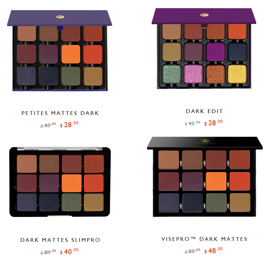
What drew me to Tales of Terror is how much the matte shades reminded me of the Viseart Dark Mattes Palette I bought in 2016. It was my favorite Fall color story, but around four years later, the eyeshadow performance gradually worsened. In 2021, I tried to use the Viseart Dark Edit Palette as a replacement, but I majorly disliked that palette. By now, there are less expensive options from Viseart, but I don’t have as much confidence in the consistency of Viseart’s batches anymore. This is due to the period of time when Viseart was transitioning from their products being produced in France, to being produced in the US.
The Tales of Terror palette has similar colors I loved, without the blues and red that I didn’t care about, plus the addition of shimmers. So, I felt compelled to give this a try! I waited for a sale on this one though because €69 is a lot of money to spend on a brand I hadn’t heard of until the release of this palette.
As these photos show, these shimmers are very big in particle size, bold in color, and reflective. Because they appear more textured, they naturally look less refined than the kind of shimmers I tend to use. That’s not a bad thing, as I bought this palette specifically for the eye-catching nature of it. It’s just that some brands, like Pat Mcgrath, are better at balancing intensity and sophistication at the same time. So, this palette is better suited for someone that wants maximum impact and drama. Someone who isn’t satisfied by mainstream eyeshadows is most likely to love a palette like this. Conversely, someone who likes toned down types of colorful palettes and neutral ones with a few exciting pops might find Tales of Terror to be a little too exciting.
The brand classifies all these shimmers as duochromes. They’re a bit thick and have an emollient feel. This formula is the most prone to want to migrate out of the deepest line of my eye crease. Also, the opacity level of the shimmers is so high that I can accidentally cover up all the crease work if I’m not careful with the placement. They definitely overpower the mattes, even though the mattes are super pigmented. The mattes also layer and blend out quite well. Of the three palettes I reviewed today, I like these mattes the most. As for the shimmers, it’s tied with Glaminatrix Cosmetics because it depends on my mood. The ones in Tales of Terror are the most intense, but I don’t always want intensity.
The important thing to note about specific shades is that Creepy Crawlers and Nevermore look very similar on my eyes when used together, but it can’t compete with the twin-ness of Flickering Lights and Autumn Dreams. The duochromatic shift is not as easy to see with Dark Void, but it changes from a spring green to a cooler aqua-green. Lastly, Spooky Nights is the kind of shade pretty much every brand that has duochromes and/or multichromes releases. However, this one is at least formulated very well. I never enjoy this kind of shade if it’s too sheer on my lids.
I like Tales of Terror enough that I foresee myself actually continuing to reach for it, though most likely just in the Fall season, the way I used to use my Viseart Dark Mattes palette. However, I don’t think I will buy more from the brand. This palette is still a bit bold for my current makeup style, and I don’t see that changing in the future. Adding additional ultra colorful palettes to my collection would be wasted on me.
I have a few more indie palettes to review, but they are coming much further in the future.
The timing of this post could not be helped. So many indie brands have suspended shipping to the US because of the tariff situation. It is ironic that I couldn’t get indie products for so long and now I might have access to makeup that my friends in the US can’t!
I hope that this post will still be helpful all the same.
Today’s post will be a review of the Swan Palette and Dusk Quad, plus I will show some mock ups of the DIY custom palettes I’m considering making using the Ambient Lighting Powders.
I already reviewed the Fox Palette, so if you wish to see more details about that one, please click HERE.
If you’d like to see even older Hourglass Palettes, I have a list HERE with the links to all of them.
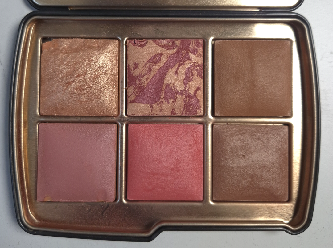
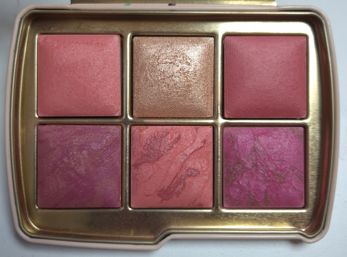
Hourglass Ambient Lighting Edit – Unlocked- Swan (in Deer Packaging)
The Swan Palette comprises of Color Palette 2, generally known to be geared towards those with medium skin. I will admit the reason I bought another palette after Fox was because I could not let that beautiful Deer Packaging go. I like the original Swan design, but I felt an even stronger pull towards the Deer. So, I needed to put something inside it. I contemplated going for the Fox color story again, but I thought it might be more helpful for review purposes for me to choose Swan’s Color Palette 2 and see just how many shades I could get away with using. Plus, the blushes all looked pretty. So that’s what I did, and it’s not the first time either! I own the Owl Palette from 2023 that holds the Leopard color story, and I’ve gotten a surprising amount of use out of it!
DIM LIGHT (Finishing Powder) – This is one of the most frequently repeated shades among the Ambient Edit palettes, but thankfully only my second time getting it. It’s the lightest finishing powder Hourglass makes that I can pull off if I use it lightly, and if I’ve stayed out of the sun enough. At the moment, it’s a bit too light for me to wear with my regular foundations, but I have been successful in using it to lighten some of my foundations that are too dark or too orange right now.
In my review of the Fox palette, I mentioned that the quality seems better than it has been in the last few years. The powders feel softer and less dry. Out of curiosity, I felt my older Dim Light Powder from the Leopard Palette compared to the newer one, and this year’s feels the tiniest bit silkier. When I swatch them, the shades are identical, but when I rub them into my skin, I can see slightly more of a cast from the older powder. I hope my photo helps, but it’s a bit difficult to try and demonstrate the results from a sheer finishing powder on the skin.
This change probably won’t make much difference on someone with a light skin tone, but it works out better for me. Realistically though, I’m going to stick to using Eternal Light or Desert Light instead. So, Dim Light might be ignored by me when I open this palette.
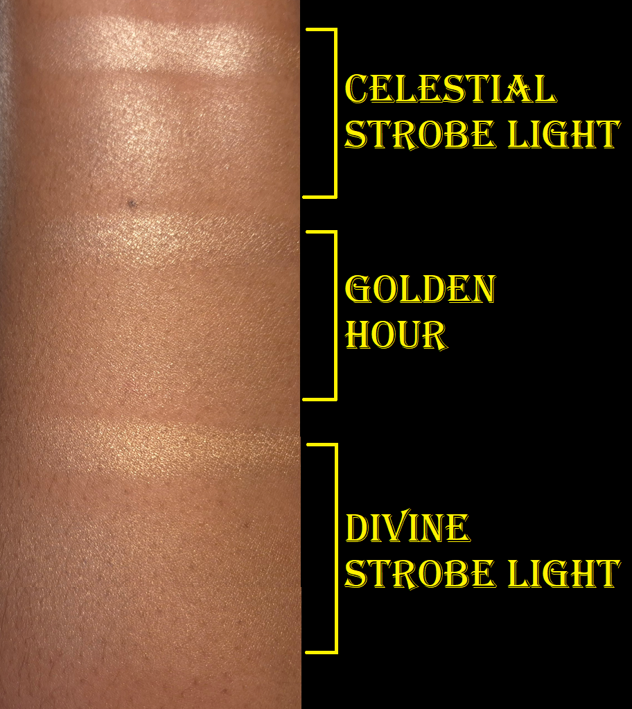
GOLDEN HOUR (Highlighter) – This is a new shade for Hourglass and I feel it is one of the more refined highlighters they’ve made. There’s no avoiding that this is quite beaming, but it doesn’t look as crazy on me as I expected. In swatches, it is clear that Golden Hour is lighter than Divine Strobe Light, but it blends into my skin so well that I feel I can pull off Golden Hour even better.
Darker highlighters are obviously going to look better on me, so I don’t foresee myself using Golden Hour very much. However, it’s nice that I could if I wanted to. Since the quality is great, I think most people who like intense highlighters will be happy with this one.
This photo demonstrates my best efforts at applying a sheer amount of Golden Hour to make it work. It is incredibly easy for it to look beaming and intense if that’s what I wanted.
NATURAL BRONZE (Bronzer) – It’s no surprise that this doesn’t work for me as a bronzer. I can just barely see a cool-toned tinge on my skin in person (it’s invisible in photos). Hourglass finishing powders can be used as bronzer, so the reverse is true as well. However, because Natural Bronze leaves a slight grey tone on me, I cannot use it for either purpose. I’m fine with that considering it’s the only truly unusable powder for me out of six.
One of the complaints a lot of people with a lighter skin tone have is that Hourglass bronzers tend to lean too warm/orange. So, I wonder if this particular color will make the majority of customers happy. It is apparently not a new shade, but I don’t know where else it has been.
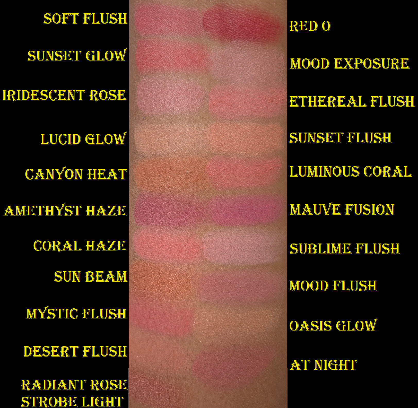
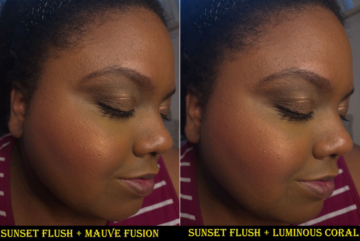
LUMINOUS CORAL (Blush) – I really like this color! It is a little darker than Ethereal Flush, and warmer than Coral Haze, which makes it my favorite of Hourglass’ coral blush shades! It’s vivid enough to pop on my cheeks without looking clownish and it doesn’t require too much effort building it up.
SUNSET FLUSH (Blush) – This blush has the Nars Orgasm effect on me: a slight tinge of pink may be seen when I face forward, but a gold sheen is all that shows when I turn my head towards the light. I could use this as a highlighter, but I prefer how it looks as a blush topper for Luminous Coral and Mauve Fusion.
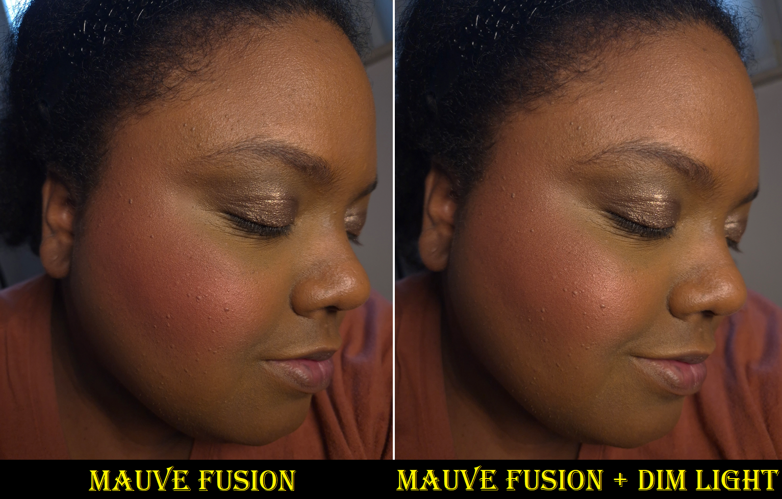
MAUVE FUSION (Blush) – Although this blush is lighter than Amethyst Haze from the Fox Palette, it has enough pigment to look extremely bold with enough layers and a dense brush. In swatches, Mauve Fusion looks fuchsia-pink and Amethyst Haze looks magenta-pink. On my cheeks, Mauve Fusion looks like a normal pink blush. I still think it’s pretty, and between the two, I do think Mauve Fusion looks the most purple on my cheeks. However, I find Mood Flush to look like a truer mauve. Perhaps Mauve Fusion will look different on other people with a different undertone than mine (and a different ratio of color marbling in the blush).
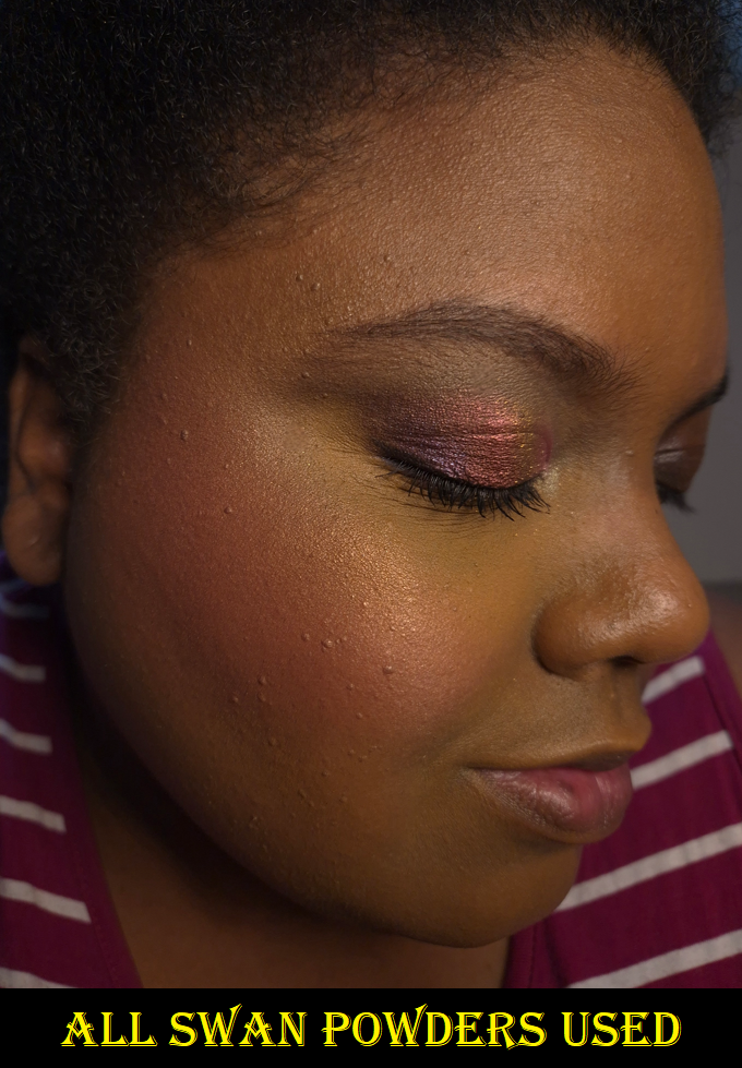
Overall, the Swan Palette colors work pretty well for me. Luminous Coral and Golden Hour were my favorites, but Luminous Coral, Sunset Flush, and Mauve Fusion combined are the real standouts.
As much as I like this palette, I don’t love any of the powders enough to say that I’d have been missing out if I skipped getting Swan. However, I don’t regret my purchase when the goal was to have Deer Packaging, and I ended up with five usable products to boot.
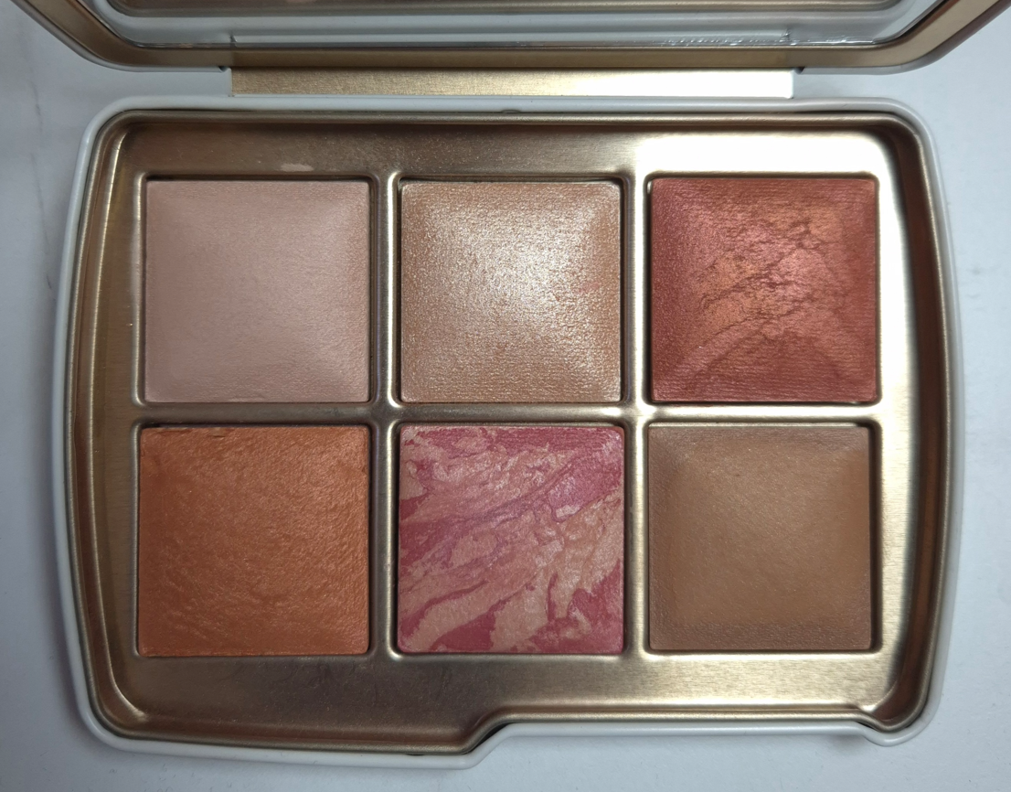
Hourglass Ambient Lighting Edit Quad – Dusk
As you might already know, Hourglass released five curated quads in May 2025, plus the option for US-only customers to choose 4 out of 24 Ambient Lighting powders to put in a custom quad. In my Window Shopping Hourglass post, I said the smartest move would be for me to wait and see if any of the shades I want will end up in one of the deeper holiday palettes I planned to buy anyway. This was my plan, but I kept thinking about the Hourglass Barney’s Volume III Palette that had my two most sought after shades (Lucid Glow and At Night in the “edit” size), and how it was never restocked. So, that compelled me to get the Dusk Palette in its final restock, which sold out a minute after I ordered it. Considering At Night did not make it into this year’s holiday palettes, I really don’t regret my decision. Plus, I got a discount on it.
I’ve had this quad for quite a while, but I figured the start of the holidays would be the best time to review it.
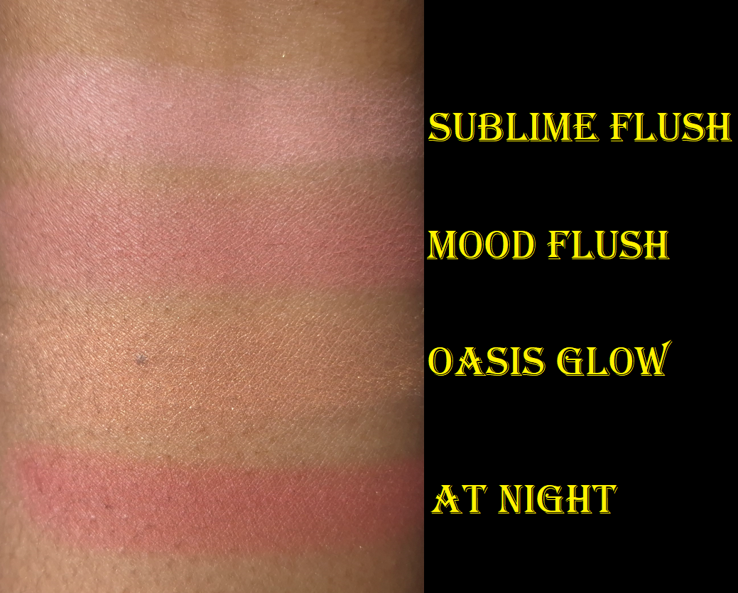
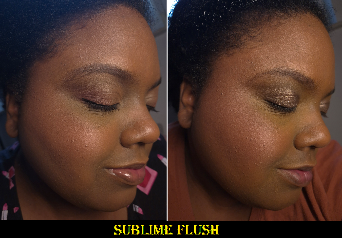
SUBLIME FLUSH (Blush) – I knew this blush would look cool-toned on me, and potentially ashy. Sometimes this shade doesn’t look too bad on me if I mix it with other blushes, but it’s really not for me.
MOOD FLUSH (Blush) – I have to build up this color quite a bit, but I love this blush. It’s a duplicate shade for me, as I already own and depotted one out of the Sculpture Quad, but that just means I can keep one in two different custom palettes of my own making.
OASIS GLOW (Blush) – I knew the chances were high that I couldn’t use this as a blush on my skin tone. I wanted this shade as a subtle highlighter, and that’s exactly how I’ve been able to use it.
AT NIGHT (Blush) – I own this in the full-size, but wanted it in the smaller Ambient Edit size to be able to put it in custom palettes. I love the one that came in the Dusk Quad because I have a larger section of deep red marbling, making it easier to get more of that dark color and less of the tan-beige color. This means it’s even deeper and requires less building up, so I’m very pleased.
I have been content to leaving this quad as is, as a blush/highlighter palette. However, with the additions of Fox and Swan, I’m feeling even more of an impulse to rearrange one or even two Ambient Edit Palettes!
With this year’s launch (and my purchase of the Dusk quad), I have procured nearly every shade from Hourglass that I’ve wanted from the beginning of the launch of these palettes until now. Iridescent Coral is the only one missing, but it would likely be another highlighter shade on me, so I’m giving up on it.
I have experience depotting and rearranging these myself, which is great considering the brand still hasn’t made that option available to those outside of the US. I could continue to wait for this to happen, but there’s no telling when they will roll it out internationally, when they will use 6-pan palettes instead of quads, whether the palettes will be made of tin instead of plastic (which is more ideal for depotting without ruining the packaging). So, I am feeling a bit impatient when I see that creating my perfect palette is now within reach! My biggest obstacle at this point would just be procuring the right magnets and trying to depot the powders old-school style without my Z-Potter.
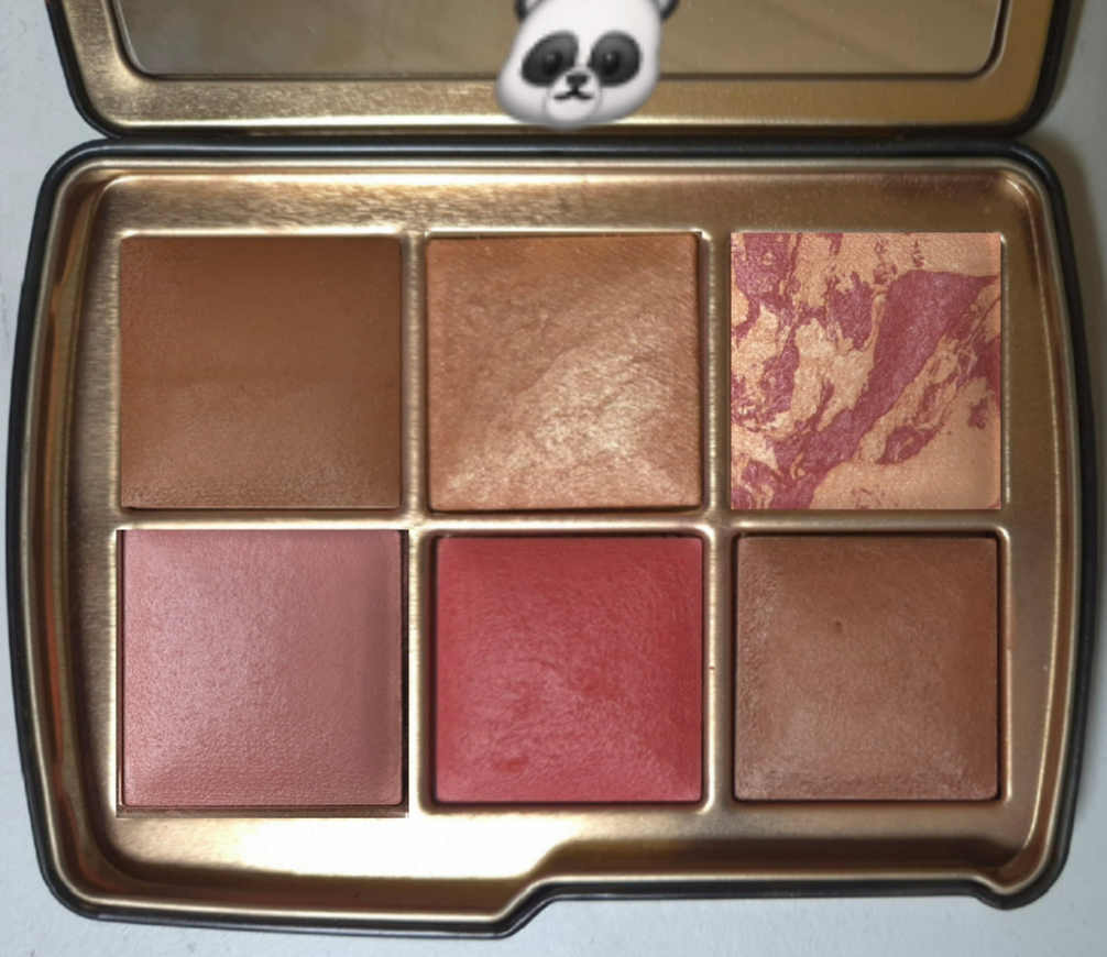
Below is a mock up of the first concept palette I decided upon, which I gave the name Panda for no reason other than to wish it into existence. I’d love a Panda design in next year’s Hourglass Palettes!
CONCEPT PALETTE: “PANDA”
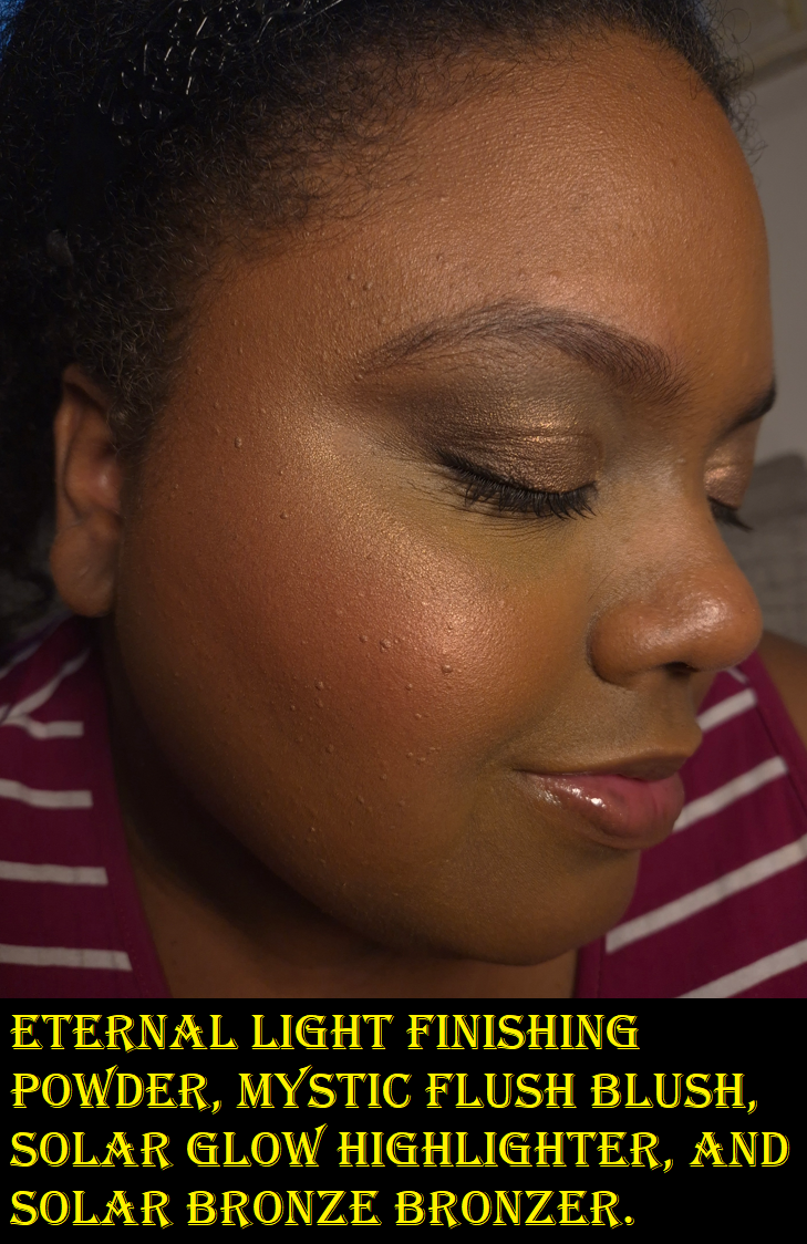
Eternal Light (Finishing Powder) – Lotus, Permanent Shade Solar Glow (Highlighter) – Fox At Night (Blush) – Dusk Quad, Permanent Shade Mood Flush (Blush) – Sculpture and Dusk Quad Mystic Flush (Blush) – Snake Solar Bronze (Bronzer) – Snake
When it comes to choosing the best shades for me, as a person with a medium-deep skin tone, I think I’d put Eternal Light in any palette to be on the safe side of working for me, but Desert Light poses a very tempting second option.
There are plenty of pretty highlighters from Hourglass that I can make work, but the newest one from Fox is the clear winner. Solar Glow would be in any version of my ultimate palette, but if I made a second custom palette, there are a few blushes I use as highlighters that I’ve come to enjoy enough to put in the running.
My two bronzer contenders are Solar Bronze and Solar Fusion with one being my best shade match and the other being similar to that with an added sheen. At times, Solar Fusion will be too light, so the Solar Bronze would need to be in my alpha palette (Panda).
At Night is one of my favorite blush shades of all time, so a perfect palette would be incomplete without it. Mood Flush is typically my second favorite. It works alone as a subtle blush, but also pairs well with At Night. Mystic Flush is the most pigmented and easy to blend of the medium-dark pinks, so that’s typically my third blush option, but Sunset Glow is such a similar color that I go back and forth as to which I like more.
Desert Flush, Luminous Coral, and Ethereal Flush are the next ones that grab my attention the most from the blush swatch photo in the Luminous Coral review section. Truth be told, I haven’t been wearing Desert Flush because I’ve gotten more sun this year and that shade is really only usable for me when my skin is at its lightest. Luminous Coral is brand new, so I’m not fully committed to moving it around. Ethereal Flush is one that I keep forgetting about since it’s in my palette with lighter shades (Owl).
Speaking of lighter shades, Mood Exposure also shows up as a solo blush, depending on the time of year, but I also like using it to calm down punchier blush shades. So, I could see myself adding it to a custom palette as well.
Mood Exposure on the cheeks.
It wasn’t until this week that I started to question whether I should put all of my favorite Hourglass blush shades into one palette considering At Night and Mystic Flush can sometimes look alike. I need to have blush variety, but the colors should be the ones I wear most often. I considered placing Canyon Heat instead of Mystic Flush for the greater difference between shades, but ultimately left it as is.
The more I look at the Panda Concept, the more interested I am in making it.
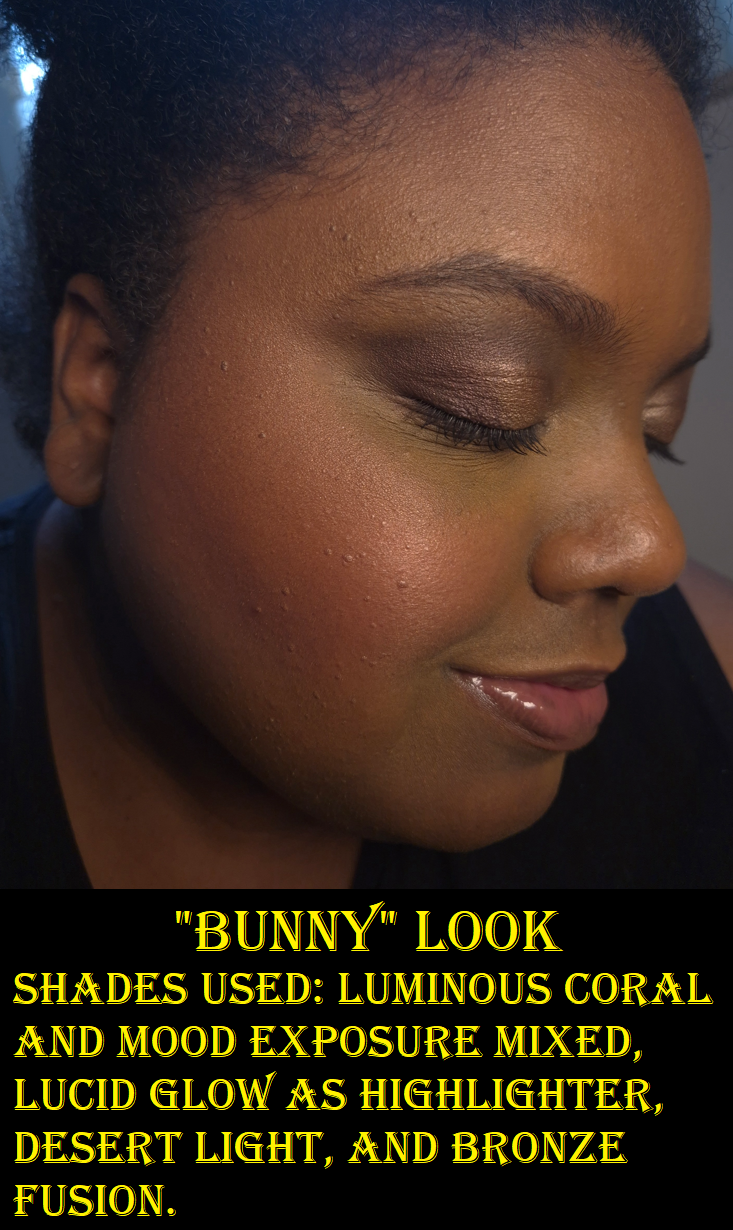
CONCEPT PALETTE: “RABBIT”
Mood Exposure (Blush) – 5 Holiday Palettes, Permanent Shade Lucid Glow (Blush as Highlighter) – Fox, Ghost Quad, Sunset Quad, Barney’s Volume III Desert Light (Finishing Powder) – Fox Luminous Coral (Blush) – Swan Canyon Heat (Blush) – Fox Bronze Fusion (Bronzer) – Fox
Since Desert Light and Bronze Fusion were close to matching my top picks, and Luminous Coral is the best of the corals, I decided to create a second mock up called “Rabbit.” The majority of shades in this one are from Fox, and while I might’ve been content to leave that palette as-is, rearranging them might help me get even more use out of them.
Lucid Glow and Oasis Glow are my top two blush-as-highlighter products from Hourglass, but Lucid Glow has more shimmer impact, so it won out. I did contemplate putting Infinite Strobe Light, but it’s just easier to keep Lucid Glow within the Fox Palette to minimize the amount of depotting I have to do.
For a similar reason, I’m leaving in Canyon Heat. It’s too new for me to know if it can top my other favorite blushes, but I’m still looking to have variety. This is the best of the oranges.
I could use Mood Flush a second time, since I have two now, or Sunset Glow to act as a duplicate for Mystic Flush, but I want to see how well this arrangement can do first.
It’s a little ironic that Mauve Fusion and Amethyst Haze didn’t make it into either of my theoretical custom palettes, considering they were the two blushes I was the most excited to see this year. They both have the potential to rise up the ranks though. I just need more time with them.
At this point, I can finally say that I don’t need additional Hourglass powders. I have all the shades I want. However, it’s not even about the powders anymore. I enjoy collecting them and whether I end up loving or hating the offerings, it’s one of the most exciting makeup events of the year for me to talk about with other makeup lovers. So, as long as the brand doesn’t do anything cancel-worthy next year, I will likely buy another palette. I will just try my hardest to limit it to one and not two!
In my post called Window Shopping the Hourglass Custom Quads, I came to this realization: “The more I think about it, the more I realize having a quad isn’t necessarily what I want. A palette with one finishing powder, one highlighter, one bronzer, and three blushes sounds like heaven!”
So, Hourglass is off to a great start by having the Fox palette, the darkest of this year’s holiday offerings, meet those exact specifications. In addition, this palette contains 5 new shades and the only repeat is Lucid Glow, which I don’t own and have been trying to get my hands on. Fantastic!
Today’s post is going to follow my usual format when discussing Hourglass products. First will be the review with comparison swatches included, next will be the assessment as to how well the brand has done this year, and lastly a list of things I wish to see in the future.
I received this product early because I purchased it prior to the official launch (shortly after the links were available online), and I paid for express shipping. However, I also ordered the Swan Palette (in Deer packaging) via standard shipping. It arrived too late for me to include anything but comparison swatches in this week’s post, but I will publish the review as a bonus post as soon as it’s completed. A review of the Dusk Quad will be in the Swan post as well. If you haven’t already, be sure to click follow to be notified by email whenever a new review is out!
DISCLOSURE: I am not affiliated with this brand. All thoughts and opinions are my own. I used two random influencers’ codes that I found online (via Retailmenot) to get 10% off my orders.
Anyone who wants to see a list of links to my past Hourglass reviews can find them HERE.
What We Got
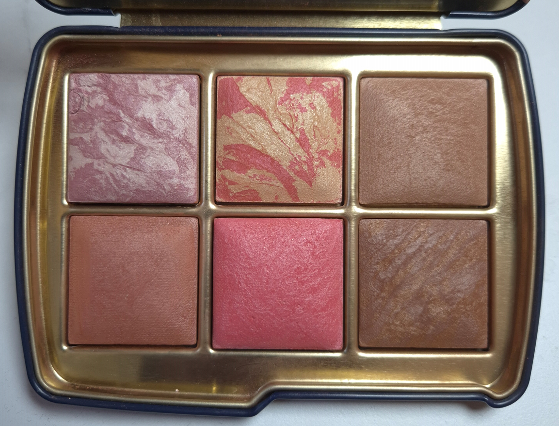
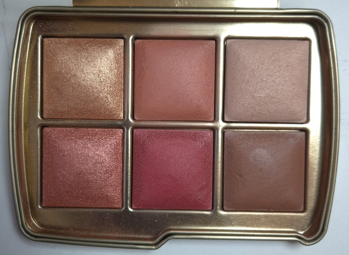
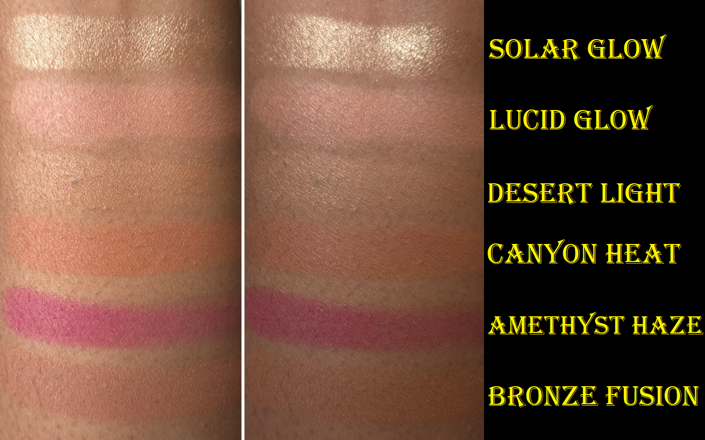
Hourglass Ambient Lighting Edit – Unlocked- Fox Palette
IMPORTANT NOTE: Any Hourglass powders that have a swirl/marble/veining can differ in color from palette to palette. For example, Lucid Glow could look lighter and yellower or a darker coral-pink than mine depending on how much of each color is present in the blush. Amethyst Haze can look more of a plum-purple if it contains less of the shimmery pink. So, even though I am sharing swatches, mine may look different compared to what others have.
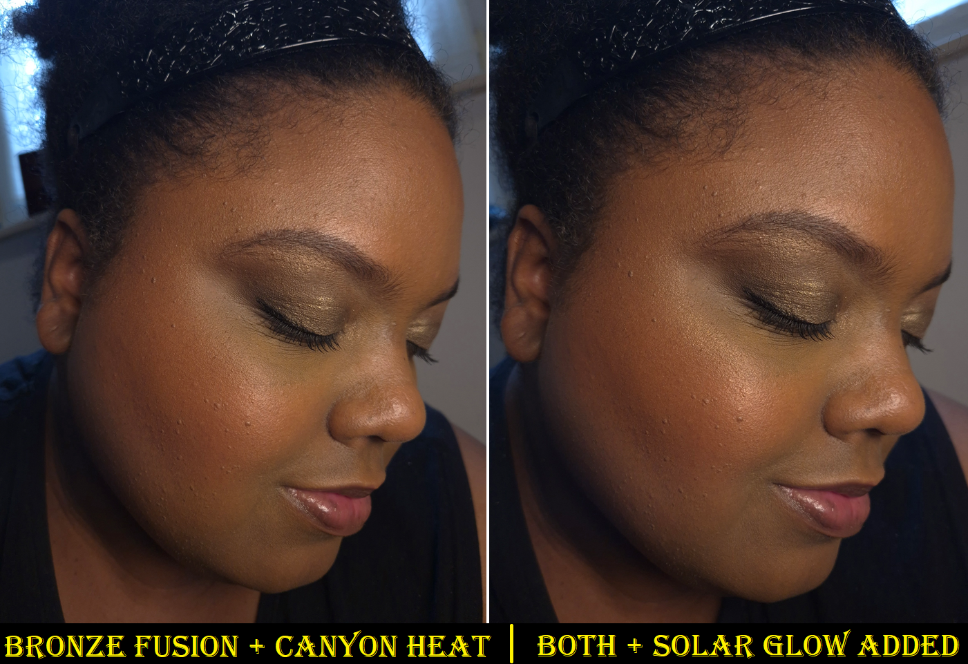
SOLAR GLOW (Highlighter) – I finally have a perfect highlighter from Hourglass! In terms of shade, last year’s Gilded Strobe Light from the Lotus Palette was everything I wanted, but the strobe formula tends to enhance texture more than I like. For some reason, this new one does not. Gilded Strobe Light is a golden shade with the same color depth as Solar Glow, but Solar Glow has warm yellow-gold veining along with marbling that looks identical to Gilded Strobe Light. Although Solar Glow is described as a “golden bronze” on the website, the yellow veining keeps it from having as much of a golden-orange tone as Gilded Strobe Light. So, the color stands out a little more on my skin, but it’s still in the right color family for me.
The shade match, plus the level of shimmer refinement makes this not just the best highlighter I own from Hourglass, but the kind of highlighter I like in general. Infinite Strobe Light from the Snake Palette was also a decent shade match, a little less reflective than the typical strobe highlighters, and it is slightly darker than Solar Glow. Divine Strobe Light from the Tiger Palette worked too, but neither than one nor Infinite Strobe Light became favorites. With Solar Glow, I can use my best brushes to get the exact level of shine I want, as it blends easily into my skin. The shine doesn’t fade or dull down as the day goes on, nor does it have any other longevity issues.
I have swatch comparisons below, and a photo with me wearing the highlighter is in the Canyon Heat section.
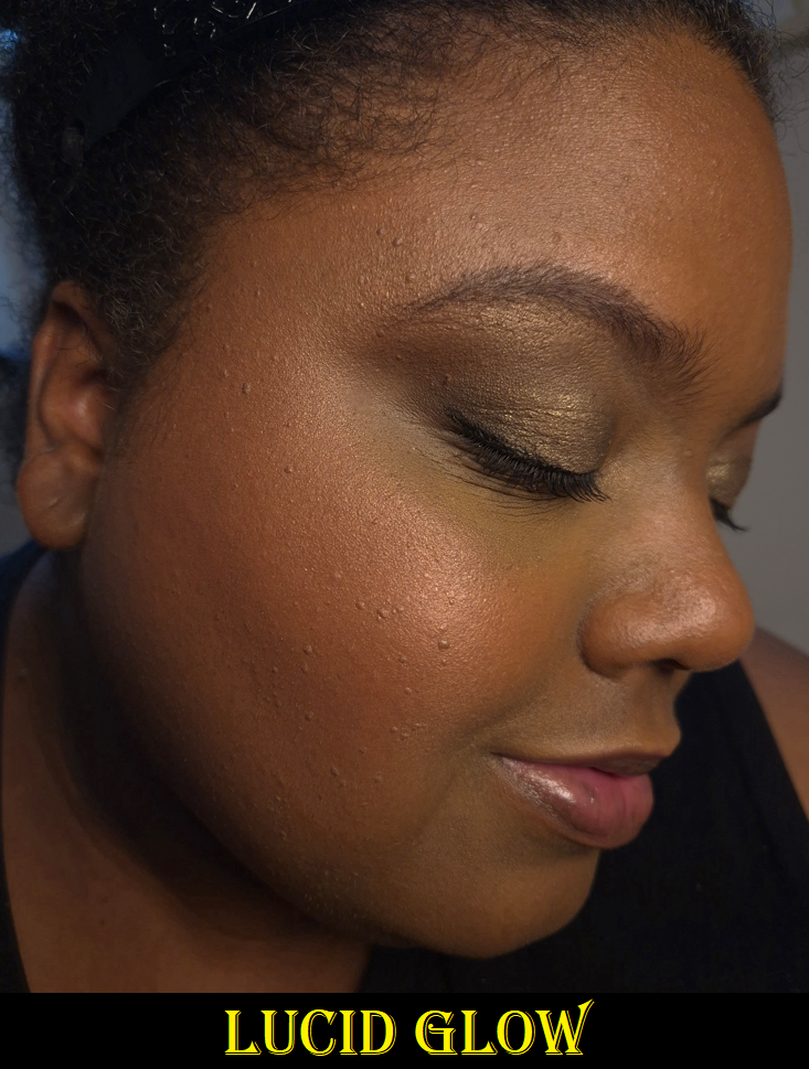
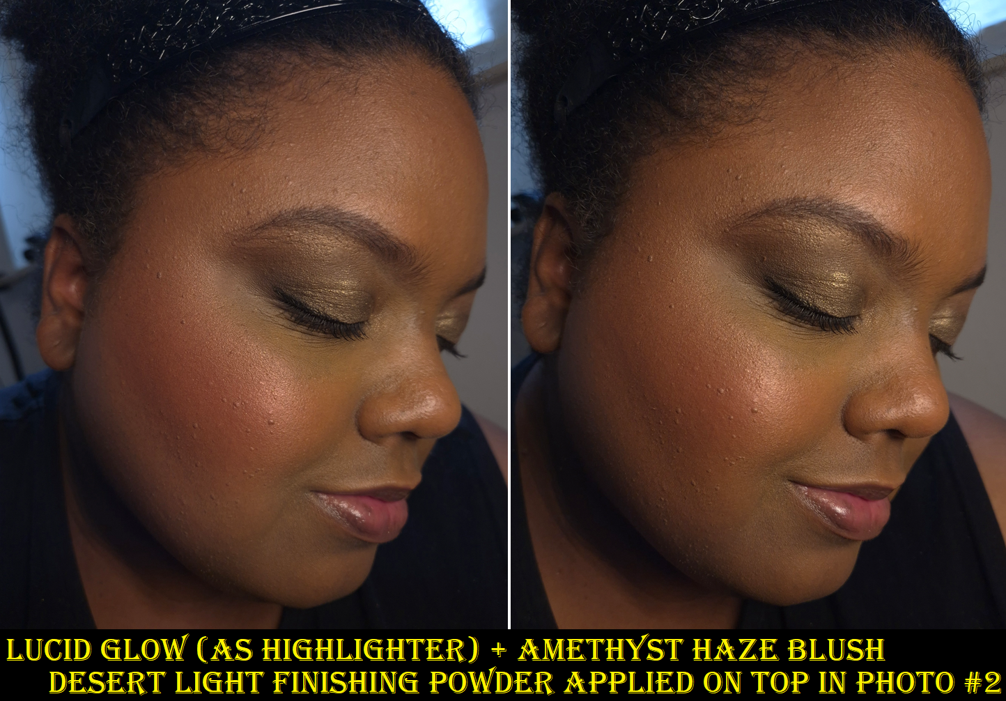
LUCID GLOW (Blush) – If I wear this like a blush, I can see a faint peachy-pink tinge (the brand describes it as coral) on my cheeks. However, I feel this looks the best on me as a highlighter when paired with Amethyst Haze. Although Lucid Glow is a warm shade, the pink tone still manages to compliment the cooler pink-berry color of Amethyst Haze better than Solar Glow, which is even warmer.
Lucid Glow also makes a great blush topper for Canyon Heat. I prefer to wear a radiant blush the majority of the time, so the sheer color from Lucid Glow doesn’t alter the color of Canyon Heat that much, and just adds the glow.
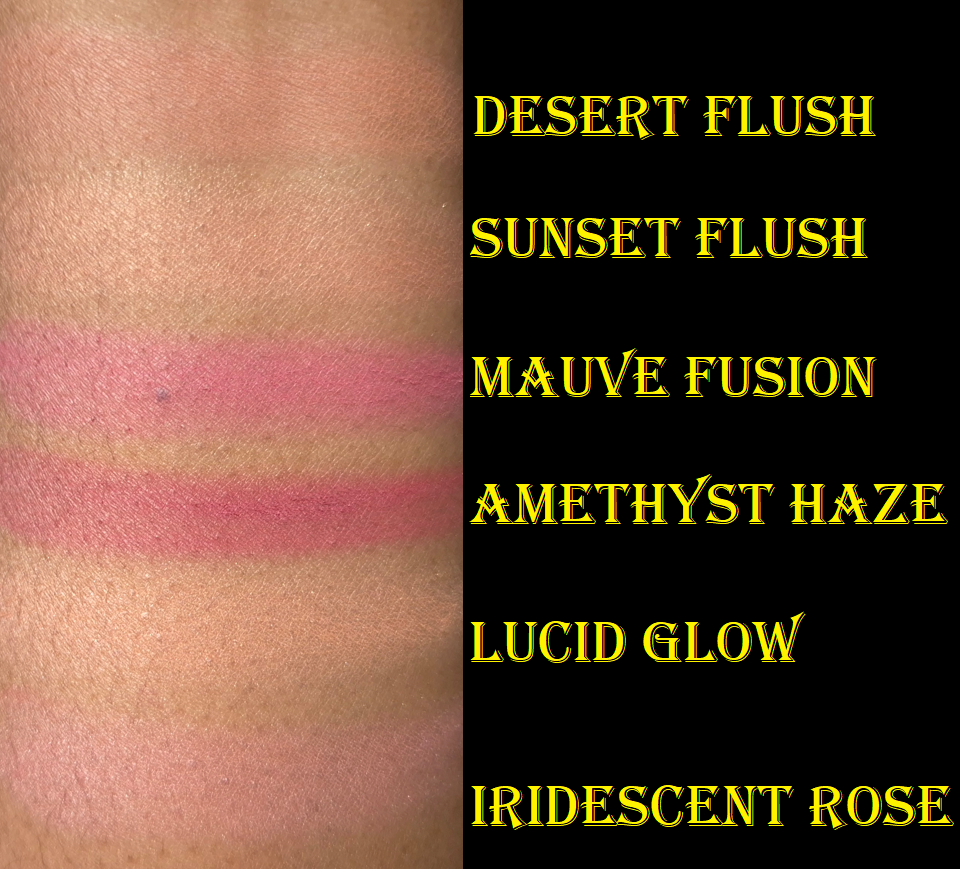
I see this color as the warmer version of Iridescent Rose, a shade that Hourglass has put in at least 4 palettes by now. It’s around the same depth as Lucid Glow, and the brand calls it a warm rose, but it has a pearly-mica type of sheen that makes it appear cooler toned on me. Perhaps Iridescent Rose would look even better with Amethyst Haze on those with a cool undertone, but Lucid Glow helps to bridge the gap in making that shade work on me. Therefore, I don’t mind having this in my palette, even though I don’t wear it as a standalone blush.
The lightest blush from the Lotus Palette, Desert Flush, is still darker than Sunset Flush from the Swan Palette and Lucid Glow from the Fox Palette.The Lotus Palette continues to be the darkest Ambient Edit Palette thus far.
DESERT LIGHT (Finishing Powder) – The performance of all Hourglass finishing powders are the same on me, as long as the shade isn’t too light, which then makes my skin look dry, textured, and ashy. These powders are lightweight, sheer, easy to blend, have minimal ability to lock in makeup, and minor blurring capabilities. So, choosing between them comes down to whether or not there is visible shimmer and if the shade is a good match. The palest one I can wear from Hourglass is Dim Light, but it can slightly lighten my foundation if I am too heavy-handed. Desert Light is darker and warmer, so it suits me even better. It is technically still lighter than my skin tone, but I could only tell by applying a heavy swatch to my face. When rubbed in, the slightly brightened area did not look unnatural. So, it’s no surprise that using a normal amount on my face works well as a finishing powder.
My closest match, especially right now, is Eternal Light. Eternal Light is the tiniest bit darker than my skin tone (again only detectable when swatched heavily), but applying a normal amount looks perfect. I always have to preface that the Eternal Light shade from the Ambient Lighting Palette Trio in Volume III had noticeable gold specks in it, but Eternal Light from the Ambient Lighting Edit Unlocked Lotus Palette does not. This is why I prefer Eternal Light from Lotus and that’s the one I consider to be my best finishing powder shade from Hourglass. This new one, Desert Light, contains gold shimmer again, but the particles are far tinier than the Volume III trio. So, I don’t mind the beautiful sheen and the brightening effect. Desert Light is particularly well suited to calming down a “loud” blush, like Amethyst Haze, plus it adds a little warmth. I just have to be careful using it in my bronzer zone because it can make Bronze Fusion look even more subtle than it already is.
CANYON HEAT (Blush) – This is finally an orange blush I can get behind! Past orange blushes from Hourglass were metallic, to the point of seeming more like highlighters, and were just too saturated for my liking. Canyon Heat is more of a slightly muted terracotta with a soft matte finish. The earthy orange-brown hue is quite flattering. It shows up on me, but a little more pigment could have made this blush better able to suit those who are darker than me. This is probably going to be too light for some people I know.
I find it interesting that of the three blushes, this one has the least amount of sheen. However, it still contains Mica, Synthetic Fluorphlogopite, and Boron Nitride as the first three ingredients. There is a possibility that other people could have a stronger sheen in theirs than mine. Then again, the Desert Light finishing powder also has those top three ingredients, but still has even less of a sheen than Canyon Heat. In any case, Canyon Heat is not flat matte, but isn’t shimmery like the other blushes either.
I like Canyon Heat, but I need more time with it to decide if it can surpass my older favorites.
AMETHYST HAZE (Blush) – Hourglass has a few mauve blushes (Mood Flush and Mood Exposure), and they released a deep-pink berry blush called Rose Heat from Universe Unlocked in 2021, but Amethyst Haze and Mauve Fusion are the closest they’ve gotten to making a purple blush. Amethyst Haze is like a magenta-berry and is one of their darkest blushes, alongside Red 0 from the Lotus Palette in 2024 and Rose Heat from the 2021 Universe Unlocked Palette. Mauve Fusion from this year’s Swan Palette is a slightly lighter, cooler, and less pigmented version of Amethyst Haze. I consider it to be a fuchsia-pink. Mauve Fusion has a touch more blue tone, while Amethyst Haze has a little more red.
I’m always happy to see a dark blush option from Hourglass, and that it’s less pigmented, making it easier to work with than Red 0. Amethyst Haze is also only moderately metallic, so I think it has a pretty finish.
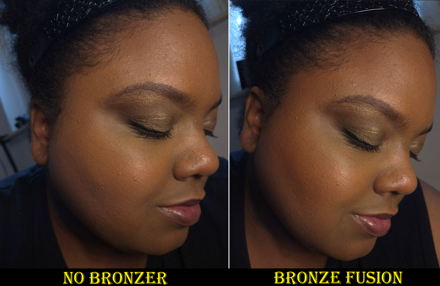
BRONZE FUSION (Bronzer) – This bronzer isn’t as light as Lustrous Bronze Light from the Leopard and Elephant Palettes, but it’s just barely dark enough to show up on my skin while the last of my summer color is clinging on. Solar Bronze has been my correct bronzer shade up to this point, but what Bronze Fusion has going for it is the fact that it’s the darkest shimmer/glow bronzer Hourglass has made so far.
The foundation shades I wear most of the year are Nars Light Reflecting Foundation in Caracas (but in some formulas, like Sheer Glow, I wear Macao), Hourglass Ambient Glow Foundation 13.5W, Danessa Myricks Yummy Skin Serum Tint in 11, and Chanel N1 in BD91. I should theoretically wear BD101, but I make BD91 work even outside of winter. I used to mix BD91 and BD121, but BD121 is too orange.
Why this is important is because I can see the bronzer on me when I wear BD91, but when I wear a full face of BD121, I can only see the warmth the bronzer adds in person. The sheen is subtle to begin with, but even harder to see in photos. So, once again, I find myself liking a product that will unfortunately be unusable for a lot of makeup lovers that have come to expect the “Color Palette 3” of the holiday palettes to be deep-skin friendly.
Wearing Chanel Foundation in BD91
How well this continues to show on my skin throughout the year will determine whether it’s above or below Solar Bronze as my favorite.
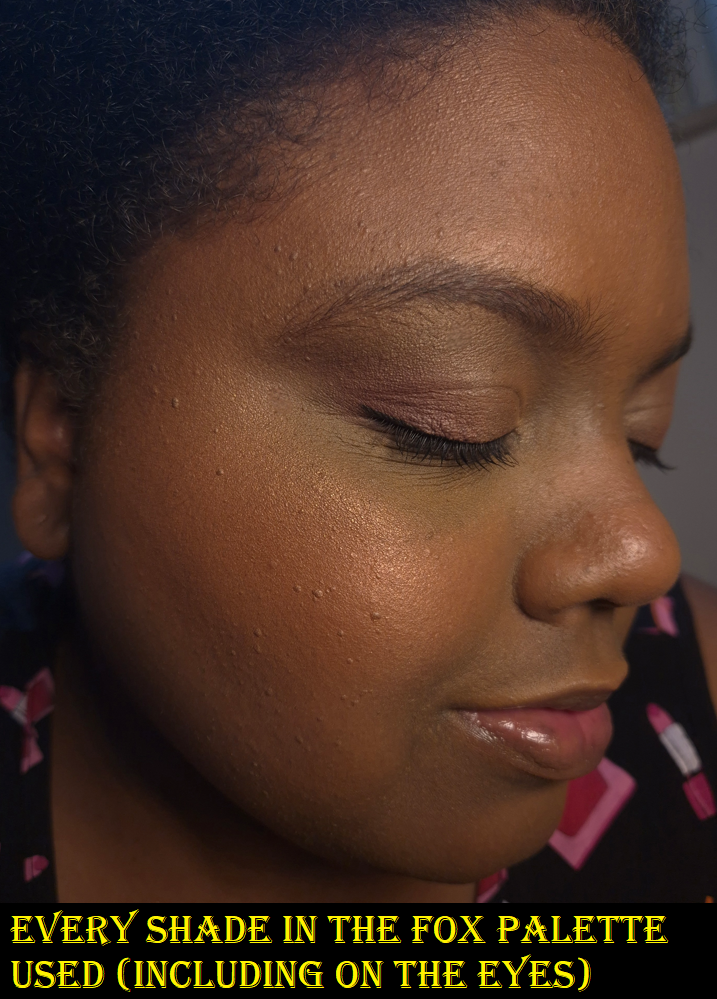
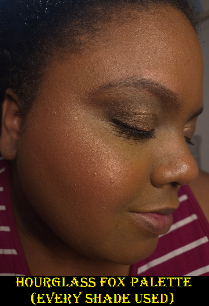
When it comes to using these powders on the eyes, it’s once again something I’ve done for review purposes, but will rarely do in my everyday life. It’s similar to how I dislike using Hindash powders on my eyes, but love them on my face. They just look so dull on me as eyeshadows.
How Did Hourglass Do This Year?
My Tiger Palette in the top left contain two blushes from the Butterfly Palette.My Owl Palette contains the color story of Leopard, but I swapped out one blush for Mood Flush. My Leopard Palette has contains the color story of Snake.
Regarding the Fox Palette specifically, I think Hourglass did a fantastic job in catering it to my preferences. I’m thrilled about that for myself, but it’s a step backwards from being inclusive towards those with deeper and richer skin than mine. There are four options this year, if we count the Sephora-US exclusive Horse Palette. Considering that one has all repeat shades, I’m willing to overlook it, but I understand why some of the people I know are disappointed that Fox is their only option and that they can only use half of the palette.
Staying on the topic Fox, I feel that the quality is better this year. The powders feel slightly less dry. The shimmers are more refined. The choices to make most of the shades warm-toned suits me well. One of my biggest complaints with how they used the marbling “miscelare technique” in the past was to combine a color with beige, effectively ensuring the combination would turn into a medium value color at the darkest. As fascinating as the swirls look, I would have rather Hourglass make dark palettes with solid colors (like they did in Lotus) to ensure there aren’t huge shade discrepancies among the same palettes. Lucid Glow isn’t new, so I’m lucky mine had enough pink veining to be wearable. Amethyst Haze and Bronze Fusion look solid from afar, but they are actually the combination of two dark colors on each tile. I believe even the Solar Glow highlighter has the subtlest bit of marbling between dark warm gold and bronze. I’m happy they’ve done this successfully for the darker powders.
Although the depth of the colors could be be improved, I feel like Fox has the most cohesive and complementary options for those in the warm-toned Tan to Medium-Deep skin category. For example, with the Lotus Palette, I felt that I was forced to use the two blushes together to create a middle-ground color because the two had such a huge difference in depth. The person who could rock the lightest blush alone wouldn’t be able to use either of the two highlighters. In Fox, I can use Lucid Glow in various ways with both blushes, and technically by itself. The highlighter, bronzer, and Canyon Heat blush are beautifully warm and clearly go together. If I feel Amethyst Haze is too dark or too cool, I can fix both issues once I put the finishing powder on top. I can also use all three blush shades to create the perfect medium toned neutral flush on the cheek that isn’t too muted or too bold and isn’t too shimmery either. The only downside is that I have to be careful using the entire face palette together since the combination of Lucid Glow and Desert Heat can tone down the vibrancy a bit too much. Some examples of this are in the photo below, but I would realistically only use 4-5 shades at a time.
I’m still gathering my thoughts about the Swan Palette, and I don’t own Deer, but it seems Hourglass intended for Deer to suit those with fair skin who want not only light Ambient powders, but ones specifically formulated to require building up. Both Han Beauty 101 and Theresa is Dead seemed less than pleased by the Deer Palette, even though it was intended for people like them. It really highlights the fact that it’s not enough to match someone’s skin tone depth. Preferences play a big part, which is why being able to customize these palettes in the future is so important. Hourglass makes a lot of money off people (like me) who buy more than one palette, but they also know fatigue is starting to set in. The limited availability of custom quads was likely a test, and I hope the customers passed that test. Also, regarding Deer, Han Beauty 101 said that she has used the palette enough times that she’s getting more pigment now, especially having switched to a denser brush. So, perhaps that’s something to keep in mind for those who want to buy Deer.
I think the amount of repeat products Hourglass put in the palettes are acceptable (Deer – 3, Swan -2, Fox -1, Horse-6), because I view Horse as no different than the Owl Palette from 2023 that didn’t have a Color Palette attached to it. Besides the holiday palettes with special packaging, Hourglass releases a few repeat palettes and trios each year anyway. They just don’t get talked about as much and disappear off their website just as quickly as they arrived.
Overall, I’m quite happy with Fox. Usually it’s the blushes that have me the most excited for the holiday palettes, but this year it’s the highlighter, finishing powder, and bronzer. I think this is a good addition to my collection, which is quite the relief considering I am supposed to be cooling it on buying face palettes. It’s nice to know the hefty price was worth it. I didn’t get all holy grail shades, but many of them have become second favorites instead.
Future Wishes
I liked the animal options this year. The new artist they hired, Sasha Unisex did a great job. After all, a good portion of my decision to buy a second palette was for the packaging. I am still hoping and wishing Hourglass will commission a Panda and Rabbit in the future. Since we’ve had non-animal ones like the Barney’s cover, Evil Eye, and Lotus, I would go crazy for a star/moon/celestial design. I’d also love to continue on the mythological train and have a phoenix, mermaid/siren, unicorn, etc.
I’m still hoping Hourglass will take the two colors within At Night to be mixed into one solid color, with an increase in pigmentation. If they made a solo blush out of the darker of the two colors in At Night, I think that would be pretty great too.
Hourglass makes a lot of pinks and berries, but I’d love a red-brown similar to Pat Mcgrath’s Paradise Venus or Benefit’s Terra. Perhaps the reason Hourglass has zero true red blushes is because they don’t use carmine. Red 0 from Lotus was still an ultra deep pink. I would just like to have less pink and orange, and I’m still hoping we’ll get darker nude blushes that will look natural on someone with dark skin.
The creation of a rich dark bronzer is still on the wishlist for so many people. That would be great to finally see next year.
Sometimes I create mock ups of what my perfect Hourglass Ambient Edit Palette would look like, if I was in charge of the arrangement. It was easy to decide my top two finishing powders, bronzers, and highlighters, but I have been so indecisive about the blushes that I decided to cut that portion from today’s review. I think I will try to include it in the Swan post instead. So, if you’re interested in seeing that as well, please visit my blog again soon!
I said in my Prada review ten weeks ago, “For now, I’m content with the two products I have.”
Yet, here we are again!
The contentment did not last. I couldn’t stop myself from buying Pansy to mix and match with Primula. I also watched a lot of balm related videos on YouTube, and the Prada balm kept ranking among the top. So, despite the fact that I’m on a restricted low-buy regarding lip products, I bought one anyway.
The triangular compact mirror was a free gift with purchase via Douglas.
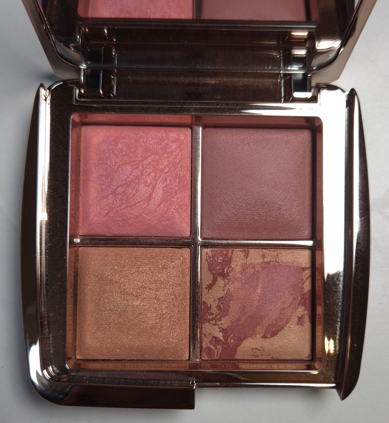
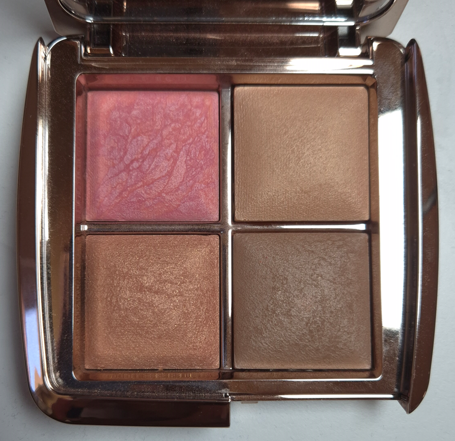
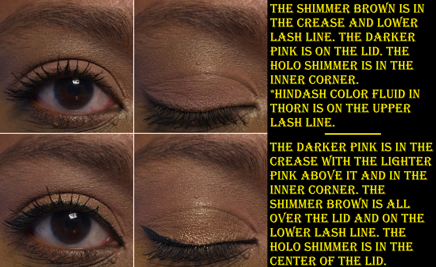
Prada Dimensions Holo Nude Eyeshadow Palette in Pansy
I thought these shades were going to be on the darker side of medium, but the darker pink and shimmery/satin brown are lighter than I expected on myself. I still consider this palette to be pretty, especially the triangular eyeshadows in the bottom left and right sides of the palette. I don’t know how else to describe that shimmery brown, which has a pink tone to it. In my previous review, I also said that Primula had the prettiest Holo shimmer among the three quads Prada launched, but I might have to reconsider that statement.
The quality is on par with Primula. The shadows are incredibly creamy feeling, as though it’s a cream-to-powder formula. The eyeshadow payoff is the soft buildable type. I don’t get fallout, fading, or creasing, and they are easy to blend.
The downside, is that I can’t build any depth using this palette exclusively, but I knew that before I bought it, plus I intended to use these shades with Primula.
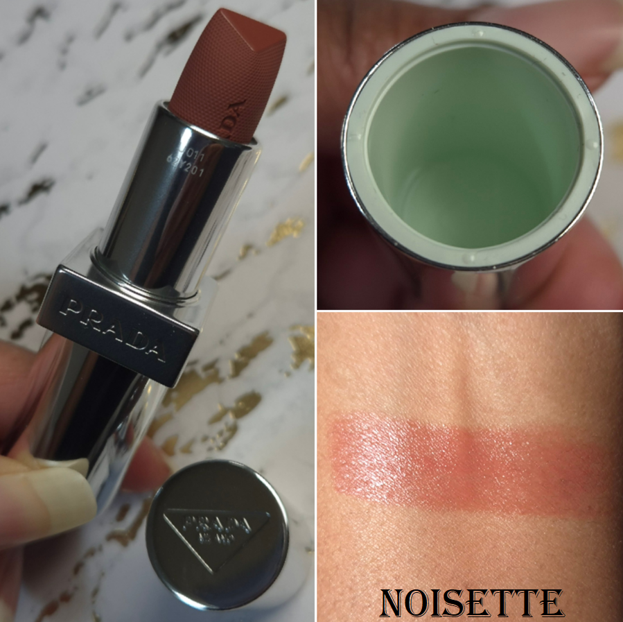
Prada Optimizing Care Lip Balm in 11 Noisette
I love how this balm color looks on my lips! It is so rare to find a light shade that is dark enough for me to not need to wear a lip liner with it, without being too saturated/vibrant, and also contains enough pigment to show true-to-color. I’m always looking for a medium-toned pink, but they end up being too cool-toned, have too much mauve, too much of a white base and looking milky or ashy, or too sheer to appear different from my natural lip color. I am super happy with this shade!
Without eating, and with a normal amount of drinking, this lasts about 4-5 hours on my lips before I feel the need to reapply. My lips feel nicely moisturized and hydrated while I wear it, but I do have lip balms, oils, and glosses that are better at conditioning my lips. However, I’d still place in somewhere in my top 15 or 20. I also don’t consider it to be that sticky.
There are two flaws, with one being far more significant than the other:
As beautiful as the color is, it’s not perfectly smooth. The color can sometimes settle into the lines of my lips, so I need to really rub and blend them together to get the color to smooth evenly back out. I notice this during the initial application, and then it’s good until there isn’t as much left on my lips, so I need to reapply anyway.
My biggest issue with this balm is the added fragrance. It not only smells overpoweringly strong of florals, but I can literally taste the perfume! It even makes my tongue tingle when I accidentally get some of it in my mouth! I try my best to avoid putting the balm too close to the inner rim of my mouth, but I still manage to taste that gross floral perfume anyway.
I admittedly only did four all-day wear tests because I could not handle anymore attempts to eat food while I had remnants of the balm on. Most balms aren’t so gross tasting that I have to bother wiping everything off my lips before eating, but Prada’s is. After I quit doing wear tests, my M.O. has been to put on the balm for photos and then wipe it off after I’m done. This is the only way I can continue to use this product! The color is gorgeous. The formula is quite nice and cushiony on my lips, but the parfum and additional aroma ingredients (limonene, geraniol, linalool, citronellol, etc) seriously impact my desire to wear this. I don’t understand how this doesn’t bother more people, besides apparently myself and State of Kait.
The amount of fragrance in the foundation, I can ignore. The highlighter is powerfully scented, but I power through because it’s unlike any other in my collection. However, the lip balm’s perfume is nearly as strong as the highlighter and I cannot tolerate having them both on at the same time. I get an instant headache.
The packaging is beautiful and luxurious. I love all the details with the logo on the cap, around the sides, the Prada green color on the inside of the cap, the shade name near the opening of the tube, the magnetic closure, and the fact that this is refillable. Sure, the price is high. However, I would have said it was worth it if not for the scented aspect. I cannot recommend this product based on the experience I’m having with it. I seriously hope the fragrance will dissipate over time or that they reformulate these in the same colors, but make them fragrance-free. I bought this at 20% off, but I would repurchase a parfum-free version at full price in a heartbeat. This had the makings of being a holy grail product. What a shame!
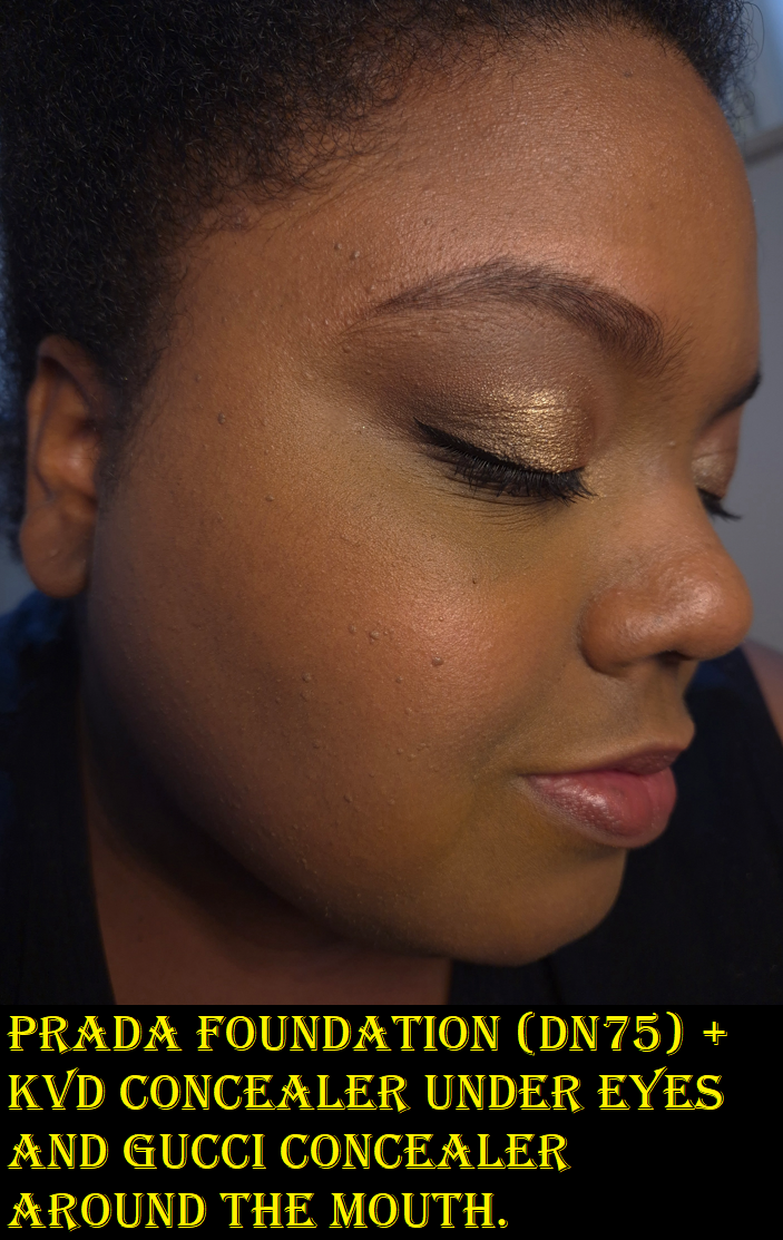
Prada Reveal Skin Optmizing Refillable Foundation (sample) in DN75
I got a foundation sample card in one of my orders and DN75 was the closest match out of what was available. I would say it’s still a shade too light for me. I assume either DW75 or DW80 would be better for me, but I don’t plan on buying the full-size because the finish is more matte than I would like. It if looks like this on me in the summer time, I can imagine how dry and dehydrated I’d look in winter. My hydrating setting sprays could help, but I will just stick to using the foundations I already have.
I have noticed during longevity tests that this foundation gets more dewy on me as the day goes on, but I’m not sure if that has to do with the hydrating skincare I use (such as hyaluronic acid) taking effect. This kind of thing happened to me with the Hourglass Ambient Soft Glow Foundation, but I prefer to have a hydrated look from the start and it staying the same all day, instead of having to suffer through looking dry in the morning and then by afternoon I’m glowier in a way that looks worn in, the way this Prada Foundation does.
According to what’s written on Prada’s website, this foundation has, “buildable medium coverage and a long-lasting soft matte finish,” plus, “…the technology-powered formula instantly enhances radiance and hydration with additional overtime care.” So, perhaps this “additional overtime care” explains the dewy phenomenon. Looking more radiant is welcome to me, but I don’t like being able to actually feel the moisture increase on my face. This foundation is not transfer-proof, and I agree with the medium coverage claim.
Because of the fragrance and dewiness throughout the day, I’m glad I was able to use the sample and didn’t have to commit to buying it first. I tested this foundation 3 or 4 times, as there was plenty in the container and I was able to use tape along the sides to keep it as fresh as possible between uses.
That’s all for today! I truly do think I am slowing down on buying more from Prada, especially if there’s going to be fragrance in those products too.
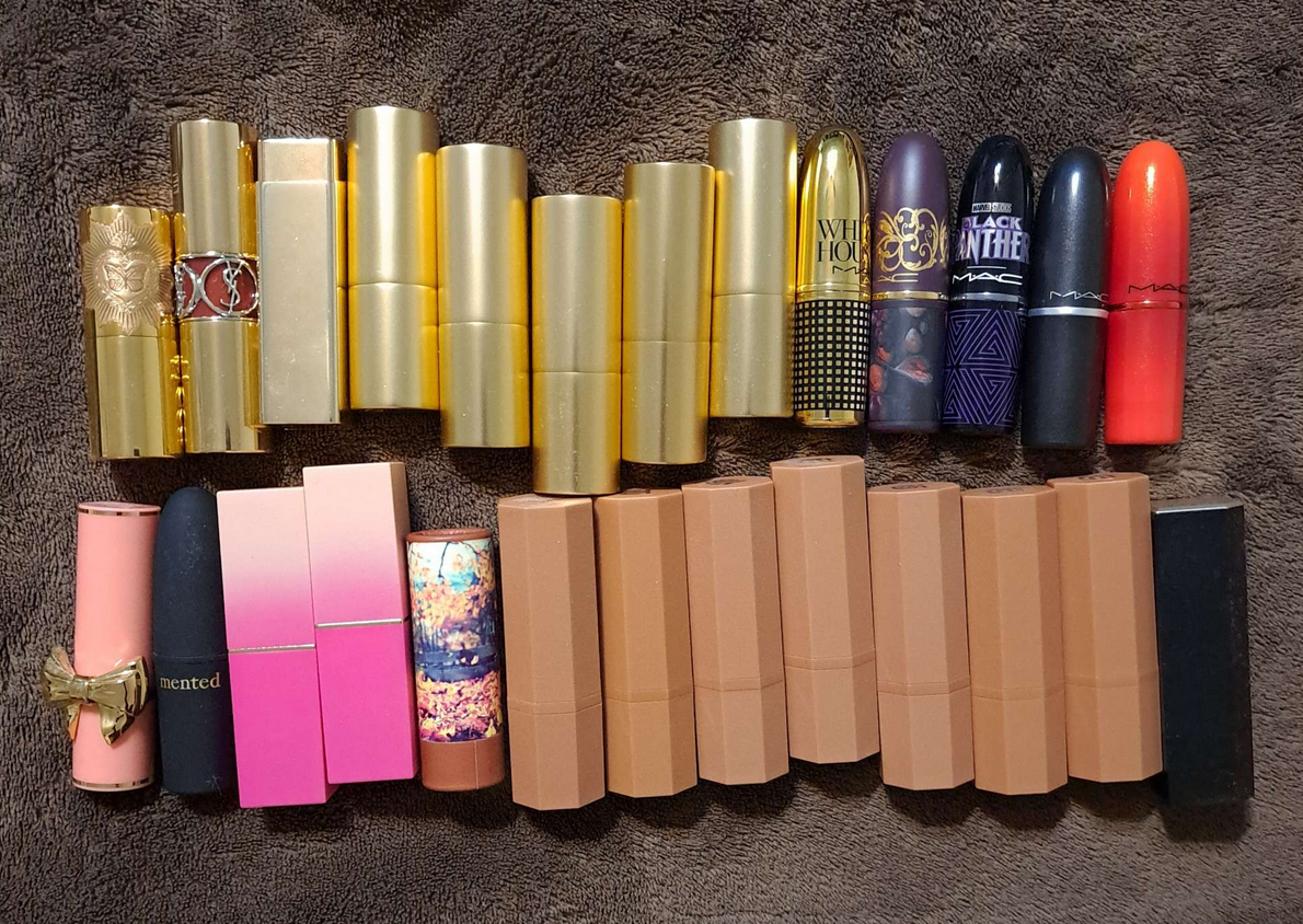
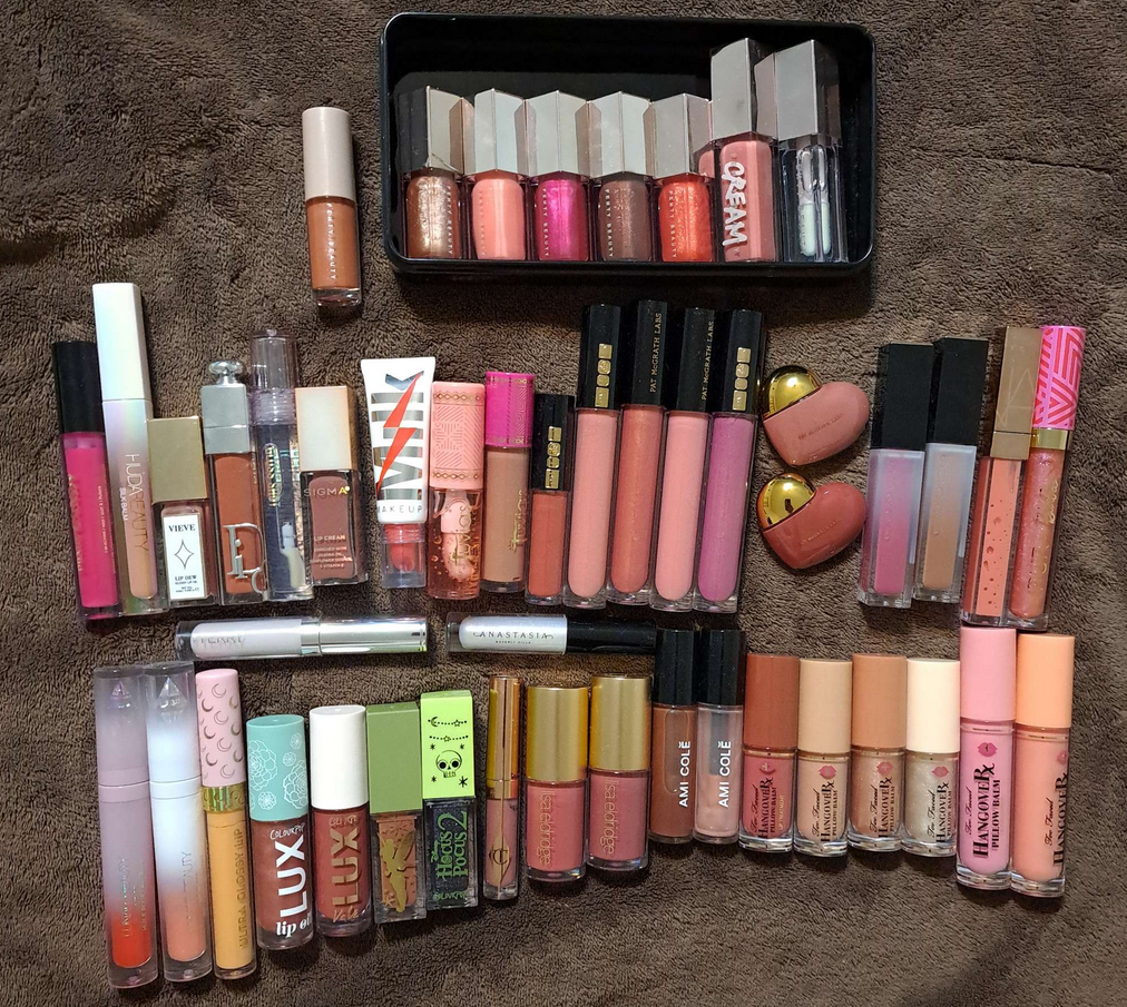
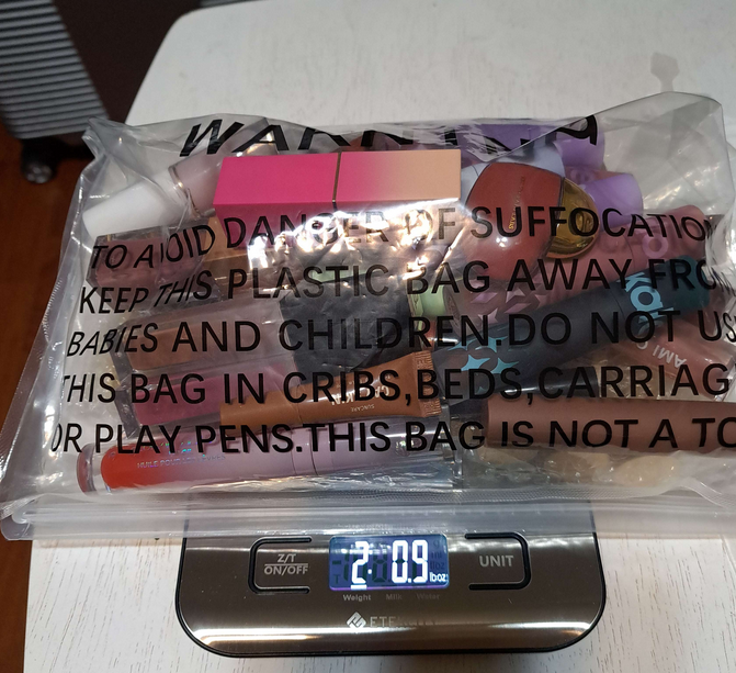
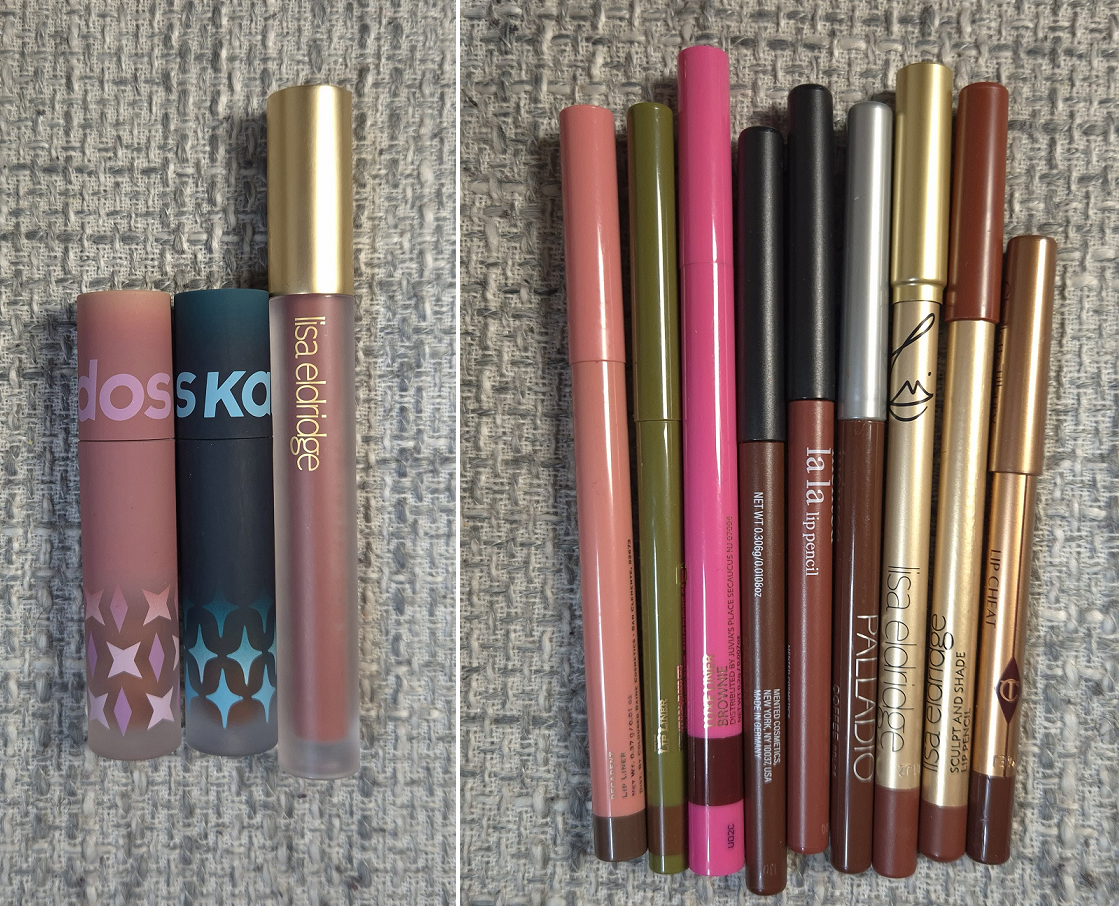
The photo above shows all the lip products I purchased or was gifted in 2023. I was systematically trying to review everything new that year, but ran out of time once I got engaged. Since I was moving overseas, I suddenly had to do a declutter and decide which items I would be bringing with me, whether I completed reviews for them or not.
Then, in 2024, I was trying to balance between reviewing newer and older items. It got overwhelming trying to juggle reviewing 25 lippies in a single declutter style post. My collection was getting out of hand again, so I decided to go on a low-buy. I switched gears and started focusing on posting smaller batches of lip reviews.
For today, I will finish reviewing the remaining interesting lip products from 2023, in addition to describing the process of how I whittled down my collection. At the end, I’ll show what my current collection in 2025 looks like and explain which items wouldn’t make the cut if I had to do another declutter.
I only got rid of the expired lip products, which were a few Propa Beauty Lipsticks, the Melt lipstick, and Sephora Collection one. I also left behind the MAC lipsticks, except the one from the Whitney Houston Collection, because I had them mainly for collector purposes and knew I wouldn’t wear them. That’s where I would have loved to stop, but the baggage weight limit required me to leave behind even more. Because my remaining Propa lipsticks were oldest, it pained me, but I had to leave them. I also dropped the Juvia’s Place lipsticks because I was fairly sure they ship to Germany and that I would potentially be able to replace them if I really missed them during one of their massive sales. It turns out, I did not miss them.
Of the remaining bullet lipsticks, I will showcase the only older ones that haven’t been previously reviewed.
Hourglass Unlocked Satin Crème Lipstick in Dahlia 318
The luxury-packaging-lover in me is still happy that I bought this lipstick, but I was never satisfied with the brand’s shade options. The initial excitement customers had surrounding the launch seemed to have disappeared so quickly afterwards, even when the brand extended the range. I can’t recall any beauty YouTuber that mentioned the lipsticks again even one month post-review. Considering how long it has taken me to talk about this, I can’t say I blame them!
The real reason I never bought more is truly because I didn’t think any other colors would suit me based on how the shades looked in Youtube videos and Instagram versus the photos Hourglass put out. At a $38 retail price, I wasn’t about to take anymore chances. I mean, Dahlia looks a bit darker than the bullet, but on my lips it is such a brighter pink!
Photo Credit: This picture is from the Sephora DE website.
Over time, the color has gotten even bolder. The dye called Red 27 is the one that is used in all the ph-adjusting products. This contains Red 28, which looks extremely close to that tone of fuchsia, which I’m not a fan of seeing on myself.
I love the amount of shine the satin finish gives. It’s not too creamy as to slide around everywhere. The pigment level covers enough of the dark pigmented spots on my lips for me to be happy. I believe this used to have a typical vanilla scent, but after having it so long, it smells slightly sweet, waxy, and spicy. I think mine is reaching the point of being too old to wear.
It feels very nice on the lips, but gets drying towards the later hours of the night. I think it’s because it has a slight staining effect and stains tend to dry out my lips. It feels comfortable for the majority of the day though. Touch ups are still a must for anyone that wants to keep the moisturizing glossy layer, but be forewarned that this will definitely transfer onto whatever it touches.
Besides the packaging and the finish, I really liked the shape of the bullet as it was easy to apply and stay within the lines.
Overall, I do still like this, but I won’t be buying additional colors because I prefer more non-tradtional lipstick formulas and because of the shade range.
Suqqu Sheer Matte Lipstick in Houjitsu 112
It’s so interesting that this is a “matte” line, but for this limited edition shade, Suqqu added fine shimmer that gives this a somewhat metallic look. In the same way that many matte cream blushes still have a creamy (and therefore minimal wet sheen) look to them, the lipstick looks almost satin. Although I can’t do it effectively with this shade, I can see how other colors could help create a soft and pretty blotted lip look.
The combination of waxes, oils, and silicone based ingredients makes this lipstick feel very comfortable on the lips. It easily and smoothly glides across the lips without tugging. It also leaves a very minimal imprint on glasses or anything else the lips touch. For a sheer lipstick, I consider the staying power to be decent, but a few touch ups are necessary throughout the day. I really like this formula! Even though it doesn’t feel drying, if I try to wear this two days in a row, my stubbornly dehydrated lips will punish me for it. This is not unusual for me, and it’s why I wear balms and glosses far more often than lipsticks, but I wanted to mention it anyway.
This is not a fully opaque lip product, but it can be built up a decent amount. In this case, sheer doesn’t automatically mean subtle. Although this particular shade is discontinued, Suqqu has a permanent range of color options. Just know that the brand does not sell the lipstick together with the lid/case. Ordering the lipstick alone will get the customer the lipstick bullet in the base with a small clear plastic cap on top. They sell the matte black and gold covering/lid separately under the name “Sheer Matte Lipstick Cap” for around $4. Because of the unique six-sided shape, no other case will fit over it except the one Suqqu makes. When I was living in the US, I could only buy Suqqu from Selfridges, and it takes them forever to restock them. So, I couldn’t get the proper top for the lipstick until five months later!
I appreciate the brand’s efforts to produce less plastic, but no one who buys high end or luxury goods want to spend so much money to then be forced to keep a cheap plastic covering over the product for nearly half a year! There should be a guaranteed way to ensure every customer’s first lipstick will come with a proper case. This honestly ruined my initial experience with the lipstick and it’s why I never included it in my other Suqqu reviews. This is also why I decided that if I ever wanted to try a line of Suqqu lipsticks again, I would buy the case as soon as I saw it offered even if I didn’t plan to get the actual product until much later. That’s what I did with the Moisture Glaze in 2025!
This was an easier category to sort through because my dry lips can only tolerate very few formulas. I tossed the expired ones: Ofra, Rare Beauty, and Kaleidos’ Wild Apple and Skinship. The Juvia’s Place lippies didn’t suit me without a lip liner, so I left that behind. The Oden’s Eye ones aren’t as comfortable as Kaleidos Lip Clays, so it seemed smarter to hold off on bringing them. I didn’t declutter the Colourpop x Sailor Moon one for nostalgia, but it had to at least stay behind. The Huda set was new and the formula reminded me of the KVD ones I used to like. However, since I hadn’t done a proper wear test beforehand, and didn’t want to take products with me that I was unsure about, I left them too.
It came down to bringing my Lisa Eldridge Velveteen Liquid Lip Colour (which I used along with other products on my wedding day) and the Kaleidos Lip Clays. I wanted to bring all eight left, but space dictated that I narrow it down to six. I was pretty adamant about keeping those too, but when I had to whittle down the top favorite lip products, liquid lipsticks made no sense to keep a lot of considering how infrequently I used them (even in favorite shades). Mahogany and Sienna were all I had room for, along with Lisa Eldridge’s Muse. I have not purchased any additional liquid lipsticks after that Lisa Eldridge purchase.
Lip Balms (plus lip primer and a satin lip pencil)
Summer Fridays, Nars Satin Lip Pencil, MAC Lip Primer, Nars, Makeup by Mario, Tart, Cay Skin, Kaleidos, Vacation, Beekman 1802, Rare Beauty, MAC Glow Play, Colourpop
This category had so many products I hadn’t yet tried or reviewed, that I decided to only take new balms with me, plus my Nars Satin Lip Pencil. I hoped I would love at least one of the new ones enough to make it worth leaving behind my favorites (the Nars Laguna balms for the look on the lips not the formula) or repurchasing old favorites. Unfortunately, I was missing having a good conditioning balm and needed to buy quite a few in 2024, which are not pictured above. In 2025, I ended up bringing one of the Nars Laguna balms back with me.
Beekman 1802 Goat Milk Lip Balm, Vacation Strawberry Jello Salad Lip Balm, and By Terry Baume de Rose (in pot and liquid form)
I basically roped all of these together because they were not memorable. I took the photos a year and a half ago and only remember that the By Terry one had a rose scent, the strawberry smell in the Vacation balm was very mild, I couldn’t smell anything in the Beekman balm, and absolutely none of these were conditioning enough for my lips. The By Terry lip products were quite old and had been lost in my collection (both samples), so perhaps I didn’t give those a fair enough try. The others, I recall being unhappy with during the testing process and would not recommend them.
Nabla Viper Lip Masks
These were a 2024 Black Friday purchase. I was curious about the formula, coming from a brand I respect, but this was a rare time that I specifically sought out a product with added fragrance. How could I resist Cookie or Peach ‘n Apricot? Even Midnight Orchid smells fantastic, and I’m not usually a fan of florals. Coconut Cream has the mildest scent, but it’s also good. I missed the delicious scents of Laneige products and hoped these would be an even better alternative. I believe this is!
This consistency is a firmer wax, making it less Vaseline-like than Laneige Lip Sleeping Masks. It isn’t as easy to spread if I put it on directly from the container. However, after it has been on my lips for a while, I can rub them together and the warmth will help finish spreading the product and evens out the layer. I noticed Coconut Cream and Midnight Orchid seemed slightly more emollient, but it might just be because they were the last ones I opened and are fresher.
From what I can see in the ingredient lists, these four are mostly similar, but Peach ‘n Apricot has the order switched around in a few places, plus it has a lot more natural fragrance ingredients than the others (limonene, linalool, geraniol). They all contain flavor/aroma, but Midnight Orchid and Cookie contain vanillin and Coconut Cream has menthol. I feel the slightest bit of a cooling sensation from Coconut Cream, but it’s barely noticeable. This might be because there’s so little of it as the second to last ingredient.
This doesn’t feel as moisturizing or hydrating as my favorite lip balms, but it does a good job of sealing the moisture in and conditions them a little. I’ve been able to eat and still have about half left on my lips. There is enough dye to make Cookie, Peach ‘n Apricot, and Midnight Orchid look like different colors in the container, but they are all clear/slightly milky on my lips. These also have hardly more shine than a typical chapstick. They’re thick and waxy/balmy, but not sticky.
I can wear this when I want to indulge in the various scents, but I don’t use it on days when my lips need intense nourishment.
Lipglosses (and a few lip oils)
Top Row: Fenty. Second Row: Prada, Huda, Vieve, Dior, Kaja, Sigma, Milk, Juvia’s Place, Pat Mcgrath, Suqqu, Nars, and Pur Cosmetics. Horizontal Row: By Terry and Anastasia Beverly Hills Bottom Row: Lunar Beauty, Colourpop, Charlotte Tilbury, Lisa Eldridge, Ami Cole, and Too Faced.
I love all of these glosses, but as a low-pigment product, I had to prioritize the best ones and ones that still needed to be reviewed. It’s actually easier to show a photo of which ones survived the first round of declutters (left side) and which ones got left behind purely for being old (right side with the exception of the extra Too Faced Hangover Pillow Balms that I just had too many shades of).
The only “old” ones that passed the first round were the Charlotte Tilbury mini size gloss and the heart shaped Pat Mcgrath Glosses, but since my combined total of lip products weighed 3 pounds…then 2 pounds after whittling it down some more, I had to leave Charlotte’s behind (I kept PML Flesh 6) along with dropping the Fenty glosses, the brand new Kaja one I had no attachment to, and Lunar Beauty. The latter was left behind because I decided not to feature that brand on my blog and would not need to keep it around to review it. I kept one Suqqu Treatment Wrapping Lip, the Sigma Lip Cream, a colorless mini of the Too Faced Pillow Balm, and the original shade of Ami Cole Oil/Gloss since it was full and would last longer. I was halfway through finishing Bliss. I now have a backup in 2025 in the shade Happy that I will not open until my current one is finished. I technically have two more backups in the US.
Lip products are surprisingly heavy!
I was planning a giant Lisa Eldridge lip post, so both glosses had to come. I kept PML’s Bronze Temptation that I had in my purse during my wedding and kept Colourpop Hocus Pocus 2 So Glassy Lip in Boys Will Love Me for the unique color. Vieve Lip Dew was kept to review.
Rather than repurchasing Fenty’s Gloss bombs last year, I ended up getting different versions in the form of the Gloss Bomb Stix in Spice Cold and the Gloss Bomb Oil in Coppa Cookie, both of which have been reviewed.
Ami Colé Lip Treatment Oil in Bliss and Excellence (Original)
This is currently (and has been for over two years) my favorite and most nourishing lip product in my collection. I was able to let go of my Nuxe Reve de Miel and Sara Happ balms because this product. It contains Baobab, Camellia, Pentaclethra Macroloba,and Passionfruit Seed Oils, which are all oils I have very little experience with. However, my current number one foundation contains Camellia, and that oil is in a few of my favorite hair products too, so it makes sense that Camellia oil is amazing for my lips as well! As for Passionfruit Seed Oil, it’s in my favorite Cleanser/Treatment from Lisa Eldridge.
The hydration level is such that I can wear this once and then skip wearing a lip product for 3-4 days before my lips will start to show signs of chapping. It also softens the skin, which means I have an easier time removing the dead skin/chapped skin off of my lips. This was such a miracle product while I was still struggling to create a routine and was frequently forgetting to put anything on. The formula helps repair my lips when they’re in a bad state, but it instantly looks smoother and plump from the glossy shine. It’s a thick product, and its biggest downside is that it’s very sticky. However, that stickiness is what helps to keep a sealing layer to lock in moisture. It also helps this product to last longer on the lips without needing as many reapplications, as well as remaining on the lips overnight while sleeping.
In addition to it being a lip treatment, I get the benefits of the sheer color. Bliss can look a bit too light if I use too much, but I still find it to be pretty. I left it behind in the US because of the second flaw, which is the leaky packaging. There is never an excess of product around the rim when I put the applicator back in the tube, but sometimes I would randomly open it and product will spill out as if it overflowed, or I will in fact find that it leaked outside of the tube enough to feel sticky (though not enough to form a puddle). I don’t know if it has to do with air bubbles/suction that I hear while I try to close it. For this reason, I always try to keep these stored upright. The original shade, now called Excellence, was unopened before I moved. So, I brought that one to Germany with me. Between the two shades, I have used up close to one tube’s worth of product. This is a rare accomplishment for me, proving how much I actually use these Ami Cole lip oils/glosses. The only reason I haven’t gone through them faster is because my husband can’t stand when I have sticky lips, and even if I try to wipe these off, he can still feel the remnants. So, I have fewer opportunities in which to use this product.
I am so sad about the fact that Ami Cole will be closing its doors in September. I have some lippie backups, so I will try to enjoy them for as long as I can before they go bad.
Dior Addict Lip Maximizer in 039 Intense Cinnamon
I feel a cooling sensation on my lips that lasts several hours after I put this on, which I don’t enjoy. It’s at least better than having a plumping burning sensation that I would like even less.
I don’t get a smooth color application right away. It takes some work by rubbing my lips together to get it to look even. It’s also easy to go outside my lip lines, especially when trying to smooth it out. However, it’s still better at creating an even look of color than the Fenty Cream Gloss Bombs. This one, once smoothed, will stay that way until it’s gone or until I feel the need to layer on some more.
This is fairly sticky on the lips and it does not improve my lip dryness. My lips look moisturized with it on, but when the product is removed, I can see all the chapped parts (plus a bit more than before). My lips look so nice with it on that I’ve been tempted a few times to try other colors in the range, but I prioritize conditioning over looks. So, it wouldn’t make sense for me to buy more. This is one of those long hyped products in the luxury beauty sphere, so I’m glad I could at least experience it, even though it wasn’t a great purchase for me.
Clarins Lip Comfort Oil in 01 Honey
This lip oil was far too hyped up for me to never try it. I was just waiting for a great discount, which is why I eventually got one in October 2024. I chose the classic honey color (basically colorless on the lips) which smells deliciously sweet! I like the big applicator paired with the strong stopper that prevents too much oil from coming out, but allows one to cover the lips quickly with the larger surface area.
It leaves a nice moisturized coating on the lips that has some adherence, but it not being sticky means it has an easier time coming off than lip oil hybrids. I try to give it the best chance of lasting on my lips by putting on two layers instead of just one. This amount doesn’t feel goopy, doesn’t drift past my lip line, and feels medium-weight on the lips. Three layers would be too much for me. I still get a good amount of shine from two.
I’m happy to say the ingredients hydrate quickly enough that even when I forget to reapply after a meal (since it usually lasts through drinking, but very little remains after eating), my lips continue to feel soft and smooth. It doesn’t last through the whole night as an overnight treatment and doesn’t hydrate enough that I can skip wearing anything on my lips for more than a day, but as a nourishing product, this is among the ranks of the better performers in my collection. I sometimes wonder if I should try other Clarins lip products, but since I don’t see anyone raving about them, I’m going to continue to push my curiosity aside.
Lip Liners
Coloured Raine, Juvia’s Place, Mented, Nyx, Palladio, Lisa Eldridge, and Em Cosmetics.
I don’t consider myself to be too picky about lip liners. I just want something that glides easily on the lip line, feels comfortable enough to fill in my lips if I want to, adds definition, and is at least water resistant. What made the cut were Coloured Raine in Decadent and Pine, Juvia’s Place in Brownie, both liners from Mented, Palladio in Coffee, and Lisa Eldridge in Sorcery. I later ended up later buying her Sculpt & Shade Lip Pencil in 3W.
Unfortunately, Coloured Raine went out of business. I would say those lip liners were my top favorites, but I’m pickier about lip liner colors than formulas. There are no shortage of good ones, so I’m in no rush to replace them.
CURRENT LIP COLLECTION 2025
Bullet Lipsticks2025
Row 1 (L to R): Mented, Lethal Cosmetics, Nabla, and MAC. Row 2 (L to R): Charlotte Tilbury, Hourglass, PML, and Lisa Eldridge. Row 3 (L to R): Suqqu and YSL
I wouldn’t declutter any of my bullet lipsticks, however, I wish I hadn’t bought the Lisa Eldridge Rouge Refillable lipstick in the shade Lisa, and I could have done without Ashes of Roses and Simone. I have the Lethal Cosmetics Lipstick for collector purposes. I bought the Hourglass and Suqqu (Sheer Matte) to satisfy my curiosity, but I wouldn’t be sad if they were out of my collection. Lastly, I wish I hadn’t bought quite so many YSL lippies. I should have stuck to just one single engraved lipstick and skipped buying the Loveshine Balms. I love the Candy Glazes, but if Shade 16 (Watermelon High) was released at the same time as Shade 15 (Showcasing Nude), I wouldn’t have bought 15.
Lip Balms 2025
Yellow Box: Eadem Top Row (L to R): Summer Fridays, Nars, Rabanne, Lisa Eldridge, Nars, Makeup by Mario, and Nabla (stacked in a line). Bottom Row (L to R): Labello, Nuxe, Rom&nd, Nivea, Prada, and Lancome.
I intend to declutter the Labello and Unscented Nivia lip balms because they add no color and are the weakest at conditioning my lips. I’m keeping the Makeup by Mario purely for reference purposes. I replaced my old Summer Fridays balm, and I could have done without having an extra Rabanne Balm (or at least without one that is practically clear on my lips). I am also keeping the Nuxe stick balm because I haven’t even opened it yet.
Lip Glosses and Oils 2025
Row 1 (L to R): Fenty. Row 2: (L to R): Nuxe, Fantasy Cosmetica, Vieve, Sigma, Pat Mcgrath, and Suqqu. Row 3 (L to R): Colourpop, Lisa Eldridge, Ami Cole, Too Faced, and Clarins.
The Fenty Gloss Stix is my favorite of their lip formulas, so I could declutter the lip oil. The Nuxe lip oil was disappointing, so I should get rid of it, but the shape is so cute that I feel compelled to hold onto it for longer. The Too Faced Kissing Jelly could also be decluttered, since I prefer the Pillow Balm formula.
Liquid Lipsticks and Lip Liners 2025
Liquid Lipsticks: Kaleidos and Lisa Eldridge. Lip Liners: Coloured Raine, Juvia’s Place, Mented, Palladio, Lisa Eldridge, and Charlotte Tilbury
My liquid lipstick pile is unchanged and my lip liner pile has grown slightly. I intend to keep them all the same until they are bad and need to be tossed out. The Mented lip liners are probably too old, but I haven’t been using them anyway.
The only unreviewed lip products I bought between 2024 and 2025 are the Suqqu Moisture Glaze, MAC LustreglassSheer-Shine Lipstick in Posh Pit, Nuxe Lip Oil, and Nuxe Lip Moisture Stick. So far, the only unreviewed lip products I bought in 2025 are the Charlotte Tilbury Unreal Lips Healthy Glow Nectar Oil (forgot to photograph) and the Charlotte Tilbury Pillow Talk Lip Kit that contains minis of the K.I.S.S.I.N.G Pillow Talk Deep (Intense) lipstick and Lip Cheat Pillow Talk Deep lip pencil.
The Charlotte Tilbury lip products will likely be reviewed in the future. The others I forgot about, so I don’t feel compelled to really review them unless someone requests them.
Anyway, that’s everything! My lip collection has been fully updated! I have too many lip products, which is why I’m trying my best to cut back on purchasing more.
From left to right: Chanel Tweed Cuivre, Guerlain Royal Jungle, YSL Over Brun, and Chanel Boutons Couture.
It is very unusual for me to want a purely neutral quad, but the photo above shows that it’s not impossible to draw me in. I knew I didn’t need this newest addition, and I had an entire month to try to talk myself out of buying it after seeing the sneak peeks on Instagram, but I couldn’t help it.
Les 4 Ombres Boutons Eyeshadow Palette in 219 Boutons Couture
The compact is typical for Chanel, but the embossing on the shadows, the gorgeous chocolatey shades, and the pattern on the velvet dust cover sleeve are such alluring qualities!
As someone with brown skin, the thought crossed my mind that these shades might not look distinctly different enough on my eyes. I grew excited when I swatched each color on my arm, and felt hopeful as I put each shade solo on my lids. I can clearly tell them apart when used separately. However, when building an eye look, the end result of using all four shades together is that it looks like one single eyeshadow. That’s how much the colors blend into one another, making it wasted effort. I can’t speak for anyone else, but on me, using 1-3 shades actually allows me to have more variety in the eyeshadow looks I create.
Lisa Eldridge Liquid Silk in Phoebe was used as the eye base for all looks in this post.
I’m content with the pigment level of the darkest three eyeshadows, but the beige shade (Shade 2) is practically the same color as my eye base. It’s too gently pigmented to show up easily on my eyes, and it makes the bare minimum of impact if used to highlight the center of the lid. Wetting my brush does not intensify it. It makes for a nice color to soften edges at least.
Shade 4 is a mauve-taupe that has the most shimmer of the four, and it adds a pretty gleam to the lids. I consider it to be an intense satin though. Applying this shade with a wet brush helps to pack more color onto the lids, increasing the opacity level. So, it ends up looking a tiny bit shinier, but I imagine most people don’t consider it worth the effort for a minuscule difference. Perhaps Chanel doesn’t consider impactful shimmers to be “Couture.”
Shade 1 is a warm satin, whereas Shade 2 is darker, cooler toned, and more matte.
In terms of performance, the longevity is there. I don’t get fading or creasing. I can pick up a good amount of eyeshadow with my natural hair brushes, but the eye look will be visible yet soft on that first application. If I want to speed up the process of building maximum pigmentation, using my fingers is an easy way to do that. The sponge tip applicator housed in the compact works well for that task too.
01 Tweed Cuivre is the first and only other Chanel quad I own. In side-by-side swatches, it is so apparent to me why I think so highly of Tweed Cuivre, as it is much closer to my eyeshadow preferences. Tweed Cuivre is my version of “subtle glam,” yet it still has way more oomph compared to Boutons Couture.
Since these two are my only experiences interacting with Chanel eyeshadows, I can’t say whether or not they’re worth the upcharge compared to the permanent line. From photos alone, so many of the Chanel quads’ eyeshadows look like dusty baked domes. Swatches often looked chalky, thin, and lacking in pigment. I couldn’t understand why the brand’s eyeshadows continued to be popular and thought Tweed Cuivre was the exception. If Boutons Couture had a little more bling and the light shade was more opaque, I think I’d be more interested in exploring the brand.
These eyeshadows turned out to be much softer in texture than I expected (Tweed Cuivre is creamier though). This makes it easier to use than the original Guerlain Ombres G line, but I still very much prefer the YSL formula, which happens to be less money as well (especially in Europe). That being said, I still like this quad. I would have liked to be strong enough to resist the marketing, especially with the number of influencers stating how limited this collection would be and the sharing of exclusive links to pre-order. I admittedly got caught up in the hype and there was the fear of missing out. I don’t know how many units were divvied up across the world, but every quad is still available in Germany at the time of me writing this. I heard it sold out within days on the US website though.
At this point in time, I still don’t regret buying it, even if I acknowledge that I could have managed without it.
I don’t intend to give a full review of the Chanel Noir Allure Mascara sample that I got with my order. However, I wanted to point out that I’m wearing it in the three eyeshadow demos and full face photo. I like the length it provides, but the formula is so susceptible to water. If my eyes got watery at any point in the day, the mascara easily transferred onto my fingers while I tried to wipe my lashes. Another time, the mascara dripped into my actual eyeballs. I’m not surprised that a non-waterproof mascara would run, but this is the runniest I’ve ever experienced.
Going back to the topic of the Boutons collection, I think the 239 Boutons Baroque Quad is extremely eye-catching. I’m drawn to the colors, but I’m not confident that I would be happy enough with the shades on my eyes if I tried to use them all together. One review that made me content with my decision to ultimately skip buying this quad is from Nikki. One review that made me reconsider my decision is by Lauren on YouTube. I will continue to stay strong and resist though! One palette from this collection is enough.
Also, in order to keep the embossing around for as long as possible, I have only dipped into the right halves of the shades. This is how it looks after just five days.
That’s all for this week! I had to push back some pre-scheduled posts in order to get this review out as fast as possible, especially given the apparent limited quantities of this collection. The next few posts should be featuring products I’ve used for a lot longer.