

Pat Mcgrath Labs is one of my favorite brands. Even though I was trying to avoid buying her holiday collection and only one of the Star Wars quints, those 30-40% off discounts got me in the end! The things I’m reviewing today are the remaining unreviewed items from the brand that I purchased in 2022. Technically, there are also lip glosses I haven’t showcased, but those will be in a lip collection post in the future.
Regarding what people are calling “Sticker-Gate” and whether or not the brand can be considered luxury or not, I will reserve that discussion for the very end of this post.
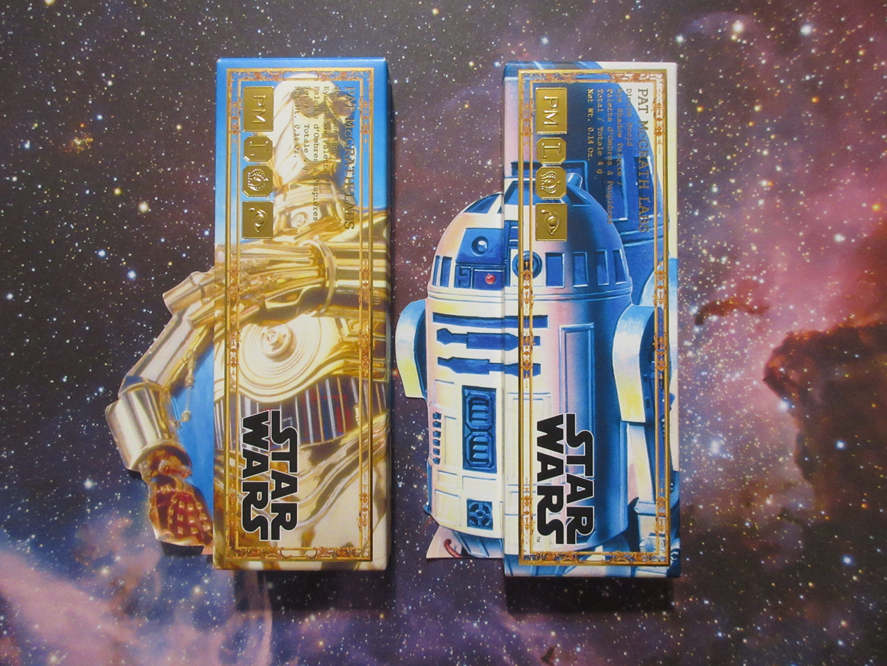
Pat Mcgrath Labs Eye Shadow Palettes in The Golden One, Divine Droid, and Nude Allure


I have 4 out of the 5 quints released from Pat Mcgrath. I specifically said in my review of Bronze Bliss that I didn’t want Nude Allure, but I saw additional photos that showed how the shadows actually look in person and the camera just doesn’t do them justice! So, now I own both of the holiday five pan palettes. The missing quint from the Star Wars collection is Sith Seduction which only one shade in that appealed to me until I realized it was darker than I wanted. So, I passed on that one. The completionist in me wanted to grab it anyway, but these five pan palettes are a hit with customers. I foresee the brand releasing a lot more of them in the future and it would be unrealistic for me to try and collect them all, especially if the color story isn’t to my taste. These four that I purchased are my types of shades.
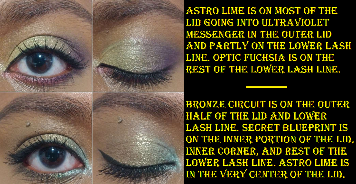
Starting with the only palette that slightly disappointed me, Divine Droid, I can at least say the colors are beautiful. They look like they’re going to be as sparkly as the others in the pans, but Astro Lime, Optic Fuchsia, and Ultraviolet Messenger look slightly duller by comparisons on the eyes. Out of the reviews I’ve seen so far, I’ve observed that the highest praises for this specific palette come from Influencers that tend to wear mostly neutrals, and the strongest opinions against the palette are from Influencers who are used to indie brands’ shimmers and those who love truly vibrant colorful glittery shadows. These shades are bold and they are shimmery, but I think it comes down to the nature of colored shimmer versus reflective metallic sparkle that the colorful shades don’t have as much of as the others. The only other way I can think to explain it is that satins are shiny from a sheen and tiny shimmer particles, and Divine Droid eyeshadows look just like that, except that these shimmer particles are more apparent and textured. The shine level is the equivalent of an amped up satin. Secret Blueprint is an exception because there’s a lot of whitish-silvery sparkle, but I don’t like light blue shades and only use them when the look can benefit from having one. To get Secret Blueprint to stay bright on the eyes, I have to apply it damp. Bronze Circuit has some golden sparkle, but the color itself is less olive in person than I hoped. It’s still a pretty antique bronze-gold with a slight green tinge, but the shade doesn’t go far enough in the direction of green to be that unique.
Even though I wanted a little more from the first four shades, the true disappointment is Ultraviolet Messenger because it doesn’t blend as well and there’s barely any visible shine when it’s on the skin. By not blending well, I mean that it goes on harsh no matter how little product I use, so it requires blending, but it diffuses so easily that the magenta tone in the base starts to appear, which makes it look splotchy compared to the darker purple. I have to be extremely careful when blending it out and packing the color back on in places. It’s not so bad when I use Optic Fuchsia with it because the magenta just looks like an extension of that shade, but it’s more of an issue when I’m trying to use Ultraviolet Messenger right next to the green or blue. And despite being applied with a finger or wet, the shine doesn’t stay. It looks dull and matte on the eyes. This might make some people happy, considering we don’t have a matte in this palette and this shade could act as one or might just stay in the outer corner as a deepening shade only, but the part that made me the most excited for that purple was because it looked the most multi-colored in the pan. I wish that translated to the eyes.
The other downside to not having a proper matte is that these shimmers have so much slip to them that they’re prone to creasing without using the right products with them. In order from most effective to least effective anti-creasing abilities out of the primers I’ve tried with them are: Gerard Cosmetics Clean Canvas, Coloured Raine Paint Base, and then tied between the MAC Paint Pot and Makeup by Mario Master Eye Prep & Set if those last two are set very well with powder. Essentially, the drier the primer the better. However, even the best pairing of the primers isn’t good enough on me without having a matte in the crease to fill those lines. In some of my eye look demo photos, I skipped using the matte crease, but in practical daily usage I would always use a matte with these shades in the future.


Also, I no longer have the PML Nocturnal Nirvana Quad, but the lime green, blue, and purple shades from Divine Droid reminded me of that one. Sure enough, Dr. Ash on YouTube had the same thoughts and held them side by side in her video. Of course, the green in that palette is more multi-dimensional than this one. I don’t care for either blue shadow. As much as I was disappointed by Ultraviolet Messenger, it is easier to work with it than the purple in Nocturnal Nirvana. I sold that quad (and replaced it with the Interstellar Icon quad) purely because I wasn’t getting enough use out of it, and not because I disliked the shades. I’ve thought about that quad several times since it left my possession, so I don’t mind having something similar back in the form of Divine Droid.

We were given an actual satin in The Golden One palette, but I use Coral Blitz in place of a matte. The actual matte in that palette is Tatooine, which is a lighter brown than the one from Nude Allure. I had no intention of buying The Golden One until I realized it had that extra blendable matte formula unique to the five pan palettes so far from Pat Mcgrath, and because I was curious about Coral Blitz. As to be expected, I was thrilled with Tatooine, but the surprise hit for me was Coral Blitz. I don’t own a satin-shimmer in that tone. The closest thing I can recall is City Dawn, a “rich matte” from the Bobbi Brown Luxe Eye & Cheek Palette last holiday. This shade, with the peachy-coral and less orange tone, plus the tiny golden sparkles make it even prettier to me than the one from Bobbi Brown.


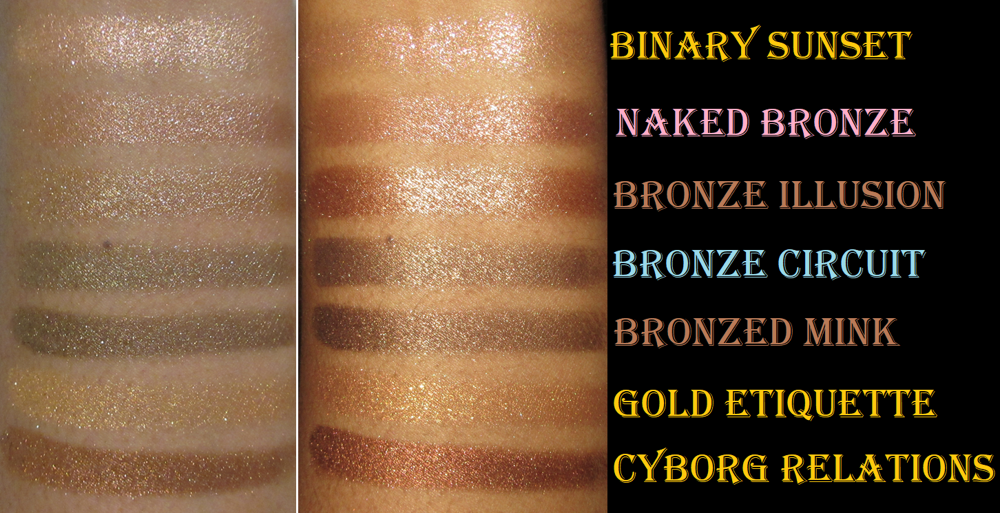
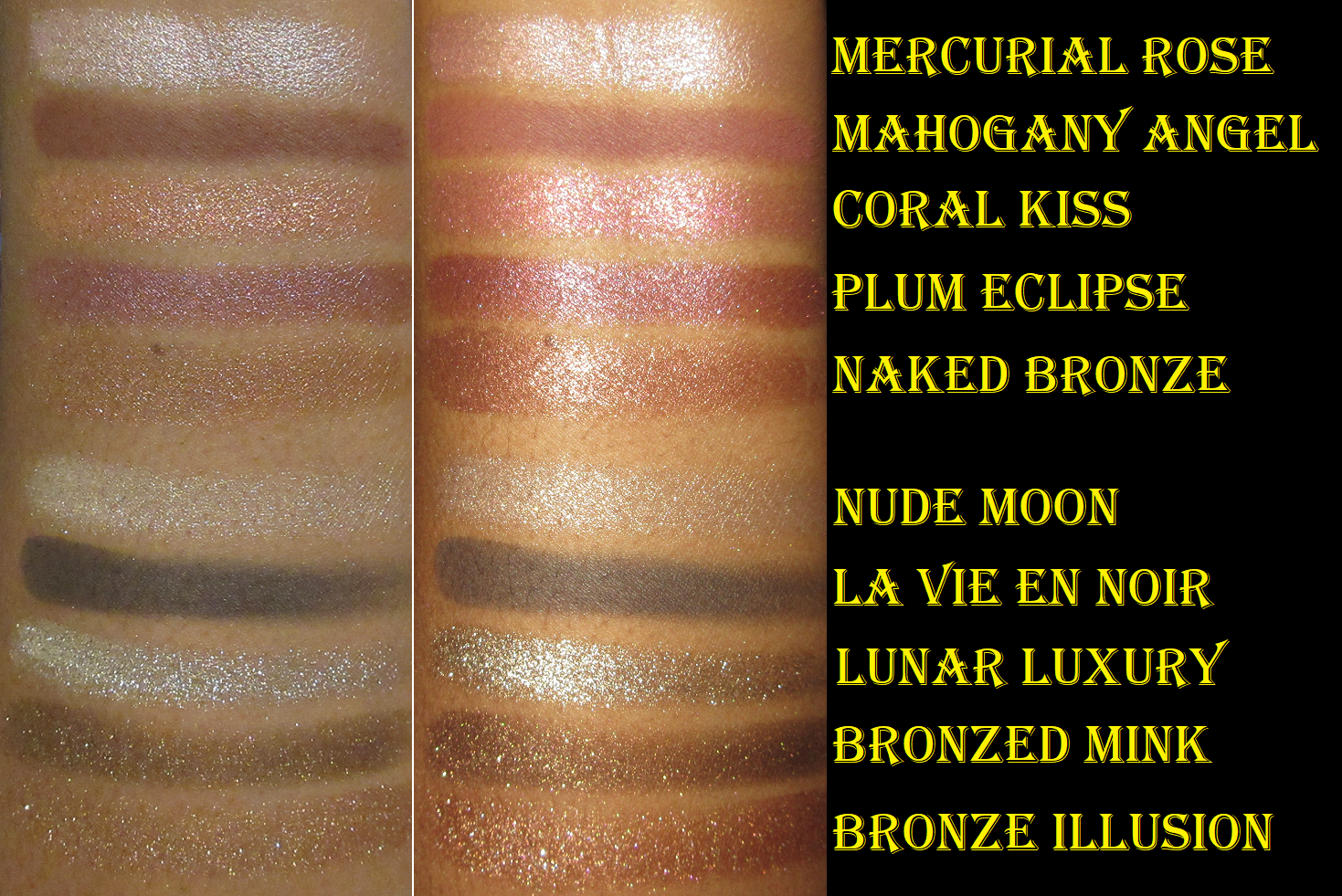
Binary Sunset is a little drier than the other shimmers whereas Cyborg Relations has extra slip to it, like Bronze Mink from Bronze Bliss. This palette isn’t as inspiring as Nude Allure or Bronze Bliss for me, but it has some great staple warm toned neutral options that will continue to benefit me as I use these palettes together.

Above is a photo comparing the three mattes (plus Coral Blitz) together, and it shows the depth differences between the browns as well. I would be thrilled for an all-matte 5 pan from Pat Mcgrath in this specific formula. If the brand includes one more brown that is lighter than Tatooine, I will feel they’ve reached their quota of neutrals and I will really be wanting more colorful mattes and/or satin-mattes. The allure of buying these quints specifically for the mattes won’t be as strong of a lure if it starts to feel repetitive. When it comes to the shimmers, I’m already feeling like we’ve hit the maximum amount of bronzes and golds needed. I also decided to compare a photo, this time below, of the most similar shades to each other from among the four palettes.
Font Color Guide: Yellow-Orange = The Golden One, Pink = Nude Allure, Brown = Bronze Bliss, and Blue = Divine Droid
If the brand can figure out how to make the colorful shimmers as sparkly and reflective on the eyes as the neutral metallic shimmers, I’d go even crazier for these palettes. For now though, after comparing the four, I’m feeling pretty satisfied with this bunch. It would take something really specific to my tastes to make me want to purchase more than these.
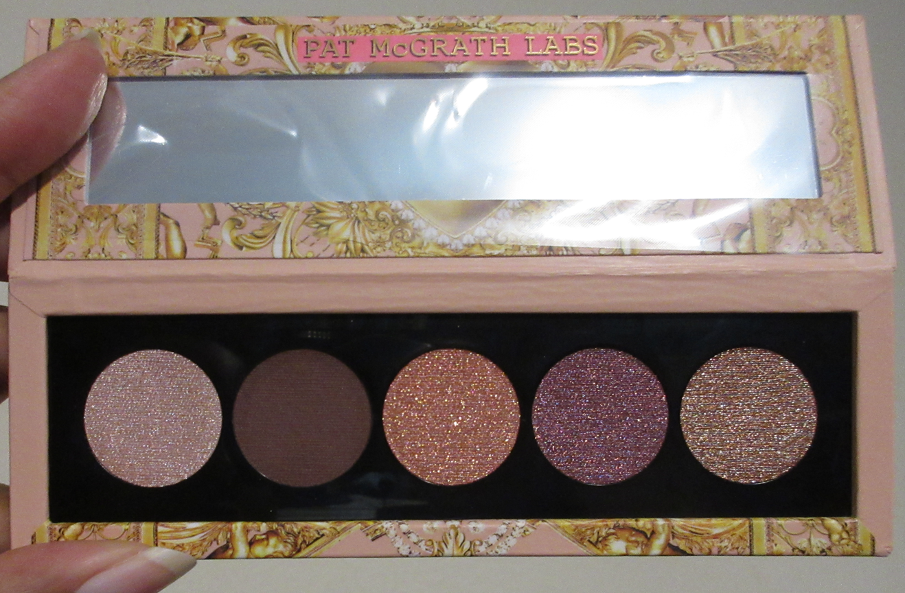

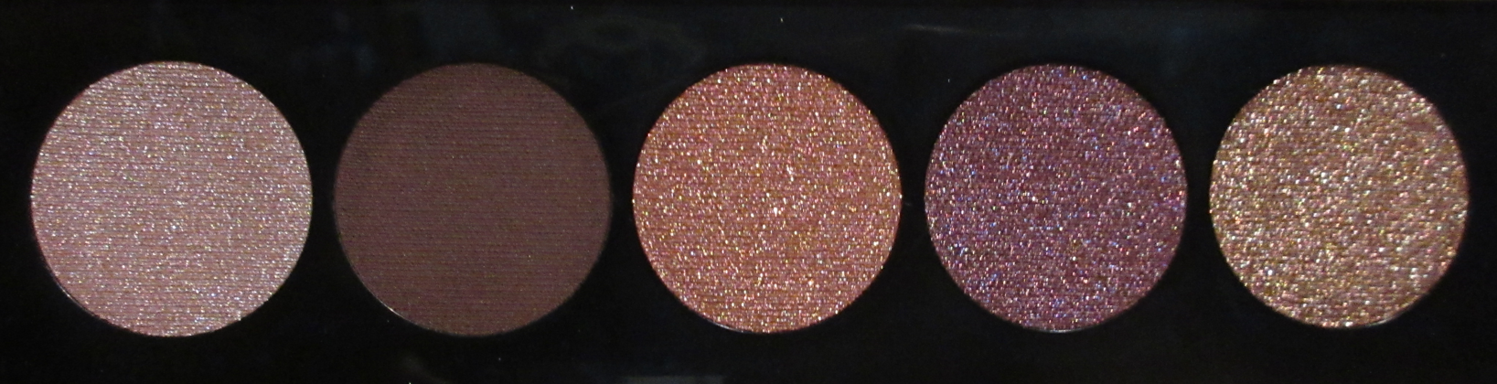
Coral Kiss and Mahogany Angel are the two main stars of this palette. Plum Eclipse comes in third, but it shares a similar issue with Ultraviolet Messenger from Divine Droid in that the gorgeous multi-colored sparkle doesn’t show as easily on the eyes. It still does a little and at least looks satin-like instead of matte, which is why I still like it. Coral Kiss doesn’t look as multi-colored as in the pan, but it does still look dynamic in person which is what counts the most to me. I love this shade and I love the first eye look demonstrated below. As for Mahogany Angel, it goes on the eyes darker than I expected, but I like that because I wanted a deepening shade that would work well with most eye looks. La Vie En Noir from Bronze Bliss has that blue leaning tinge that keeps me from using it as my deepening shade for most of my eye looks, though now that I think about it, it would probably pair well with the blue, purple, and green from Divine Droid.
Naked Bronze, to me, is like Coral Kiss without the extra oomph and vibrancy. It pales in comparison to that shade or even the other Bronzes from the other palettes because it is such a standard light bronze color. I’m sure others will like it more than me though since my style for most of 2022 was to wear neutrals with a twist. So far, this preference has carried into 2023 as well.


If I had to rank these from most liked to alright/fine, it would be: Bronze Bliss, Nude Allure, The Golden One, and Divine Droid. Bronze Bliss easily wins because it has the most of those metallic type shimmers which are what’s special about this new formula from the brand, in addition to the matte. Nude Allure comes second because of Coral Kiss and having an even more useful matte. The Golden One has the very special Coral Blitz, plus a matte, plus the gorgeous Cyborg Relations, but it is the least inspiring color story together in one palette which is what knocks it down from what could have been the second spot. Divine Droid is last because of there being no mattes, less reflective shimmer, and the stubborn purple.
These aren’t effortless shadows because of how easily they can actually overblend, the potential to crease, or the differences in textures causing a need to really spread and smooth out the shadows into each other. However, I really like these and am happy with my purchases. It’s one of those instances where I can say with confidence that I’m going to continue getting use out of these eyeshadows beyond this review.
MTHRSHP Mega: Celestial Nirvana


I swatched these from left to right going downward two columns at a time because I see these eyeshadows pairing nicely together in groups of six. So, the first set are the first two columns, the next set are column numbers 3-4, and the last are 5-6.
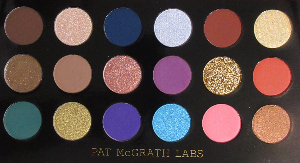
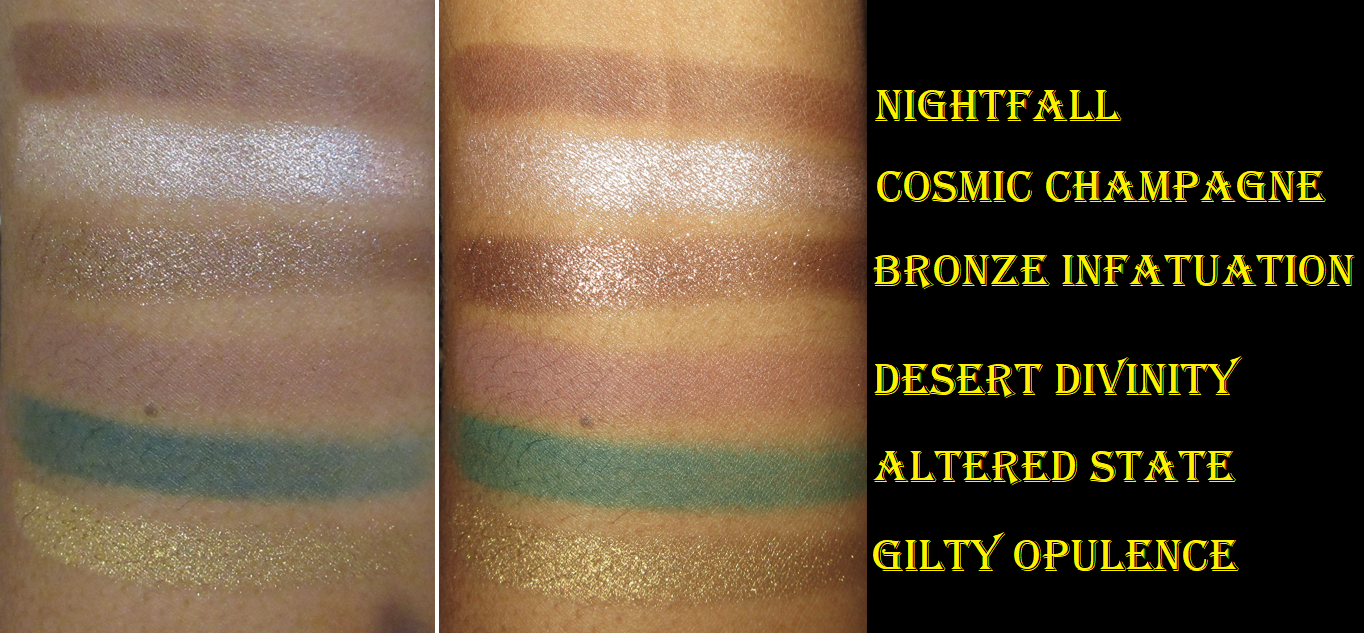
This palette has greens, purples, golds, and browns. This is very much my kind of color story, but that means it had to compete with the tons of other greens, purples, and neutrals in my collection. I heard mixed reviews about the quality of this palette, but it was honestly Altered State that continuously filled my thoughts. So many of us had been dying to get a matte green from the brand or just more greens from PML in general. They’ve released like fifty bronzes, golds, and pinks but like five greens. I actually think Pat Mcgrath hates the color green. Anyway, the old Lili was the type to buy a full palette just for one shade and I did not want to go back to that type of purchasing habit, but the brand had this on sale and after seeing Tina the Fancy Face’s in-store swatches, my resolve just melted away.
The palette was significantly heavier than I expected. I don’t know how Celestial Nirvana stacks up in weight compared to Celestial Odyssey because I skipped that Mega Palette, but it’s much heavier than the original Celestial Divinity. I like that feature because it feels more lux to me, but I also dislike it for being so large for storage and even handling every time I want to use it.
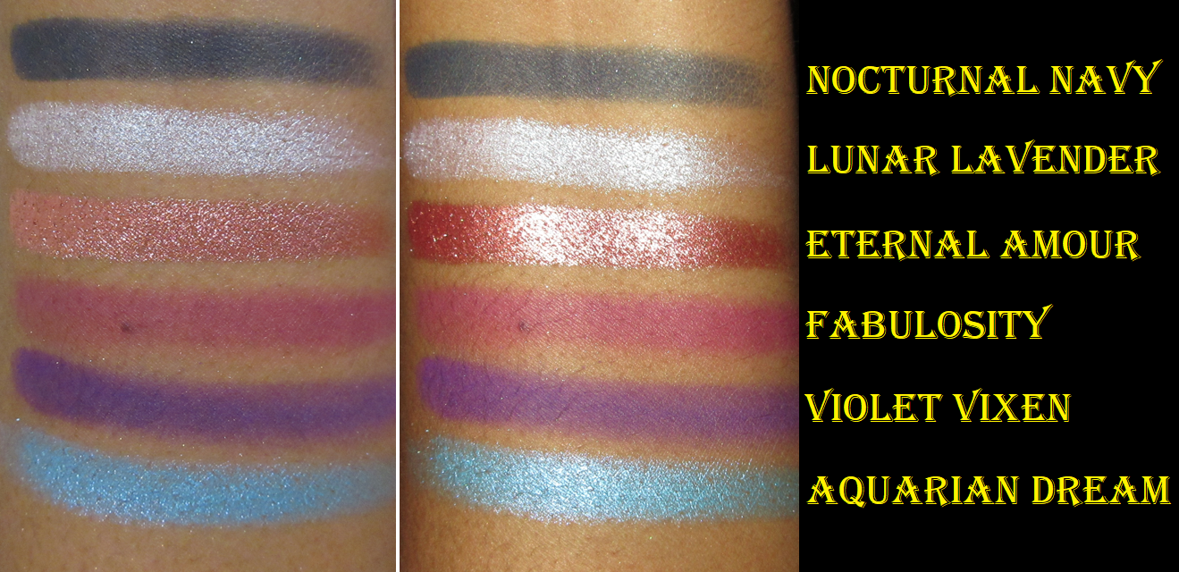
The majority of these shadows are extremely pigmented! I’ve gotten so used to creating eyeshadow looks with more softly pigmented shadows like the Lisa Eldridge Seamless Mattes and Velvets, Dior shadows, and Bobbi Brown Jadestone that I felt out of practice handling the level of pigmentation from every matte except Desert Divinity and Nightfall. I like that the brand gave softer options out of these shadows that perform like pressed pigments, but they’re almost too weak to hold their own in a palette with such bold other shades. Desert Divinity makes for a nice transition shadow, but it’s not the type that helps me blend the edges of the other colors very well. Nightfall is darker than Desert Divinity, but doesn’t give me as much depth in the outer corner as I prefer, which is why I have to lean on the brown tones within Auburn Allure to meet that line between the colorful red side and the slight lean towards brown. Auburn Allure is my best alternative if I don’t want to have to resort to the deeper yet more colorful options such as Nocturnal Navy or Violet Vixen. It was in times of searching for a neutral deepening option that I realized most of the shimmers are light and neutral (not my preference within a big palette) with Bronze Infatuation and Starlit Copper being the darkest ones that are medium depth level at best. Also, as dark as the mattes are, they deepen up even more on my eyes. Venusian Peony looks so light-medium pink in the pan, but turns medium-dark pink on my skin. The dark shades going darker (likely due to oily lids or too wet of a primer) isn’t as much of an issue for me as trying to keep the look light with the lighter shades, but it going darker than I expected.
I don’t think these mattes are as blendable as Pat’s usual formula. They’re still nice, and better than Urban Decay or Too Faced mattes for example, but not as easy to work with as I’ve gotten accustomed to for PML. Perhaps the quints have spoiled me in that regard. The truly troublesome shade is unfortunately Altered State that I was looking forward to the most. It has a tendency to stick in one place where I put it, no matter which primer I use with it and it goes on super intensely. Also, it has a blue tinge to it which I didn’t use to mind in the past, and I know that helps it to pair nicely with the blues in this palette, but I much prefer a yellow-leaning green. However, I can still make even that shadow work.
The shimmers are great. They’re fantastic. They’re impactful and just what I expect from the brand’s standard formula (not the “special” shades in the last two columns of Mothership palettes, multichromes, nor the quint shimmers). They don’t give me issues with creasing or fading, and there are no longevity issues.
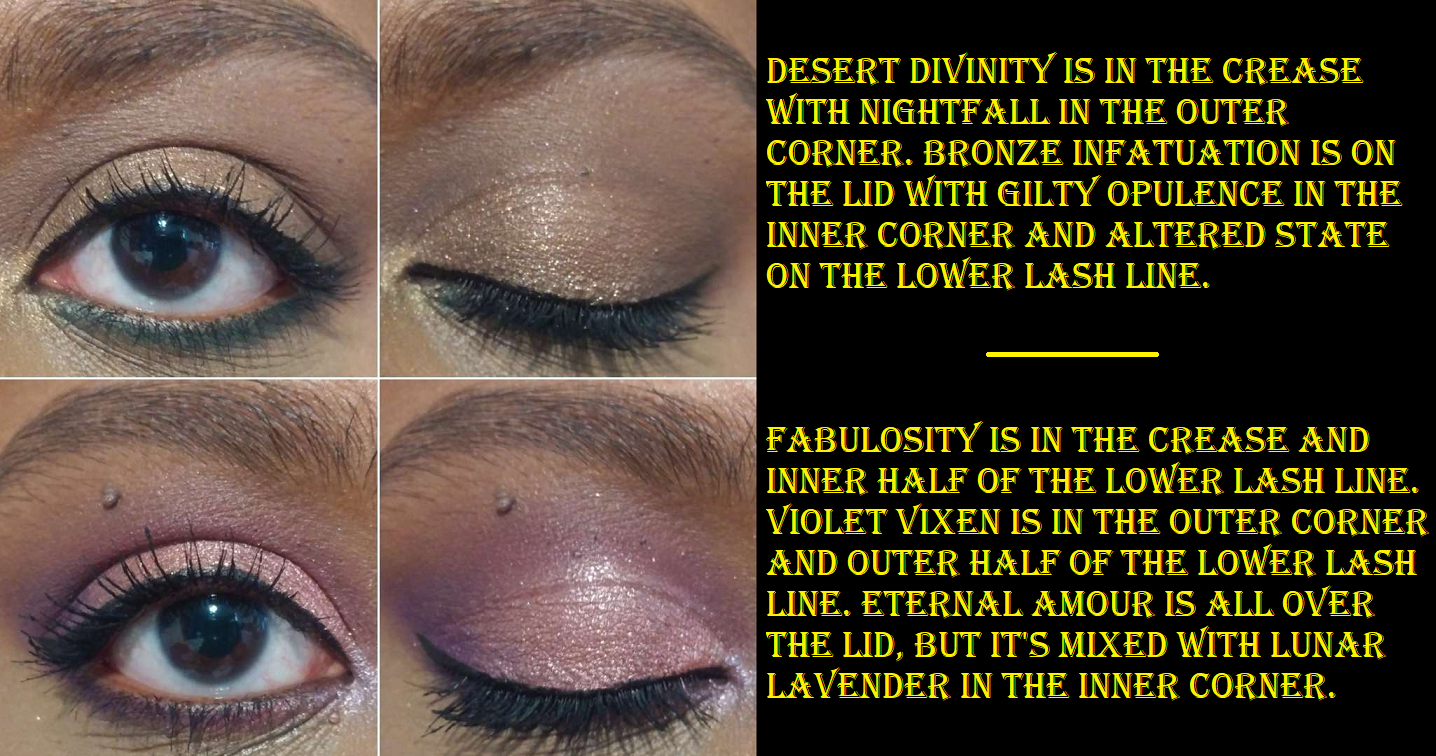


In the green, blue, and purple eye look above, I attempted to tweak the look of the deep mattes by putting shimmers on top. It can be done, but it was such a long process because the mattes have to look perfectly blended underneath first. They are so intense and opaque that trying to blend them into each other just kept covering each other up rather than mixing. When I was adding the shimmers on top, which are also quite opaque, I noticed they were doing the same thing. Eventually, I was careful enough and applied the shimmer lightly enough between them to achieve the look I was going for.
For these reasons, I recommend this palette to those who love colorful shadows and are used to working with the kind that are pigmented and opaque. Even though this palette has neutral and softer options, this isn’t the type of product suited for those who just want to dip their toes into color. It’s intended for the full on color lovers. Also, as much as this price point makes sense for Pat Mcgrath, I personally wouldn’t have bought this for any less than a 40% discount because it’s not unique enough in shades or formula for me to be willing to spend a fortune on it. If this came out two years ago when we had far fewer high quality green and purple options, I’d have said this was worth the full price, but things have advanced and we’ve been flooded with options by now. There’s a lot of competition!
At the time I’m writing this, Sephora USA still has this palette available and on sale.
Divine Blush + Glow Cheek Palette in Nude Venus


When this palette went on sale, I bought it knowing full well that I had singles of Nude Venus, Paradise Venus, and Desert Orchid (in the form of the lighter half of the Paradise Glow blush duo) sitting in my blush drawer. I think we can all agree that someone who wants to use up their products shouldn’t buy a duplicate of them.

What I really bought this face palette for was the Sunset Nectar highlighter, Divine Rose III blush, and the convenience of having my favorite shades in one palette so I can take this traveling in lightweight durable packaging. I notoriously reach for blush singles over blush palettes, but that’s because pre-made blush palettes usually have shades I don’t like or can’t use, so I subconsciously make a mental note to skip it if I’m in a rush to put on makeup (which is almost every time). However, since this has all the ones I love, it’s more memorable and I do actually reach for it. By purchasing this palette, my original singles no longer served a purpose in my collection, so I gave Paradise Venus to my sister and Nude Venus to one of my best friends. I’m keeping Paradise Glow for now, but it may not survive my next declutter.
I have been enjoying possessing my favorite shades in an all-in-one palette that makes it so much easier (and less messy than dealing with kickup in multiple separate compacts) to dip into multiple pans at once to create tailored blush looks on my cheeks. In addition, I know exactly which product to grab for those shades, whereas the black lacquer packaging between the blushes, blush duos, and highlighters are identical and require me to read the backs of them all to tell, without having to open them, which shade is which.
I probably didn’t need to have Divine Rose III considering I already owned the other three blushes, plus Electric Bloom, as well as the Divine Rose II duo and Cosmic Coral duo. I’m still happy I got it though, because it’s giving me the effect I wanted from Nude Venus, but with more depth. Because Nude Venus has to be built up a lot to show on me, I always paired it with Paradise Venus and kept it concentrated on the apples of the cheeks. Now, I either use Divine Rose III on its own for a medium toned pink flush, or mixed with a combination of all the other blushes in the palette. To see additional blush photos with my review of the single blushes, they can be found here or my review of the blush duos can be found here. I haven’t noticed any quality differences between the individual blushes versus the ones in the face palette. They’re just as beautiful and long lasting as ever!
My favorite highlighter from Pat Mcgrath is still the Skin Fetish: Ultra Glow Highlighter in Divine Rose. It has the smoothest formula, gives the wet look I love that melts into the skin, and it doesn’t look glittery. Sunset Nectar is more similar to the permanent line of Skin Fetish: Divine Glow Highlighters, which have more apparent shimmer particles, but they still blend beautifully into the skin. I keep wishing for a Skin Fetish Ultra Glow Highlighter in a dark golden color without the slight pink tinge Divine Rose has. I didn’t expect Sunset Nectar to work for me because it is extremely light in the pan, but it somehow does! It looks powdery and stark pinkish-white on my skin when it first goes on, but when I blend it in and then pass my blush brush back over the edges around it, I think I can pull it off!
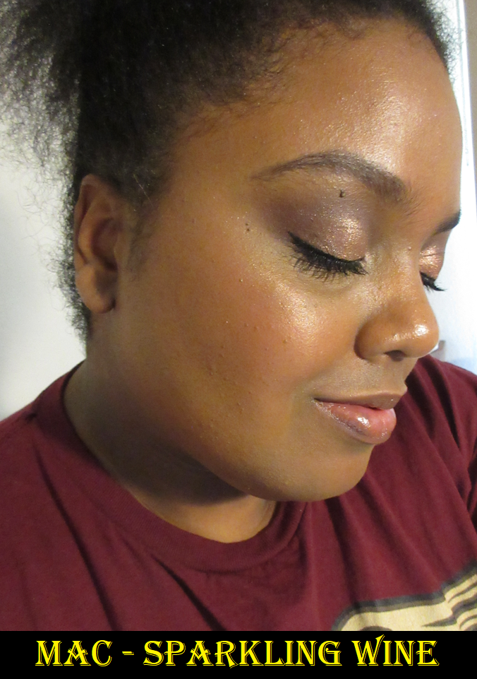
Below are different examples of lighting and days wearing these products. The first photo of the three is the Divine Rose III blush (no highlighter yet) under a ring light and wearing MAC foundation in NC47. The second photo is the same day with the same products, with the addition of MAC’s Sparkling Wine shade of highlighter, while under indoor light (with a little natural light peeking through the side). In the third photo I’m wearing the Sunset Nectar highlighter, plus a combination of Paradise Venus, Nude Venus, and Divine Rose III blushes. It’s under the same light as the second photo, but I have the Estee Lauder Futurist Foundation in 5W2 mixed with the Nars Light Reflecting Foundation in Macao mainly on the perimeter of my face.


We’ve reached the end of the review, and this is the point where I’d like to give my input on the recent “controversy” the brand has had over the Star Wars Collection, as well as the discussions around the brand devaluing itself between the frequent sales at significant discounts and the cheaper palette options and materials.

Starting with the Bantha in the room…As much as I love the Pat Mcgrath brand, it was certainly not a good idea to put Midnight Sun on sale for around $70+ until literally the day of the Star Wars launch of the same Midnight Sun palette for the full $128. It automatically sends the message to the customers that the Star Wars version isn’t worth the price and/or to wait for the Star Wars one to eventually go on sale for $70 as well. I was pretty shocked when I heard the news and watched the video going around because of what it signified for me about the brand going forward. Still, none of us can confirm with certainty that the Star Wars stickers were slapped on top of old unsellable palettes and put in Star Wars unicartons, the same way we can’t confirm that this year’s holiday specific lip products and mascaras had Star Wars stickers added to them after being removed from their original unicartons and put into Star Wars ones. Even if that’s exactly what they did, rather than viewing it as the brand trying to dupe people into buying an unpopular palette, I can see it from the perspective of the brand no longer keeping Midnight Sun on sale and putting it back at the original price with the bonus of a Star Wars sticker for free. I have been craving owning another special edition packaged palette from Pat Mcgrath, like if they took the Mothership unicarton artwork and found a way to get a high quality version of that print onto the palette, I would be thrilled. If it comes in the form of a sticker, I wouldn’t mind that either, so long as the sticker couldn’t just be peeled away. That’s where I think the brand really went wrong.
When I had packaging I didn’t like, I used Washi tape, stickers, and Mod Podge Dimensional Magic to create something I felt was beautiful. The way I did it, nothing is going to be lifting up or peeling off anytime soon. So, I don’t think Pat Mcgrath using stickers is as big of an issue as them placing many of them crooked (which cheapens the look) and not using a permanent adhesive. I don’t know if they had factory workers or machines applying those stickers, but if it was real people, I can see the benefit of making the stickers removable so they can attempt to fix extra crooked stickers on the palettes, but that’s a bit cheap to not use a stronger adhesive and be willing to toss out the imperfectly placed ones in order to ensure the customer won’t have the edges of the sticker lifting up within weeks or months of owning those palettes.

When I first saw the Star Wars Midnight Sun palette cover in photos, I actually thought it was a sticker with epoxy resin on top. Perhaps epoxy wouldn’t be clear enough (as it can turn yellow, although the vintage Star Wars image being yellow might have hid that), but at least then people would have an actual plastic feeling packaging that couldn’t be removed. This reminded me of the time when I was experimenting with Mod Podge versus Epoxy Stickers for jewelry when it came to cutting out images from Archie comic digests and turning them into pendants. I wasn’t very satisfied with either outcome so I abandoned the idea. However, that was due to a clarity issue. People who have the palettes in hand seem to think the stickers are pretty and are just disappointed by how easy they are to lift up or some people just don’t find stickers to be luxurious. The flat type of stickers I agree don’t look high end, but the raised ones are different in my eyes. Most people wouldn’t know how to make one themselves. The arts-and-crafts-loving side to me instantly started wondering if I could create my own covers for the PML palettes, but with how expensive they are, I don’t trust my skills enough to chance ruining it. However, I started thinking there might be people on Etsy working on making their own Mothership Stickers to sell. I think the brand could make bank creating their own palette sticker covers if they find a much stronger adhesive. I’d pay $15-$25 just for that because of how much of a sucker I am for pretty packaging. It’s a shame they ruined the concept because of how they went about “Sticker-Gate.”

I’ve seen some other complaints about the fact that we have stickers on top of the quints and them being cardboard. While that’s valid for people to feel that it’s not very luxurious, I feel the growing complaint about it is piggybacking off the Midnight Sun issue. We’ve had cardboard packaging for ages, starting with those six pan MTHRSHP palettes which I believe the brand released for the first time for holiday 2018 with the cumbersome envelope style flaps. The original six pan Star Wars palettes were the first time we got magnetic closure cardboard palettes in 2019. At some point (I believe 2020) we started seeing clear sticker labels on the bottoms of the packaging instead of the print being etched on. I remember being perturbed along with everyone else when the sticker on the first Mega Palette for holiday 2020 (Celestial Divinity) was crooked, but that was the point in which we all could have gotten off the hype train with the brand if we wanted.
It’s as if people are just now noticing the printed paper edges of these palettes. It’s not new. The holiday quints from 2022 has stickers on them too, but they were the same pink background color as the palettes, so perhaps it wasn’t as obvious as the white ones from the Star Wars Collection. People are also pointing out the edges of the paper covering all of a sudden, but again, it’s only obvious because the paper is a shiny solid color without the busy pattern to distract from the fact that the holiday quints are folded and glued the same way.

I thought it was a bit funny that the holiday Mega palette for 2022 is larger and thicker than the first one. That extra weight ironically makes it feel more luxurious, but I haven’t seen anyone talk about that. Another funny thing is that the sticker on the back of my Star Wars quint was crooked and I was able to peel that off and affix it at least better than it was previously. It’s the kind of sticker that air bubbles are prone to form under without using something like a credit card to press it down evenly, but I was able to get the bubbles out with my fingers without one.
I think there is absolutely something that can be said about the downgrade of packaging between the Mothership palettes to the cardboard ones, plus the sticker labels. I think it’s absolutely valid to feel like it’s not luxury. I’d just like to point out that Natasha Denona doesn’t have labels etched on her palettes either. There are clear label stickers. Her things are a similar price point to Pat Mcgrath, and she has long been experimenting with more “affordable” options with the $69 midi palettes and $27 minis, yet I hardly hear a conversation about it being less of a high end brand for offering smaller and more wallet-friendly palettes. Also, for environmental reasons, an argument can be made about using cardboard versus plastic, though I think a lot of beauty collectors prefer the plastic (myself included to be honest, but I don’t turn up my nose at cardboard anymore). Charlotte Tilbury has sticker labels on the back as well. I see most of the complaints are about having stickers on the front, but I’ve also seen complaints about them being on the back instead of etched in, which is why I wanted to mention it because those same people never said a word about the other two brands I mentioned.

Everyone knows by now to not buy Pat Mcgrath at full price in most situations. However, if we’re going to accept that we’ll only buy the products at 20-40% off, we cannot expect to still get weighty plastic or metal bespoke type of packaging. It just doesn’t make financial sense for the brand. And the big Mothership palettes don’t usually go on sale for lower than $89. We can have a luxury line in the form of those larger palettes with the luxury packaging while still offering other price points like Natasha Denona has done or even Dior with their Backstage line. I’m at least glad they aren’t lowering their ingredient quality or “Going Full Urban Decay” by releasing a product and immediately putting it on sale for 50% off two weeks to two months later.
Materials aside, I understand why there’s a growing feeling that Pat Mcgrath Labs is losing its luxury feel when people have spotted the products at T.J. Maxx and when it feels like there have been discounts basically all year long with the sale announced and lasting what seems to be 2-4 weeks, a week break, and then the next one starts in an ongoing cycle. It does bug me sometimes when I purchase something and just a month later it goes on a deeper discount.
I don’t have anything to say to rebut that feeling. It’s valid. What is also valid that I think are bigger reasons the brand doesn’t feel so luxurious is the ridiculous wait time between when the products launch and when it finally ships out. There are points where it felt like we all just paid for an unofficial pre-order because nothing ships out to anyone for weeks or the launches have been staggered out and only the palettes are available at one time and the blushes get launched a week or so later. Pat Mcgrath doesn’t have a reward program, so myself and others sometimes prefer to skip the guaranteed 10% off promo code at launch in favor of being able to purchase from Sephora using a gift card or to have the reward points accrue over there. Many times the product finally comes to Sephora by the time the warehouses PML uses starts to ship things out. Unhelpful or slow to respond customer service is another thing that makes the brand not feel like a luxury one. Items not being properly wrapped in the boxes and arriving broken is another. It has been my experience with them that if an item is known to break easily, they will send a new one with the acknowledgement that it’s possible the replacement will come broken again, but they will still ship it out anyway as a “one time courtesy.”
Perhaps PML isn’t in the luxury category anymore, but they are still a high end brand in my eyes.
So, do I think Pat Mcgrath Labs is going downhill? It feels that way, but not necessarily. I think they’re cutting corners and have been cutting corners for several years now. I think they’ve set a precedent to wait for a sale. I think Sticker-Gate isn’t as big of an issue in itself, but is one example of a larger issue within the brand. I think plenty of people will closely scrutinize everything the brand does going forward, but the hype won’t die down. The issues the brand has are all able to be fixed and forgotten if that’s what they actually want to do. There will be exciting new launches to come. People, like me, will still try to wait for a sale, but also certain items will likely be bought at nearly full price. I also expect more repackaged products to be released. I’ve done my fair share of complaining about the issues within PML, but they’re still one of my favorite brands and I’m excited to see what’s next.
Thank you for reading.
-Lili ❤
