Victoria Beckham Beauty Cocoa Eye Wardrobe and Lid Lustre Review

I love the brand’s Eye Wardrobe in the shade Victoria, so when they released the Cocoa collection, I thought I would love this color story even more, particularly because I prefer how warmer tones of eyeshadows look on me.

Before we get into the review, I wanted to take the time to describe my order experience for those who have never ordered directly from the website. I used to get my VBB products from Selfridges, but the regulations are back with Selfridges being unable to ship food and cosmetics to Germany. So, I created an account to join the V-Suite, the brand’s Loyalty Program. When you join, that makes you eligible to add a free sample in your order, but I happened to sign up during the time when there was a glitch that didn’t allow that option to pop up in the cart. After missing out on a second order, I contacted the brand, and they were kind enough to send the ones I requested in a separate shipment. I will share details about what I got at the end of this post. Also, I checked the website a week later and the glitch was fixed.

The dust pouch comes with all orders and standard shipping is free over €70. Paid standard shipping to me costs €5 and they ship to Germany via UPS. Each time has been an interesting game of receiving the shipment confirmation within a day or two, getting an email the day after that stating that my order will arrive the next day, then the next day getting an email about the delivery being postponed/delayed, and then the product arriving after that. I’m happy that VBB ships fast, and now that I know things will not actually come the first day it’s expected to be delivered, I can just anticipate the actual date of arrival and plan accordingly. Whenever I get a package that ships out of Netherlands via other carriers, it usually takes 3-5 days or more. So, I’ve been really pleased to get my VBB orders from Netherlands to Germany in two days.

The price listed on the website includes VAT already and I have not encountered any additional fees after ordering.

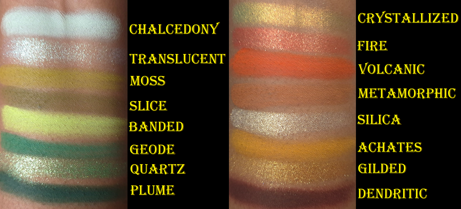
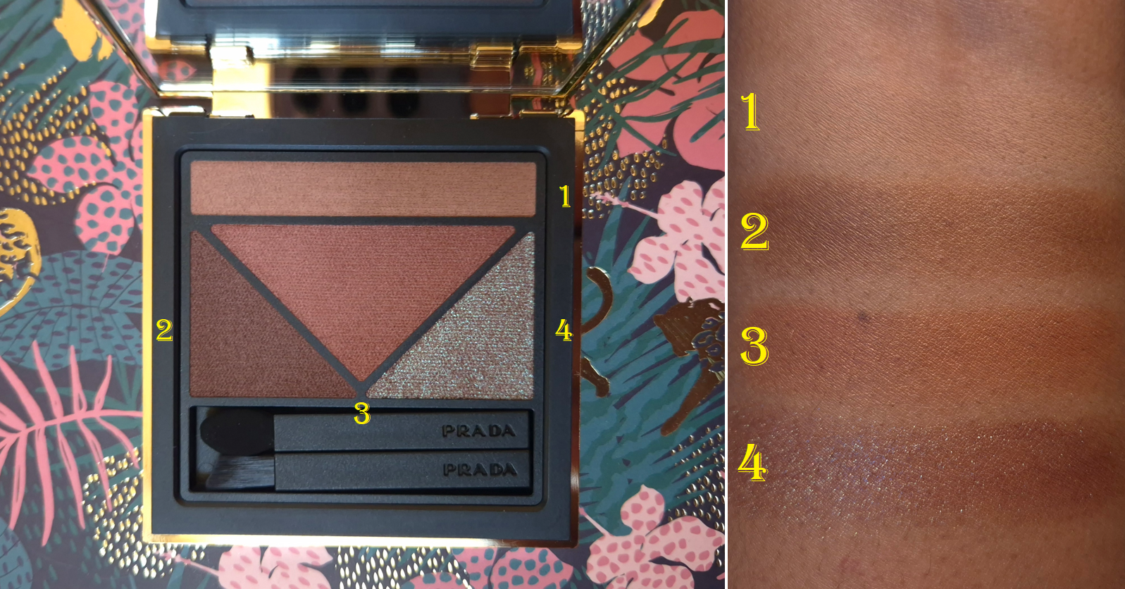
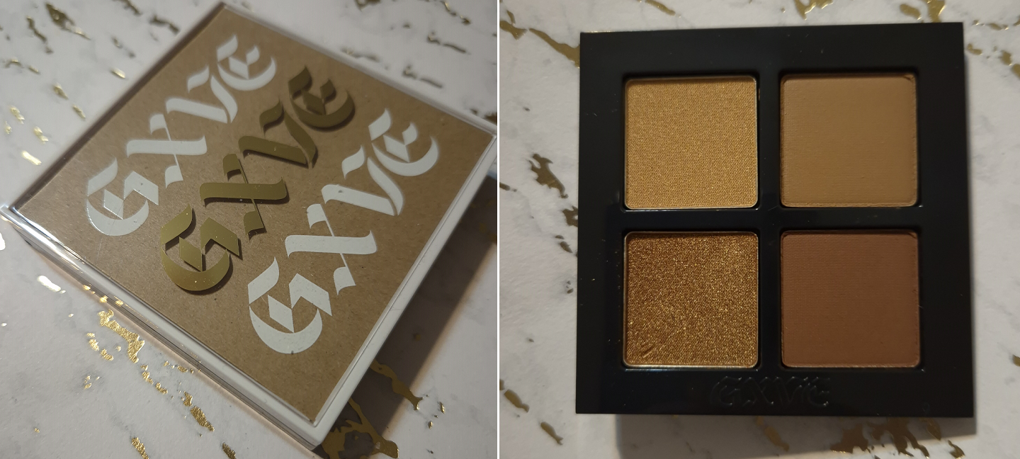
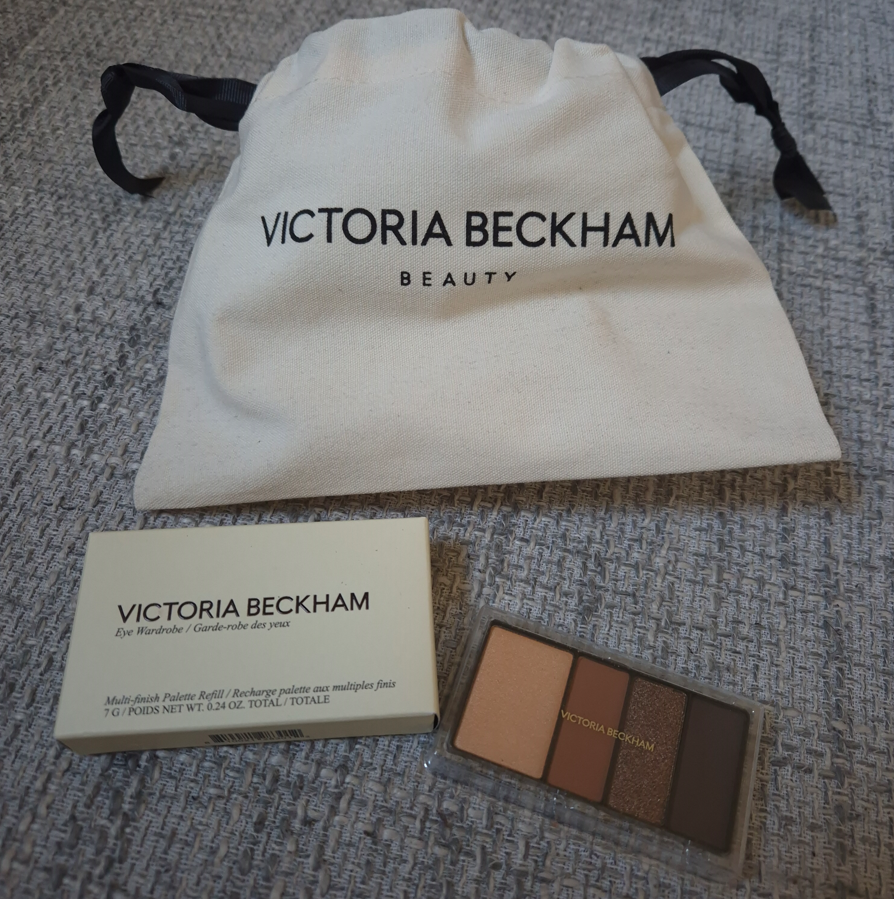
Eye Wardrobe in Cocoa

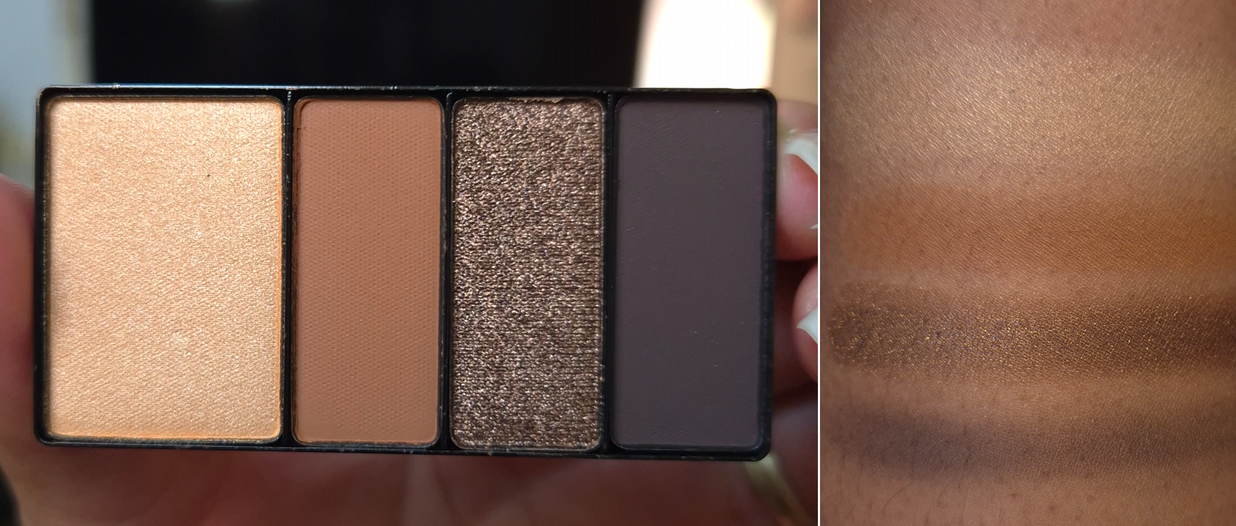
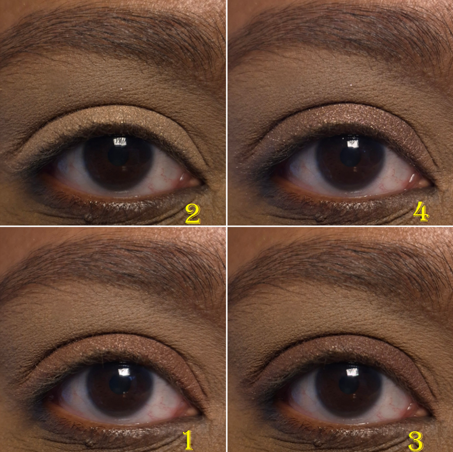
The leftmost shade, which I call Shade 1, is the first satin I’ve used from the brand. Applying a normal amount looks opaque at first, but when I blend it lightly to smooth it out, it becomes a lot more sheer. If I don’t perfectly even out the discoloration around my eyes with primer, the pearly mica within this eyeshadow creates an unflattering grey tinge (due to the level of darkness underneath). So, I have to really pack this on to use it in larger areas, I must ensure that the eyeshadow primer I’m using will create a completely blank canvas, or I just need to use it strategically in smaller areas where I want to add brightness. The latter is the easiest option for me.

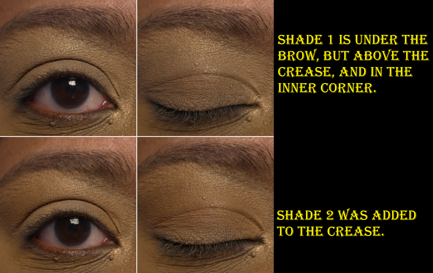
Shade 2 looks super warm when applied heavily, but if I’m just using a normal amount, it doesn’t look as bold. If I blend it out too much, it doesn’t stand out enough on my skin tone. That’s just the nature of having brown skin with a warm undertone, then trying to add a warm brown eyeshadow on top that isn’t too different in depth! So, I try my best to pack this shade on, and I’m glad that it’s buildable.

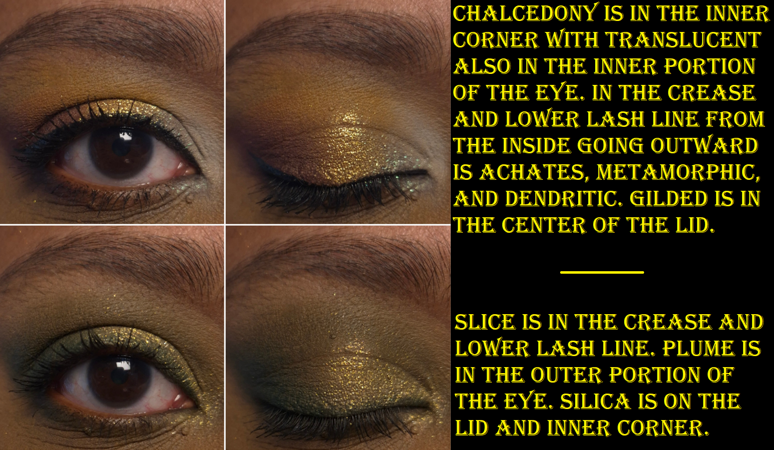
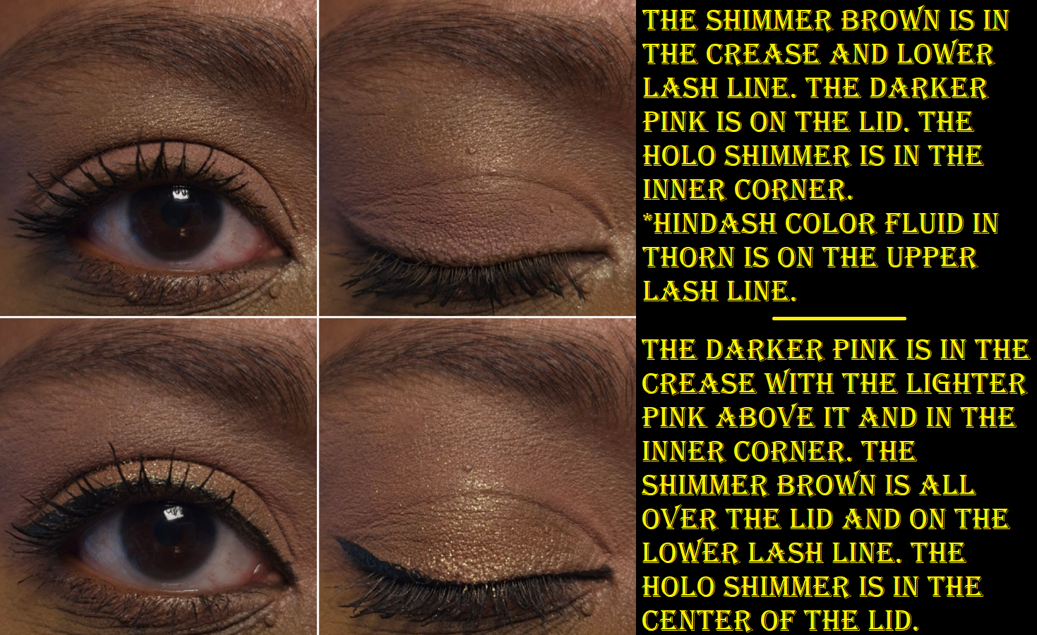
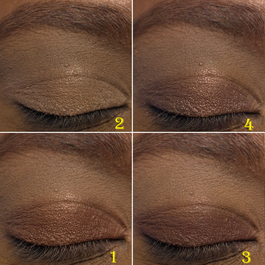
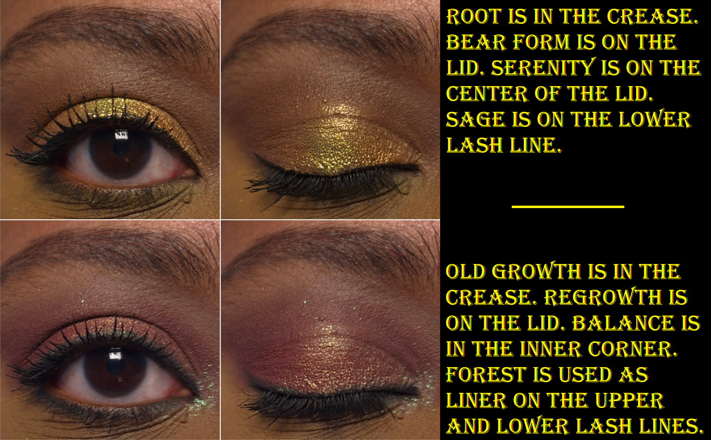
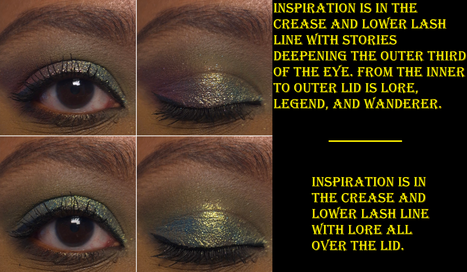
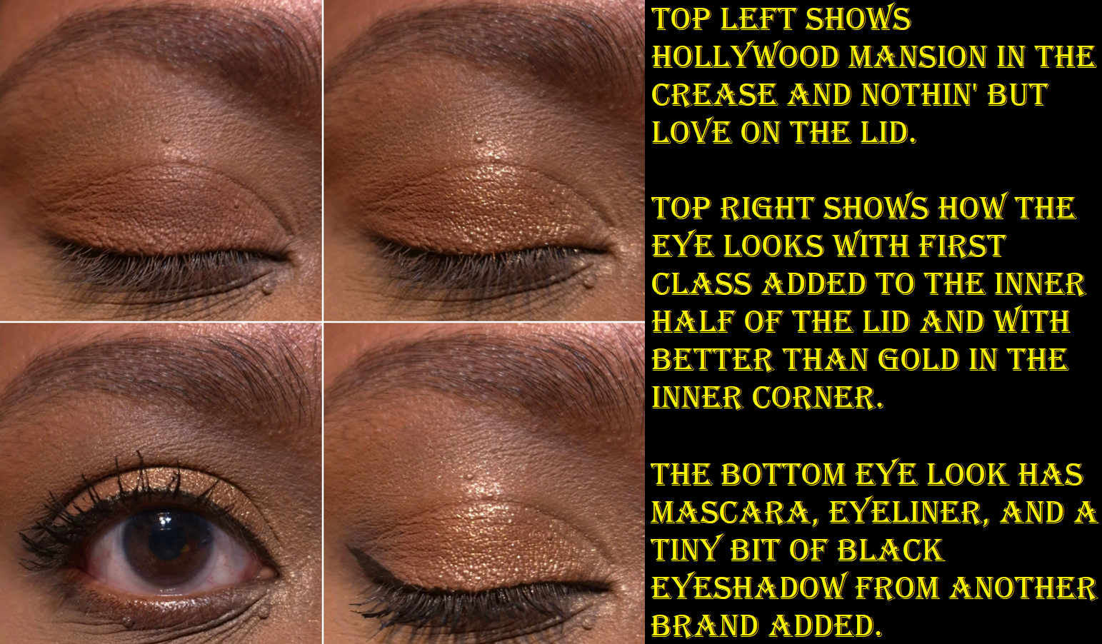
The photos above and below are the 4 steps to creating a single eye look. I wanted to show the process because of how easy it is for Shade 1 and 2 to get lost in the overall look.

I like how the eye makeup turned out in the photo, but this was actually my third attempt. I didn’t like my previous looks for several reasons, the first being that I used Shade 1 from the brow to the crease, which made everything that I tried to layer on top of it look a lot more muted. I tend to dislike my eye looks if there isn’t much of a gradient or distinction between colors, so the look became murky and unflattering. Even when I used less of Shade 1, I really did not like having it and Shade 2 blending into each other. The base color of Shade 1 is warm, but its semi-frosty sheen from the mica clashes with the intense warmth from Shade 2. I usually start my eye looks from lightest to darkest, but I found it was better to use Shade 2 strongly built up in the crease before adding Shade 1 in my usual highlighting spots. That way, I could add enough of Shade 1 for it to stand out in the look, but not in a thick enough layer to turn frosty-looking.
My final reason for disliking my earlier attempts is that I didn’t use enough of the darkest shade, which is needed to create that gradient and sculpt out the outer corner. Attempting a light, everyday type of look just isn’t my style. I wanted to celebrate having some lightness because these Eye Wardrobe color stories tend to be smoky and glam, but that’s what appealed to me in the first place. I just needed to embrace the drama, and that led me to finally creating a look that I liked.

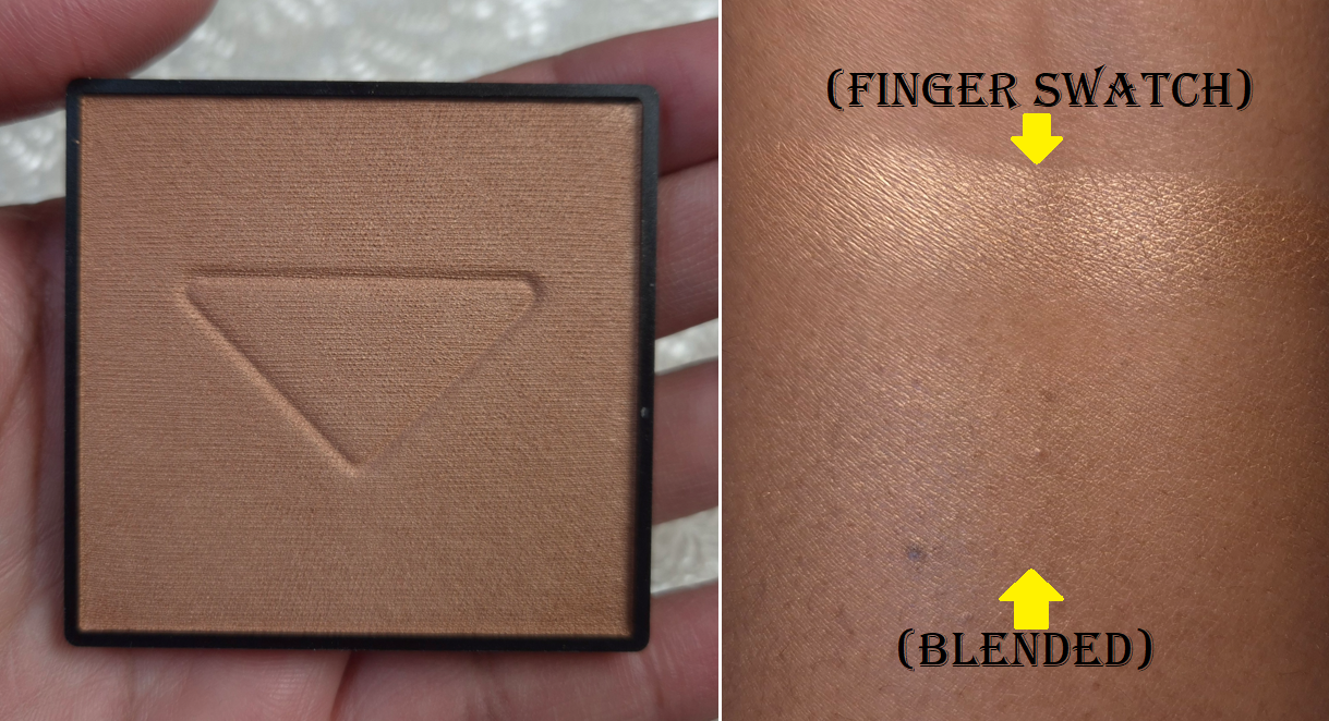
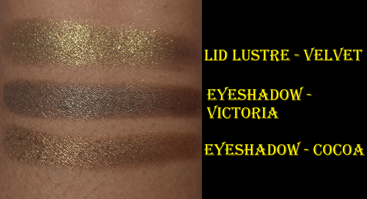
Speaking of drama, the star of the show is supposed to be the bold warm shimmery brown in this palette. As seen in the photo below, it was really not that impactful in the beginning! I liked the shine a little more when I applied it wet, but I was quite disappointed to discover that Shade 3 didn’t have the same level of sparkle as the shimmer shade in the Victoria palette. The mattes from VBB seem to be generally good, but the standout formula for me are the shimmers. When I feel the texture of the Cocoa shimmer, it isn’t as creamy or chunky as the shimmer from Victoria.

This may have just been an issue in the beginning of the testing process because some of my recent looks have been more to my preference. I guess I just needed to use the quad enough times to dig those shimmer particles out of the pan and onto my eyes. Granted, Cocoa is still smoother and drier than the Victoria shimmer by comparison, and since it’s a dark gold on top of a medium-dark bronze, the sparkles don’t stand out quite as much as silver on a blackened taupe.

In the swatches below, Cocoa looks a lot more impressive than in the beginning.

I’m not sure if my photos are good enough to be able to tell, but Shade 4 is not as smooth as the mattes in the Victoria palette, or even the terracotta color in Cocoa. It’s not rough or dry, but it just doesn’t feel as silky to the touch, and I’m not sure why considering the ingredient list isn’t any different. It’s quite surprising that Shade 3 from Victoria is much darker and smokier, yet quicker to blend out without patches than Shade 4 in Cocoa. I thought it might just be that Shade 4 doesn’t layer as well over Cocoa’s shimmer, but I didn’t use that shimmer in the mascara section and it still just doesn’t build up the same way. Perhaps the choice to make Shade 4 require more building was intentional. I haven’t seen anyone else mention this, but none of the creators had the same skin tone as me, so it doesn’t require as much product to build up this shade on them.

I’d like to clarify that I don’t think this shade is a dud. It’s not as if I can’t get it to work. It’s just not effortless on me, which I can’t help but notice because of how much use I get out of the Victoria Eye Wardrobe.

Additional information about Shade 1 that I want to share is that although I wish the base color was stronger, it’s still less sheer than the lightest shade in the Chanel Boutons Quad I reviewed a few months ago. Also, a benefit to it being somewhat translucent is that it makes a surprisingly pretty highlighter on me! I don’t know how often I’ll use it this way, but it makes me less disappointed by this shade.

I wouldn’t want to get anymore satin eyeshadows from the brand, since I doubt I would find them to be more useful than this.

Overall, it’s still a very usable palette. I’ve just ended up preferring to pair this with Victoria rather than using it alone. The shimmer in Cocoa being on the smoother side, but still reflective, leaves me feeling satisfied…enough. I have to admit that I’m just not as in love with the palette as I would have been if there was more bling, or rather, if it was easier to transfer the blingy bits from the pan onto my eyes. The only feelings of regret I have is when I think about the other neutral luxury quads I already own, but then I don’t feel as guilty for spending the money on Cocoa after making another look with Cocoa and Victoria together. So, perhaps it was still worth it in the end.

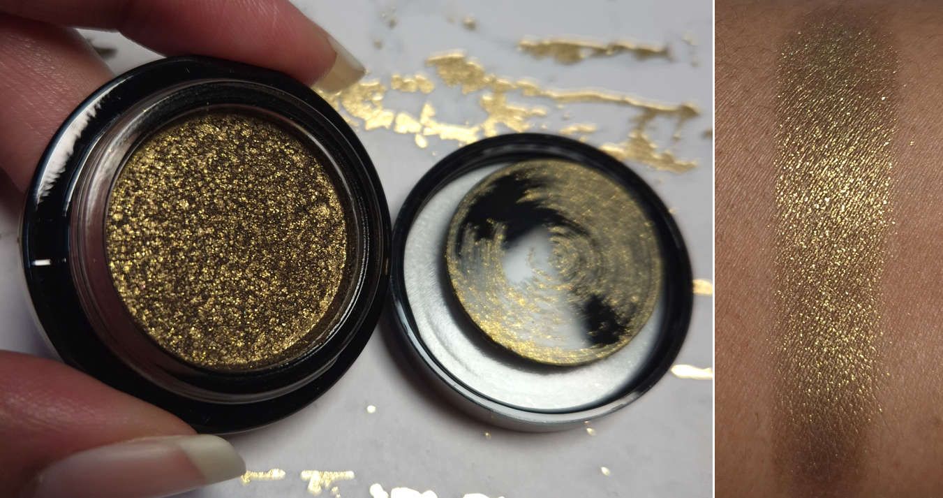
Lid Lustre in Velvet

So many people were praising the shimmer formula of the Eye Wardrobes when they first released, particularly the one from Victoria, because they said it was like having a Lid Lustre in a pan instead of a pot. Some even said the Lid Lustre formula is superior.

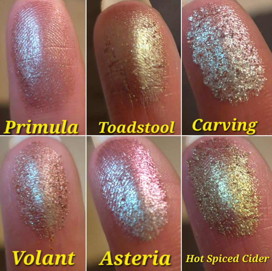
I am not a single eyeshadow type of person, but I find the idea of being able to buy additional shimmers without them being tied to a full quad quite enticing. So, I bought Velvet as my first one to try out!

Velvet is described as, “a golden olive with antiqued pearl, infused with Malachite.”
Many high end and luxury brands like to tout their crushed pearls, diamond powder, and whatnot as the key ingredient of their shimmery eyeshadows, despite the fact that we know it’s most commonly mica and/or synthetic fluorphlogopite doing the heavy lifting. In the case of the Lid Lustres, they are supposed to be “crystal infused,” with the ingredient lists citing the stones as extracts.
For example, there’s “malachite extract” in Velvet, “amethyst extract” in Midnight, “citrine extract” in Starlight, “opal powder” in Honey, quartz in Tea Rose and Mink, and so on. Since these crystals are so far down in the ingredient lists while synthetic fluorphlogopite and/or mica are right at the top, I feel like the contribution of these crystals is almost negligible except to New Age crystal therapy believers. However, I cannot deny how great the formula is, and how much shine and sparkle I get from Velvet, which is the most important thing.

I think it’s evident in the swatches of the shimmer eyeshadows compared to the Lid Lustre that the Lid Lustre is indeed more sparkly with a wet-look shine. I had assumed the Lid Lustres would feel like a cream eyeshadow, but it’s nowhere near that level of wetness. However, there’s still water, squalane, hydrogenated vegetable oil, glycerin, caprylyl glycol, caprylate, and propanediol in the formula, so the brand included a plastic protective lid within the jar to prevent those moisture elements from drying out.

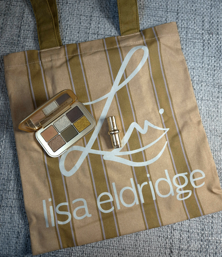
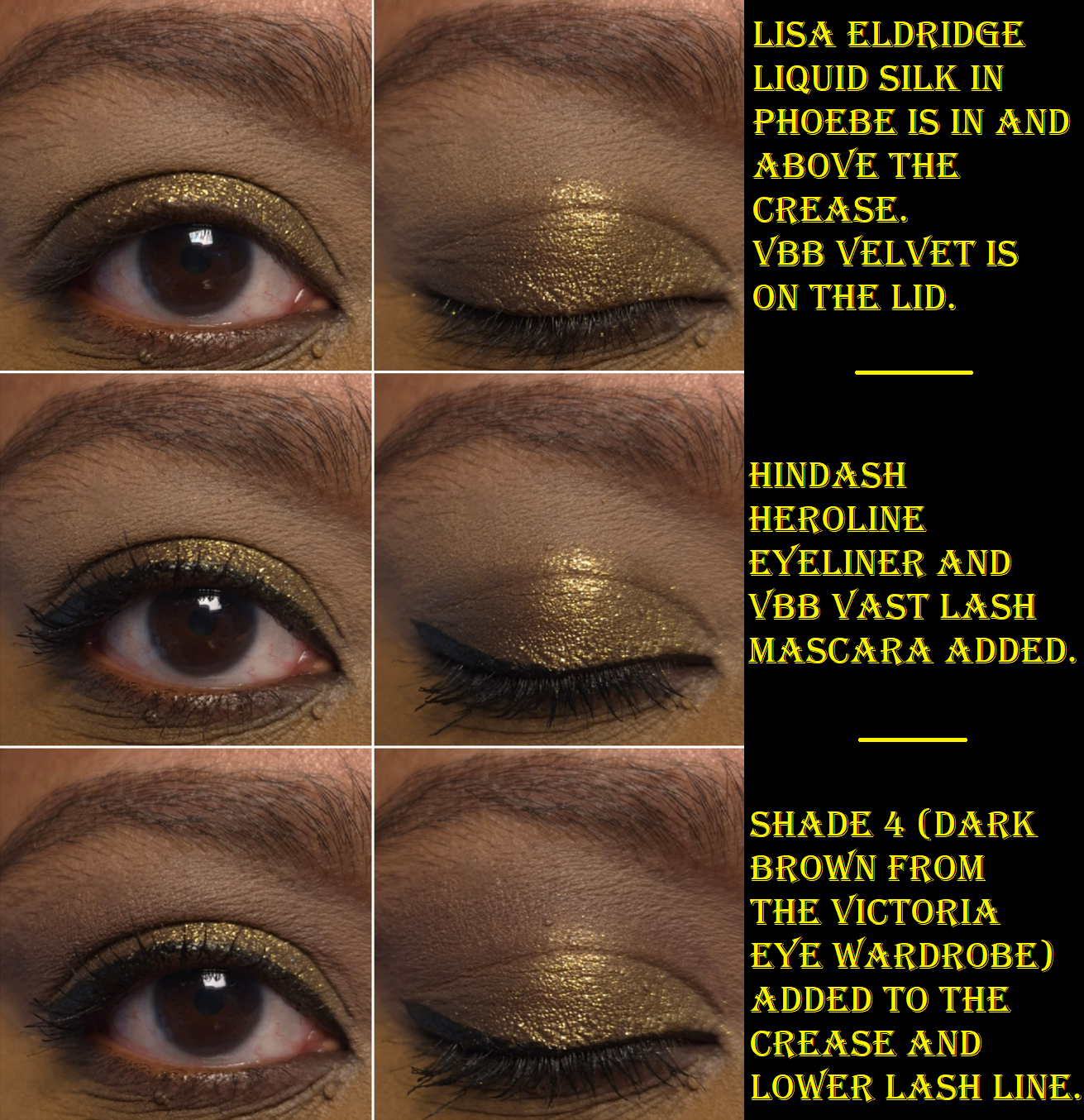
I mentioned that I’m not a single-eyeshadow type of person, especially when it comes to cream and liquid formulas, but I thought it would be interesting to compare the Lid Lustre shine level to the Pat Mcgrath’s FetishEYES Longwear Liquid Eye Shadow and Lisa Eldridge’s Liquid Lurex.

I’ve always been impressed with the Lisa Eldridge liquid eyeshadows because they tend to be a little more impactful and set better than the ones from Pat Mcgrath, plus they happen to be less expensive as well. While they’re $30 for LE vs $32 for PML in the US, the prices in Germany are €25 for LE vs €34 for PML. So, it’s easy to see why Lisa Eldridge became my go-to if I want to use liquid eyeshadows.
VBB Lid Lustres are $38 in the US or €42 in Germany. The Lid Lustres are more impactful, but they also cost a lot more money. In Germany, the price of two Lid Lustres is the same as four eyeshadows in the Eye Wardrobe. I could spend €42 on a Lid Lustre or €55 for an Eye Wardrobe refill. So, as much as I like the idea of being able to just buy a single, the Eye Wardrobes are arguably a better value. Then again, if future Eye Wardrobe shimmers aren’t going to have as much bling as the Lid Lustres, the money may be better spent on the Lid Lustres instead. For all I know, there could be some tamer shades of Lid Lustres too. I haven’t seen the full range in person.

Since I’ve only had this pot eyeshadow for a few weeks, I can’t say how long this will stay fresh. I can only say that the formula adheres well to the lids, although it works much better when I apply it with my finger instead of a brush. I haven’t noticed any fallout. I don’t get creasing.* There’s no fading. I am very satisfied with the sparkle and shine level. If I apply these with a damp brush, the surface looks smoother, but the overall effect doesn’t change a whole lot.

*UPDATE: NOVEMBER 10, 2025 – I have to specify that I don’t get creasing or fading in the usual way I wear a Lid Lustre, which is with a primer of some kind underneath. Typically, I use the Lisa Eldridge Liquid Silk Liquid Eyeshadow to conceal the discoloration around my eyes, and it’s also a good barrier to prevent the oils from my eyelids from breaking down my eyeshadow. Since it’s second nature for me to prime my eyes before using a Lid Lustre, I didn’t realize that using a Lid Lustre on my bare oily eyelids will cause creasing before it starts to break down fully. So, please be aware that if you have oily lids too, a good primer is likely necessary.

If I were to store this in a drawer or someplace other than right where I do my makeup, I would not get enough use out of this product for it to be worth it. However, I have been keeping it next to the Victoria Eye Wardrobe, so when I want to use that palette, it’s not too much extra trouble to dip into Velvet as well. I definitely would like to have more of these, but I will think it over when Black Friday rolls around because the brand usually has 20% or 25% off products during that time.

One final thing I wanted to mention is that I have been very tempted by the Olive Eye Wardrobe color story, but a few people were disappointed with theirs, stating they didn’t like the satin and the shimmer didn’t have enough oomph. This is why I bought Velvet instead, and I feel like I made the right choice.

Website Samples/V-Suite

Victoria Beckham Beauty Vast Lash Mascara (Deluxe Sample)

I love the richness of the black mascara, and I could definitely use some volume, but I still prioritize length over volume. I used this in the Lid Lustre demo photo, and my lashes could hardly be seen above my eyeliner. So, I made sure to do as thin of a line as I could in the photo above, so the effects of the mascara can be seen. I have only used this twice and I didn’t have issues with clumping or smudging, though I did find a mascara flake under my eyes one of those times.

I know VBB has another mascara called Future Lash, which might be more my speed. I hope it will one day be a free sample option or that the brand will make a travel size.

The Concealer Pen (Sample Booklet 2: Medium Dark to Rich)

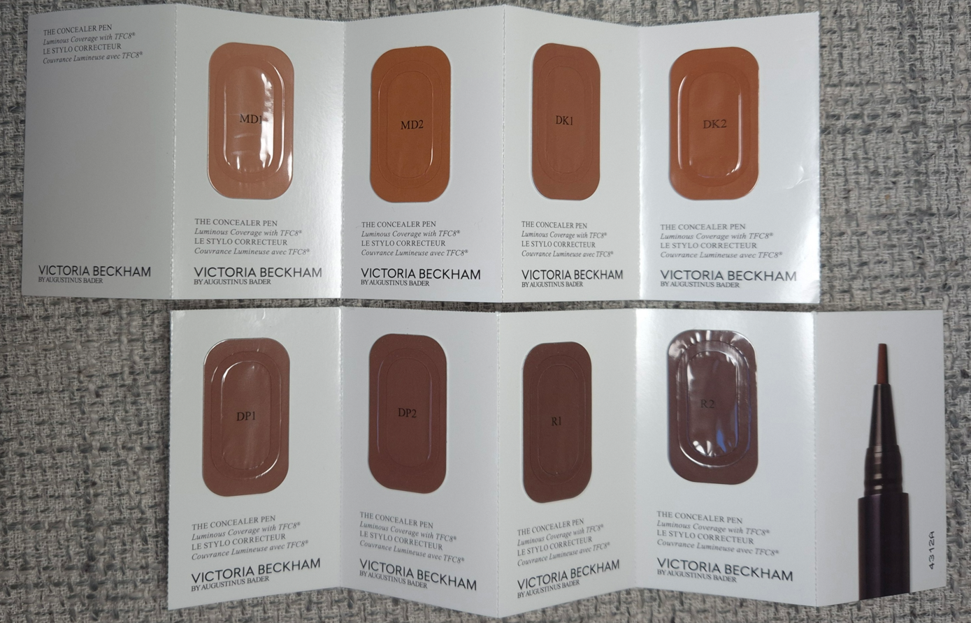
I’m mostly just sharing what the shades look like. There wasn’t enough product in the foil samples to try more than once, and I had to cut the wear test short.

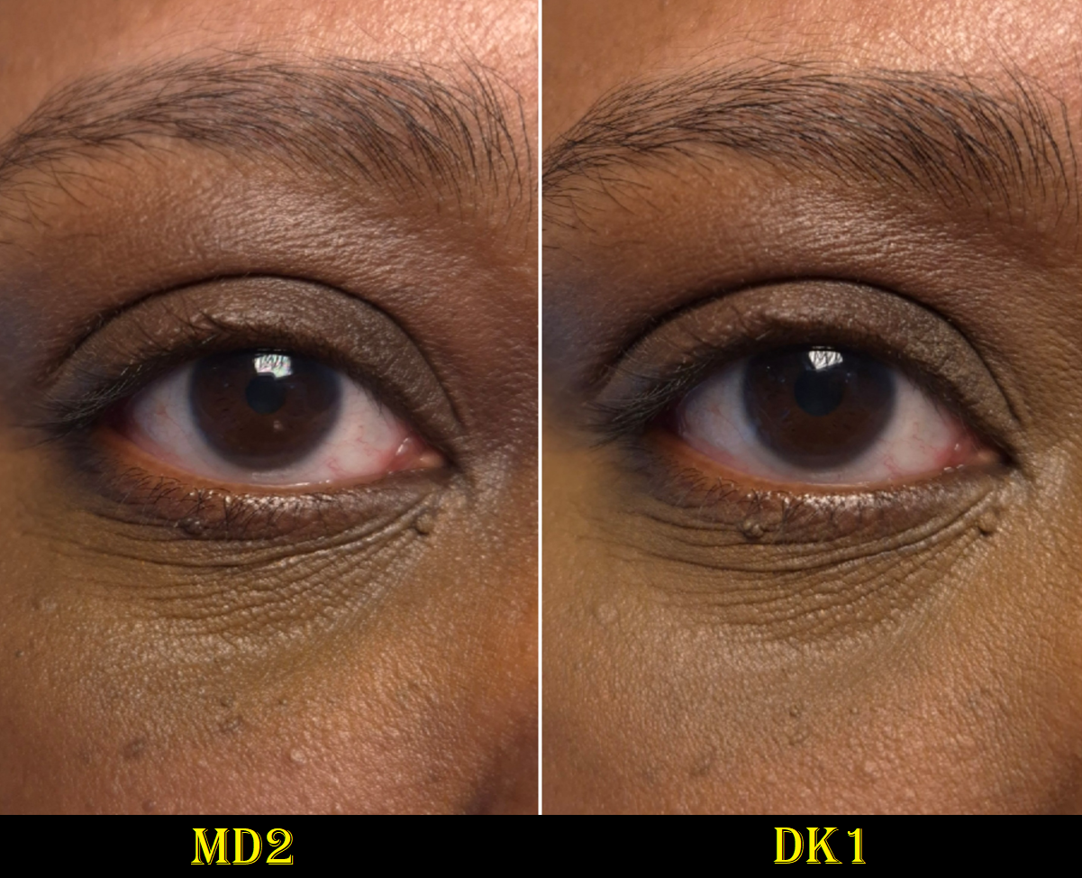
I was pleased with the amount of coverage I got. There was a tiny bit of fading early on (perhaps I didn’t apply enough), but then for the next six hours it continued to look the same and didn’t fade any further. When choosing a concealer for my under eye area, I want it to match the color of my skin above my brows and my cheek area since my eyelid discoloration will be covered up with a primer, eyeshadows, etc. MD1 was too light and MD2 was too dark and too strong of a peachy-orange color and turned olive looking on me. I was going to give up there, but decided to try DK1 anyway, and it was definitely the closest match of the bunch! It’s still a bit neutral compared to the warmth of my surrounding skin color, but I think I can still pull it off when the rest of my makeup goes on.

There is a shade called MD1.5 that was not part of the sample pack, but it’s available on the website. It is described as having a golden undertone, which sounds like it would be better for me than a peach or neutral that the majority of these medium dark to dark shades have. However, since MD1 was too light and MD2 was dark, There’s no way for me to know if MD 1.5 could still be too light, or if it could be perfect. I don’t usually buy brightening shades of concealer because it makes my under eye circles underneath look grey.

From my limited experience with these samples, I’m interested enough to want to buy one during a sale, but I don’t know if I should take the chance on MD1.5 for the undertone or play it safe with DK1 for its depth. Perhaps I should not get one at all, though I want this concealer not just for the makeup aspect, but also the advertised skincare benefits.
I’m working on a big concealer post that will probably be ready by December or sometime in the early months next year. So, if this doesn’t make it into that post, you’ll know I decided to skip it.

Well, that’s all I have for today! I hope this post has been helpful!

*UPDATE February 23, 2026 – I don’t usually post referral codes, but I wish I had known about it to get 20% off my first order of $75 or more. I shared my code here in my original review, but have since removed it. Victoria Beckham Beauty bans accounts if the person using your code uses a drop-shipping method. They terminated my customer account because of what someone else did with my code without giving me any warnings, so I would hate for anyone else to experience this. Use someone’s code if you want, but don’t share your own!

-Lili

Singe Beauty Agate Temptation Palette

I will forever think of Agate Crosner when the word “Agate” comes up in anything.

Gaming reference aside, this is my first eyeshadow palette from Singe Beauty. I love greens and this color story reminded me of the Oden’s Eye Merry Christmas Palette. Of course, the thought crossed my mind that I should probably not get this palette if it reminds me of something else, but I was too impatient to try and wait for the brand to release a color story that attracted me while being different enough to be unique to my makeup collection. Singe doesn’t do fast releases, so it could potentially take years for me to be interested in another palette of theirs (though Paisley Hoot is quite pretty). I wanted to see what kind of eyeshadow formula Angie chose, so having a lot of colors I liked was good enough for me.

I’d like to note that I’ve owned this palette since June, so this is far from a first impression. I’ve been using it every-so-often organically in the latter half of 2025. By now, I’ve used it enough to share my thoughts.

I’ll start by getting into the specifics of the eyeshadows.

Achates and Metamorphic are very uncommon tones of orange and brown. I am shocked to say that they’re my favorite mattes in the palette, even above the greens! Achates reminds me of a higher quality version of the orange shade from the Juvia’s Place Nubian Glow Palette or a bit like Oromo from the Juvia’s Place Tribe Palette.
I can’t recall where I’ve seen a shade like Metamorphic, but it reminds me of chocolate chip cookie dough. I can’t explain why!

I usually rely on black eyeshadows to add depth and smokiness to the outer corners of my eyes, but Dendritic is such a beautiful rich brown that I feel perfectly happy just using this. It’s somehow soft and intense at the same time!
Chalcedony is too light and thin, so I can see my skin through it unless I pack on a ridiculous amount of layers. I wish more of the pale mint tinge would show instead of it just looking white, but it doesn’t because of my skin tone. It would need to have more grey than white in the base for the green to show on me, like the shade Memory in the Urd palette from Oden’s Eye.
Banded is not neon on my eyes, but I don’t mind that it’s an easier to wear kind of color. It’s thin as well, but I have an easier time with Banded than Chalcedony to hide my skin peeking through.

Moss, Slice, Geode, and Plume deserve recognition for being the kind of greens I use a lot. They just aren’t as uncommon, as they are similar to Melt Cosmetics greens, Oden’s Eye greens, the Coloured Raine Safari Palette and Juvia’s Place Tribe Palette.
As for Volcanic, it’s not a shade I make a fuss for, but it goes well with the color story.

In summation, the mattes blend and layer nicely. It’s not a quick process, but it’s not tedious either. They have a semi-silky feeling, but they’re not creamy. The kickup is minimal. The pigmentation is high, but I still have to build up certain shades. Metaphorically, it’s as if someone took the old school Juvia’s Place formula (that I like way more than their current one) and combined it with Natasha Denona’s current matte formula (which is nice but still not a favorite).
A few weeks ago, I reviewed my first palettes from Cosmic Brushes, Glaminatrix Cosmetics, and Wicked Widow. I can say, I definitely prefer Singe Beauty mattes over all of those.

The shimmers are impactful, but Quartz is super reflective and sparkly. The particle size is small enough to have a refined look to the eyeshadows, but not at the same level of high end and luxury brands, which is still fine. I don’t always want a blinging shimmer, or conversely a subtle satin, so this palette’s shimmers are great for the times when I’m in-between moods.

The consistency of the shimmers isn’t too thin or too thick. Quartz is the thickest. These eyeshadows feel a bit slick, but not enough to give me problems with creasing. In fact, it wasn’t until I was nearly finished with my final draft of this review that I learned Angie intentionally wanted shimmers on the thin and less emollient side so there wouldn’t be creasing.
Translucent is the aptly named duochrome topper, which is bold, but not as intense as other indie brands’ more expensive eyeshadows. The same can be said for the multichrome, Chrystallized, which is pretty to look at in the pan, but not that shifty on my eyes. It’s ironic that it’s possibly one of the more expensive eyeshadows in the palette, yet its also one of my least favorites. Regarding the textures, I need to spray Translucent to combat the fallout and be able to apply a smooth and even amount to lids. Chrystallized is the hardest to pick up with my natural hair brushes, so it’s easier to apply with my finger.
I admit that I haven’t used this palette with my Singe eye brushes, which are synthetic. They’re not in my container of brushes in rotation because I’m really behind on my Fude reviews. The Singe F03 is still in there though!

Silica is the “sparkly wet-looking topper,” that appears mostly gold in darker and warmer light, but I can see the mix of silver and gold in brighter settings. Examples of this are in the eyeshadow demo photos.
Gilded is stunning, even though it’s a more “traditional” shimmer. The tone of this warm gold is just so flattering on my lids.
Fire is a warm red with gold sparkles. So many brands make pink to gold eyeshadows, so it’s refreshing to see a twist. Reds aren’t my favorite for eyeshadow (unless it’s a rusty red-brown), but the shade is on the fringe of looking coral on my eyes, so I’m not opposed to it being in this palette.

When I think about the qualities of Agate Temptation, the phrase, “Jack of All Trades, Master of None,” comes to mind. This is a solidly good palette; it’s just not at a level that I could call phenomenal. These days, with the number of influencers that say everything is “amazing” or “my new holy grail,” something that has the rating of “really good” can still seem like it’s not worth anyone’s time. However, I like Agate Temptation enough to easily recommend it to anyone interested in buying it. These aren’t the world’s creamiest, most blinding, immaculately effortlessly blending eyeshadows on the market. These aren’t like my YSL or Prada eyeshadows, but I still enjoy using this palette. I don’t have Juvia’s Place Tribe or Coloured Raine Safari eyeshadows with me in Germany, but Agate Temptation gives me similar vibes and I get a nostalgic feeling when I use it. I’ve also been obsessed with the warm-mint chocolate chip eyeshadow combination I’ve seen others do, and I’ve enjoyed creating my variations of the look.

I see myself continuing to reach for this palette even after the review, which made it even more worth it to buy over some of the other palettes that I consider to be better performing.
I know my criteria for judging a palette’s worth is largely centered around how much I love the formula. So, it’s strange to say these eyeshadows rank below my top ten favorite formulas, but still manages to be a purchase I’m glad to have made. The quality is good enough for me to enjoy working with the palette, and the mix of interesting neutrals with fun pops of color continue to entice me.

With the international shipping cost and fees in mind, I don’t know if this would have been worth it if I had to make the purchase directly from the Singe Beauty site. However, I am glad Angie continues to work with Monolith to provide products to the EU so that the prices aren’t double or triple what customers in the US pay.
Also, for anyone interested in the rising cost of eyeshadow palettes, the ongoing debate whether a brand should focus on leaving out “special shades” to keep costs down, and how multichromes changed the trajectory of the indie community, I recommend watching Angie’s video How Multichromes Destroyed the Indie Makeup Pricepoint.

That’s all for today. Thank you for reading!

-Lili

YSL Unexplored Garden Quad

I don’t have a good opening paragraph. Let’s just get right to the review!

YSL Couture Mini Clutch in 830 Unexplored Garden

Just like the previous four quads I’ve reviewed, and the holiday one, I haven’t had issues with fading, creasing, fallout, nor any problems picking up product with my natural hair brushes. I don’t need to spray my brush to get the sparkly shadow to stick to my eyes or be intensified. The shadows adhere on the first go. They blend well and quickly.

I still consider this eyeshadow quality to be among the top three that I own. I can’t decide for certain which one is number one.

When it comes to this color story, I haven’t found it to be that versatile, but I just need to create one pretty eye look in order to be happy.

Shade 1 is in the designated topper eyeshadow area of this quad (the top left corner). It looks white in the pan, but the shimmer is actually a light green color that is beautiful!

Shade 2 is the typical one that’s usually too light to show up much on my skin. I use this shade between my brow and crease to keep that space open and looking clean, plus blurring and blending out edges of the crease shade.

I consider Shade 4 to be a soft matte army green color. It’s desaturated and adds depth to the look. It’s not too deep for me to use in the crease, but I wish it had a little more vibrancy.

Shade 3 looks warmer on my lids than I expected, especially considering I can see silver sparkles in it.

Overall, this color story is pretty, but it doesn’t excite me. These aren’t the tones of green that drive me wild. I knew I had these feelings, but because I love the YSL formula and have been impatiently waiting for a green palette by them, I still wanted to own this anyway.

For anyone curious, YSL’s Over Brun is still my favorite quad of the bunch, followed by Golden Lace in second place.

That’s all for today! It’s a quick review since my opinions aren’t different from what I’ve said about the previous quads. I hope the brand will continue to explore colorful options in the future.

-Lili

Indie Brands Firsts: Cosmic Beauty, Glaminatrix Cosmetics, and Wicked Widow

None of these palettes are new within the world of indie eyeshadows, but this is the first time I’ve purchased anything from each of these brands. This was made possible thanks to the brands working with the European retailer, Monolith!

I hear so many great things about many more independently owned businesses, such as Blend Bunny, Bella Beaute Bar, Dede Signature, Whats Up Beauty, etc. I’m just waiting for a launch from them that’s so exciting that I can no longer resist giving them a try.

For now, I have the following to play with…

Cosmic Brushes Tis the Season Palette

I purchased this palette in December 2024.

I consider the Cosmic Brushes matte formula to be better than Beauty Bay’s, on par with the better of Colourpop’s formula, but it doesn’t quite top the best of BH Cosmetics’ formulas. The mattes are colorful, pigmented, a bit dry, and are blendable enough to layer well with the other shades, but I wouldn’t call them low effort. That can make it sound like they’re troublesome to blend, which they are not. It just takes a little more time and I think it’s because most of them are pressed pigments rather than regular eyeshadows. So, that’s the trade off for the extra pigment.
I find it best to work slowly, use smaller and fluffier brushes, and apply in the order from light to dark when trying to build the eye looks. If issues still occur, I recommend trying a different eyeshadow primer.

The only matte I consider a real problem is Party, because for some reason it fades like crazy no matter how much I layer on. To be more precise, it darkens to an ashier grey-purple shade that’s a similar color depth level as my dark circles and skin discoloration, giving the illusion of it having faded to almost nothing. I had to keep packing on more of Party while taking photographs of my eye looks so that the purple tone could continue to be seen. I have a similar problem with Ribbon, but because that shade is so bright to start with, what lingers behind is still a lighter sort of grey. Switching eyeshadow primers did not help with this one. Building up about six to eight layers makes it visible for a few hours, but it’s really not even worth the effort for me as those are not the kind of purples I like anyway.

Even though the mattes generally aren’t bad, I’ve been too spoiled by more expensive eyeshadow brands and prefer to work with those over these. When it comes to indie brands that have a better balance between pigmentation and ease of use, I recommend Fantasy Cosmetica and Oden’s Eye.

Regarding the shimmer formula, I’m pleased that they have the kind of impact I expect from an indie brand. There’s no need to spray my brush in order to intensify the shine, but a shade like Baubles is on the flakier side and could benefit from a damp brush to minimize the fallout. Candle Light and Fairy Lights are a bit thick, but smooth out across the eyelid nicely. Decorations is also chunky, but the wettest of all the shadows is Celebrate.
Festive is thick and stiffer than the others, but somehow isn’t dry feeling either. It reminds me of the way Sydney Grace eyeshadows feel. Tinsel feels similar to Festive, though slightly less stiff.
Cranberries is the smoothest of the shadows, but it doesn’t have that much more slip or wetness than the others.

According to the brand, the special shades are Cranberries, “a multichrome that shifts from a cranberry red, to orange to green,” Fairy Lights, “a multichrome metallic that shifts from pastel purple to pink, to soft yellow,” and Tinsel, “a duochrome pink to gold metallic.”
I agree with their assessment of Cranberries and Tinsel, but Fairy Lights acts like an iridescent purple and pink duochrome on my skin tone.
And even though Candle Light is only described as a, “fiery orange metallic,” and Baubles as, “a reflective fuchsia purple metallic,” those two look dimensional and above ordinary to me.

Although the shimmer formulas are damp, I thankfully don’t have to deal with creasing per say, just that the shimmers don’t like to stay in the deepest line in the crease of my eye, so that’s the first place for the eyeshadow to go missing.

Using this palette brought back a lot of nostalgic feelings. It was like working with the kind of indie eyeshadows I used so often in the early years of my makeup journey.
I like the colors in this palette, and if I got this in 2019, I think I’d have been much happier with this. But, now that I’ve been spoiled by buttery, creamy, soft, highly blendable and very expensive eyeshadows from Victoria Beckham Beauty, YSL, Pat Mcgrath, and more, I am most likely to only whip this palette out during the holiday season. Even though my beloved Oden’s Eye Merry Christmas Palette contains no purples, it’s at least a holiday palette that I use all year round.

I also want to add that I think this is one of those palettes that is good for the price. To get multichromes and duochromes for $39 is pretty great, but I don’t know how much the shipping from the UK factors into the cost for those that live in the US. From the EU retailer Monolith, this cost me a little over €48 ($56) from VAT, but no additional shipping costs since I ordered enough other things to reach the free shipping minimum.

Glaminatrix Cosmetics Nocturnal Mini Palette

I bought this in October 2024.

These mattes are also quite stiff in the pans, but that doesn’t seem to effect the blend too much. I like the colors and tones, but the blues and purple are prone to changing color when I try to layer them and create a gradient. Shade mixing can be a good thing, just not when I want them to stay true to how they look in the pan. So, in order to have each individual shade be clearly recognizable in the photos, I couldn’t blend them as much as I wanted. Some of the eye looks I had to recreate a few times so they wouldn’t look like a muddy mess.
Also, Gloom turns very dark on me as time goes on, to the point that it looks like a contour color on me. It going from grungy yellow-brown to an ashier kind of brown in spots can look really messy on my eyes without even trying to layer other shades with it. As for Fog, that color also darkens to more of my skin color, but if I can get it to show true to color for most of the day if I build up enough layers.

I should also note that despite these mattes being super pigmented, Shadow is even more so. I have to be very careful incorporating this into my looks. It can get out of hand quickly.
I find it easier to do my crease shade and then put Shadow in the outer corner before adding the eyelid shimmer and topping a little bit of Shadow back on top. This is because Shadow doesn’t build on the shimmers as easily.

I like these mattes more than the ones from Cosmic Brushes, but I can understand why someone might disagree if the colors blending into one another or darkening is viewed as problematic.
These remind me of Terra Moons mattes, but better.
Despite considering these mattes to be nice enough to keep using, I still prefer to reach for easier formulas. Since living in Europe, I don’t do bold colorful looks as often, which is why the extra time needed to create these kind of looks isn’t worth it as much to me right now. However, this preference could change and in the times that I do want punchier colors, I am happy to have these options. I couldn’t resist the appeal of these tones of colors, and it cost me money to finally satisfy my curiosity. I at least paid less (€49) by getting this mini size version with 22mm eyeshadow pans.

Milky Way and Luna are the flakier shimmers. Night Vision and Dusk are the smoothest ones while Constellation is smoother than the first two mentioned, but thicker than the latter two. All five of these are considered by the brand to be duochromes and are recommended to be used with glitter glue because of their thick texture.
I haven’t found the need to use glitter glue with these, but I dampen my brush to minimize fallout.

My only gripe with Milky Way can’t really be helped. On my skintone, even when I’ve used this on top of a pink matte shade from another palette, it’s just blue. I don’t count an eyeshadow that looks one color and then disappears to turn into a different color as being a shift. That’s the same kind of trick a ph-adaptive product has. So, what makes Milky Way special to me is the high shine/reflect. I’m content enough with that. It would have been nice to be able to see some pink too though.

Night Vision is one of the shades that appealed to me most from the palette. The tradeoff for it looking smoother though is that it’s not as sparkly. The grungy dark base keeps it from looking the tad bit more vibrant as I would have liked. I believe in eye look number two, I put Murky on the lid first before adding Night Vision on top in the hopes that it would enhance the green tinge (but I cannot remember for certain). These shimmers are too thick to have a matte color underneath make a difference in the overall appearance. At least on myself, and at least with the shadows from other brands I’ve attempted to use these with.
Also, the only time I’m impressed with the look of Night Vision is when light shines on it directly. I am not satisfied with a lit up room being required.

Luna has a blue to purple shift, but it mainly just looks blue on my eyes. It’s a beautiful color, but considering I’m way more interested in purples, this color helped push this palette further into the blue territory than I enjoy. It’s the most intense shimmer in the palette, so I can’t complain too much.

Dusk just looks purple to me. It’s usually easiest for me to see a shift in a chrome shadow by holding it at different angles pointing towards and away from light sources. With this shade, I have to hold it at a very harsh angle to see it change from a cool purple to what I believe is a warmer pink-purple. I just consider it a pretty purple eyeshadow. The shift isn’t prominent.

Constellation is like a bronzy-orange to green. I can see the color change easier with this shadow than Dusk, but the green isn’t obvious on my lids. If I saw this color on someone else, I would be able to detect that there’s something fascinating and special about how it appears. I would know it’s not just a simple bronze or orange, but would not be able to figure out what’s different about it. I think that’s the power of the green shift. It’s like an optical illusion where one catches a quick glance of something, but once the eye tries to focus on it, it’s unable to be seen anymore.

I’m proud of the first and fifth eye looks. They are the most eye-catching to me, but Constellation is actually my favorite eyeshadow in this palette.

I could not find this palette on the official website, so I don’t know if it’s discontinued. However, Monolith continues to stock it.

Wicked Widow Tales of Terror: A Haunting Palette

I bought this in June 2025.

What drew me to Tales of Terror is how much the matte shades reminded me of the Viseart Dark Mattes Palette I bought in 2016. It was my favorite Fall color story, but around four years later, the eyeshadow performance gradually worsened. In 2021, I tried to use the Viseart Dark Edit Palette as a replacement, but I majorly disliked that palette. By now, there are less expensive options from Viseart, but I don’t have as much confidence in the consistency of Viseart’s batches anymore. This is due to the period of time when Viseart was transitioning from their products being produced in France, to being produced in the US.

Typical sale pricing on Viseartparis.com

The Tales of Terror palette has similar colors I loved, without the blues and red that I didn’t care about, plus the addition of shimmers. So, I felt compelled to give this a try! I waited for a sale on this one though because €69 is a lot of money to spend on a brand I hadn’t heard of until the release of this palette.

As these photos show, these shimmers are very big in particle size, bold in color, and reflective. Because they appear more textured, they naturally look less refined than the kind of shimmers I tend to use. That’s not a bad thing, as I bought this palette specifically for the eye-catching nature of it. It’s just that some brands, like Pat Mcgrath, are better at balancing intensity and sophistication at the same time. So, this palette is better suited for someone that wants maximum impact and drama. Someone who isn’t satisfied by mainstream eyeshadows is most likely to love a palette like this. Conversely, someone who likes toned down types of colorful palettes and neutral ones with a few exciting pops might find Tales of Terror to be a little too exciting.

The brand classifies all these shimmers as duochromes. They’re a bit thick and have an emollient feel. This formula is the most prone to want to migrate out of the deepest line of my eye crease. Also, the opacity level of the shimmers is so high that I can accidentally cover up all the crease work if I’m not careful with the placement. They definitely overpower the mattes, even though the mattes are super pigmented. The mattes also layer and blend out quite well.
Of the three palettes I reviewed today, I like these mattes the most. As for the shimmers, it’s tied with Glaminatrix Cosmetics because it depends on my mood. The ones in Tales of Terror are the most intense, but I don’t always want intensity.

The important thing to note about specific shades is that Creepy Crawlers and Nevermore look very similar on my eyes when used together, but it can’t compete with the twin-ness of Flickering Lights and Autumn Dreams.
The duochromatic shift is not as easy to see with Dark Void, but it changes from a spring green to a cooler aqua-green. Lastly, Spooky Nights is the kind of shade pretty much every brand that has duochromes and/or multichromes releases. However, this one is at least formulated very well. I never enjoy this kind of shade if it’s too sheer on my lids.

I like Tales of Terror enough that I foresee myself actually continuing to reach for it, though most likely just in the Fall season, the way I used to use my Viseart Dark Mattes palette. However, I don’t think I will buy more from the brand. This palette is still a bit bold for my current makeup style, and I don’t see that changing in the future. Adding additional ultra colorful palettes to my collection would be wasted on me.


I have a few more indie palettes to review, but they are coming much further in the future.

The timing of this post could not be helped. So many indie brands have suspended shipping to the US because of the tariff situation. It is ironic that I couldn’t get indie products for so long and now I might have access to makeup that my friends in the US can’t!

I hope that this post will still be helpful all the same.

-Lili

Prada Lip Balm and Pansy Eyeshadow Quad Review

I said in my Prada review ten weeks ago, “For now, I’m content with the two products I have.”

Yet, here we are again!

The contentment did not last. I couldn’t stop myself from buying Pansy to mix and match with Primula. I also watched a lot of balm related videos on YouTube, and the Prada balm kept ranking among the top. So, despite the fact that I’m on a restricted low-buy regarding lip products, I bought one anyway.

The triangular compact mirror was a free gift with purchase via Douglas.

Prada Dimensions Holo Nude Eyeshadow Palette in Pansy

I thought these shades were going to be on the darker side of medium, but the darker pink and shimmery/satin brown are lighter than I expected on myself. I still consider this palette to be pretty, especially the triangular eyeshadows in the bottom left and right sides of the palette. I don’t know how else to describe that shimmery brown, which has a pink tone to it.
In my previous review, I also said that Primula had the prettiest Holo shimmer among the three quads Prada launched, but I might have to reconsider that statement.

The quality is on par with Primula. The shadows are incredibly creamy feeling, as though it’s a cream-to-powder formula. The eyeshadow payoff is the soft buildable type. I don’t get fallout, fading, or creasing, and they are easy to blend.

The downside, is that I can’t build any depth using this palette exclusively, but I knew that before I bought it, plus I intended to use these shades with Primula.

Prada Optimizing Care Lip Balm in 11 Noisette

I love how this balm color looks on my lips! It is so rare to find a light shade that is dark enough for me to not need to wear a lip liner with it, without being too saturated/vibrant, and also contains enough pigment to show true-to-color. I’m always looking for a medium-toned pink, but they end up being too cool-toned, have too much mauve, too much of a white base and looking milky or ashy, or too sheer to appear different from my natural lip color.
I am super happy with this shade!

Without eating, and with a normal amount of drinking, this lasts about 4-5 hours on my lips before I feel the need to reapply. My lips feel nicely moisturized and hydrated while I wear it, but I do have lip balms, oils, and glosses that are better at conditioning my lips. However, I’d still place in somewhere in my top 15 or 20. I also don’t consider it to be that sticky.

There are two flaws, with one being far more significant than the other:

  1. As beautiful as the color is, it’s not perfectly smooth. The color can sometimes settle into the lines of my lips, so I need to really rub and blend them together to get the color to smooth evenly back out. I notice this during the initial application, and then it’s good until there isn’t as much left on my lips, so I need to reapply anyway.
  2. My biggest issue with this balm is the added fragrance. It not only smells overpoweringly strong of florals, but I can literally taste the perfume! It even makes my tongue tingle when I accidentally get some of it in my mouth! I try my best to avoid putting the balm too close to the inner rim of my mouth, but I still manage to taste that gross floral perfume anyway.

I admittedly only did four all-day wear tests because I could not handle anymore attempts to eat food while I had remnants of the balm on. Most balms aren’t so gross tasting that I have to bother wiping everything off my lips before eating, but Prada’s is.
After I quit doing wear tests, my M.O. has been to put on the balm for photos and then wipe it off after I’m done. This is the only way I can continue to use this product! The color is gorgeous. The formula is quite nice and cushiony on my lips, but the parfum and additional aroma ingredients (limonene, geraniol, linalool, citronellol, etc) seriously impact my desire to wear this. I don’t understand how this doesn’t bother more people, besides apparently myself and State of Kait.

The amount of fragrance in the foundation, I can ignore. The highlighter is powerfully scented, but I power through because it’s unlike any other in my collection. However, the lip balm’s perfume is nearly as strong as the highlighter and I cannot tolerate having them both on at the same time. I get an instant headache.

The packaging is beautiful and luxurious. I love all the details with the logo on the cap, around the sides, the Prada green color on the inside of the cap, the shade name near the opening of the tube, the magnetic closure, and the fact that this is refillable. Sure, the price is high. However, I would have said it was worth it if not for the scented aspect. I cannot recommend this product based on the experience I’m having with it. I seriously hope the fragrance will dissipate over time or that they reformulate these in the same colors, but make them fragrance-free. I bought this at 20% off, but I would repurchase a parfum-free version at full price in a heartbeat. This had the makings of being a holy grail product. What a shame!

Prada Reveal Skin Optmizing Refillable Foundation (sample) in DN75

I got a foundation sample card in one of my orders and DN75 was the closest match out of what was available. I would say it’s still a shade too light for me. I assume either DW75 or DW80 would be better for me, but I don’t plan on buying the full-size because the finish is more matte than I would like. It if looks like this on me in the summer time, I can imagine how dry and dehydrated I’d look in winter. My hydrating setting sprays could help, but I will just stick to using the foundations I already have.

I have noticed during longevity tests that this foundation gets more dewy on me as the day goes on, but I’m not sure if that has to do with the hydrating skincare I use (such as hyaluronic acid) taking effect. This kind of thing happened to me with the Hourglass Ambient Soft Glow Foundation, but I prefer to have a hydrated look from the start and it staying the same all day, instead of having to suffer through looking dry in the morning and then by afternoon I’m glowier in a way that looks worn in, the way this Prada Foundation does.

According to what’s written on Prada’s website, this foundation has, “buildable medium coverage and a long-lasting soft matte finish,” plus, “…the technology-powered formula instantly enhances radiance and hydration with additional overtime care.” So, perhaps this “additional overtime care” explains the dewy phenomenon. Looking more radiant is welcome to me, but I don’t like being able to actually feel the moisture increase on my face. This foundation is not transfer-proof, and I agree with the medium coverage claim.

Because of the fragrance and dewiness throughout the day, I’m glad I was able to use the sample and didn’t have to commit to buying it first.
I tested this foundation 3 or 4 times, as there was plenty in the container and I was able to use tape along the sides to keep it as fresh as possible between uses.

That’s all for today! I truly do think I am slowing down on buying more from Prada, especially if there’s going to be fragrance in those products too.

Thanks for reading!

-Lili

Chanel Les 4 Ombres Boutons Review and Comparison

From left to right: Chanel Tweed Cuivre, Guerlain Royal Jungle, YSL Over Brun, and Chanel Boutons Couture.

It is very unusual for me to want a purely neutral quad, but the photo above shows that it’s not impossible to draw me in. I knew I didn’t need this newest addition, and I had an entire month to try to talk myself out of buying it after seeing the sneak peeks on Instagram, but I couldn’t help it.

Les 4 Ombres Boutons Eyeshadow Palette in 219 Boutons Couture

The compact is typical for Chanel, but the embossing on the shadows, the gorgeous chocolatey shades, and the pattern on the velvet dust cover sleeve are such alluring qualities!

As someone with brown skin, the thought crossed my mind that these shades might not look distinctly different enough on my eyes. I grew excited when I swatched each color on my arm, and felt hopeful as I put each shade solo on my lids. I can clearly tell them apart when used separately. However, when building an eye look, the end result of using all four shades together is that it looks like one single eyeshadow. That’s how much the colors blend into one another, making it wasted effort. I can’t speak for anyone else, but on me, using 1-3 shades actually allows me to have more variety in the eyeshadow looks I create.

Lisa Eldridge Liquid Silk in Phoebe was used as the eye base for all looks in this post.

I’m content with the pigment level of the darkest three eyeshadows, but the beige shade (Shade 2) is practically the same color as my eye base. It’s too gently pigmented to show up easily on my eyes, and it makes the bare minimum of impact if used to highlight the center of the lid. Wetting my brush does not intensify it. It makes for a nice color to soften edges at least.

Shade 4 is a mauve-taupe that has the most shimmer of the four, and it adds a pretty gleam to the lids. I consider it to be an intense satin though. Applying this shade with a wet brush helps to pack more color onto the lids, increasing the opacity level. So, it ends up looking a tiny bit shinier, but I imagine most people don’t consider it worth the effort for a minuscule difference.
Perhaps Chanel doesn’t consider impactful shimmers to be “Couture.”

Shade 1 is a warm satin, whereas Shade 2 is darker, cooler toned, and more matte.

In terms of performance, the longevity is there. I don’t get fading or creasing. I can pick up a good amount of eyeshadow with my natural hair brushes, but the eye look will be visible yet soft on that first application. If I want to speed up the process of building maximum pigmentation, using my fingers is an easy way to do that. The sponge tip applicator housed in the compact works well for that task too.

01 Tweed Cuivre is the first and only other Chanel quad I own. In side-by-side swatches, it is so apparent to me why I think so highly of Tweed Cuivre, as it is much closer to my eyeshadow preferences. Tweed Cuivre is my version of “subtle glam,” yet it still has way more oomph compared to Boutons Couture.

Since these two are my only experiences interacting with Chanel eyeshadows, I can’t say whether or not they’re worth the upcharge compared to the permanent line. From photos alone, so many of the Chanel quads’ eyeshadows look like dusty baked domes. Swatches often looked chalky, thin, and lacking in pigment. I couldn’t understand why the brand’s eyeshadows continued to be popular and thought Tweed Cuivre was the exception. If Boutons Couture had a little more bling and the light shade was more opaque, I think I’d be more interested in exploring the brand.

These eyeshadows turned out to be much softer in texture than I expected (Tweed Cuivre is creamier though). This makes it easier to use than the original Guerlain Ombres G line, but I still very much prefer the YSL formula, which happens to be less money as well (especially in Europe).
That being said, I still like this quad. I would have liked to be strong enough to resist the marketing, especially with the number of influencers stating how limited this collection would be and the sharing of exclusive links to pre-order. I admittedly got caught up in the hype and there was the fear of missing out.
I don’t know how many units were divvied up across the world, but every quad is still available in Germany at the time of me writing this. I heard it sold out within days on the US website though.

At this point in time, I still don’t regret buying it, even if I acknowledge that I could have managed without it.

I don’t intend to give a full review of the Chanel Noir Allure Mascara sample that I got with my order. However, I wanted to point out that I’m wearing it in the three eyeshadow demos and full face photo. I like the length it provides, but the formula is so susceptible to water. If my eyes got watery at any point in the day, the mascara easily transferred onto my fingers while I tried to wipe my lashes. Another time, the mascara dripped into my actual eyeballs. I’m not surprised that a non-waterproof mascara would run, but this is the runniest I’ve ever experienced.

Going back to the topic of the Boutons collection, I think the 239 Boutons Baroque Quad is extremely eye-catching. I’m drawn to the colors, but I’m not confident that I would be happy enough with the shades on my eyes if I tried to use them all together. One review that made me content with my decision to ultimately skip buying this quad is from Nikki. One review that made me reconsider my decision is by Lauren on YouTube. I will continue to stay strong and resist though! One palette from this collection is enough.

Also, in order to keep the embossing around for as long as possible, I have only dipped into the right halves of the shades. This is how it looks after just five days.

That’s all for this week! I had to push back some pre-scheduled posts in order to get this review out as fast as possible, especially given the apparent limited quantities of this collection. The next few posts should be featuring products I’ve used for a lot longer.

-Lili

Indie Brand Spotlight: Fantasy Cosmetica

I’ve always liked the fantasy genre, so this brand intrigued me from the moment I first heard about it. What took me so long to finally make a purchase was just the fact that my obsession with eyeshadows calmed down ever since my botched Low-Buy in 2022. It was easier to avoid overspending if I ignored trying new-to-me brands. Leaving the US also played a role, since I had less access to a lot of indie brands. However, I finally looked into Monolith EU’s website, and started trying different indie brands again through that online retailer.

I purchased the Druid Palette in September last year and loved it so much that I considered buying additional eyeshadows. The issue was that I didn’t love a lot of the full color stories of the others palettes enough to be worth the upcharge from Monolith beyond the 19% VAT. Although Fantasy Cosmetica sells eyeshadows individually on their own website, Monolith does not.
When Black Friday rolled around, I considered ordering their single eyeshadows and have them shipped within the US, but the discounted prices were such that it made more sense to actually buy the palettes in full! During my two week vacation, I tested out the Fighter, Warlock, and Bard palettes so that I could decide which of the eyeshadows I’d keep and which ones I’d leave behind, but I took them all!

All four palettes discussed today are part of the “Classes” series. At the time that I’m writing this, there are nine in total. I’ve played a few MMORPG’s in my early years, and it’s a bit funny to me that none of the characters I’ve been are in this collection of nine!
I love playing a healer type in any game whether it’s a main healer like a Cleric, a partial tank-type like a Paladin, or a damage dealer like a Mage or Psychic. I’ve played a Shaman, which I guess is closest to a Druid. I’ve also been an Archer and low level Hunter, which is closest to a Ranger. Mage is probably closest to the Wizard.
My point is that I’m shocked there still hasn’t been a Cleric, Paladin, or Priest! Perhaps one of those could be coming next.

First, let’s talk about the palette that turned me into a fan of this brand, which is Druid.

Druid Palette *NEW stained glass style*

I put “new stained glass style” in the title because that’s how it was listed via Monolith. However, I don’t know what the original palettes used to look like. The oldest videos I’ve seen have palettes that look similar to mine, so I don’t know what the differences are supposed to be.

I have learned, based on these four palettes, that the Fantasy Cosmetica formulas has the kind of balance I love between high pigment and ease of use. The mattes are opaque, easy enough to blend (minus Old Growth) and layer well on each other. It’s not on the same level as Pat Mcgrath or YSL, but it’s almost on par with Oden’s Eye, which is great. The array of colors in this palette excited me as much as the Earth Palette from Lethal Cosmetics, but I prefer how these eyeshadows from Druid perform way more!

Some of the shimmers are on the satin side, but always in interesting shades to create a statement in at least that way, while the other shimmers are sparkly and impactful without looking chunky. They are creamy enough to spread easily and smoothly, but not emollient or slippery enough to crease on the eyes. How the eyeshadows look at the start of the day is how they’ll appear at night.

As I mentioned, the only matte that is harder to blend out is Old Growth. Wherever the shadow gets placed, it doesn’t really want to move from that spot. I remember the time period when Colourpop used to make this kind of shade a lot, and many of them had this issue as well. I think it has to do with the red-brown pigments used.

The only shimmer to give me an issue is Regrowth, which has a tendency to try to hard-pan. This eyeshadow has a red base and gold shimmer, but the hardpan is how I ended up with a matte looking outer corner in the 4th eye look above.

The most “boring” shimmer is Bear Form which is a metallic brownish orange. It’s pretty, but doesn’t have any special effects. Another one that appears like it should be straightforward is Serenity, but it has a yellow to green shift. It looks lime green in the pan, but it looks very yellow on my eyes.

One of the stars of this palette is Balance, a transparent-based eyeshadow that can be used like a topper. It has pinkish-purple, aqua, and green shimmer. The other star is Transformation, the multichrome that goes from red to purple and then greenish blue. Green is the predominant color on my eyes.

This isn’t a perfect palette, but I really like it.

Fighter Palette

This is the most neutral color story available out of the Classes palettes. Therefore, I’m not surprised that this is also the palette with the most “traditional” type of shimmers. Glory is very much the standout. The base color is very sheer, but I can faintly see it’s yellow-brown, and the shift goes from pinkish-purple to blue. Might is also a fun color with its dark purple base and gold shimmer, but it looks like a very blackened purple when I use it on my eyes. I’ve noticed it hasn’t been as easy to see the gold on my eyes, and it looks like it’s wanting to hardpan like Regrowth in the Druid palette.

The three shimmers in the middle row of the palette are wetter and fairly thick. According to the brand’s description, Blade is a, “multidimensional shimmer – silver base with green and purple shifting sparkles.” Realistically, it’s a dark silver. I can faintly see purple specks if I rub the eyeshadow across my skin super thinly to sheer it out. I don’t think anyone would be able to tell there was any nuance to the silver when it’s on my eyes.

Fervor is a red with silver sparkles. The silver gives this eyeshadow more of a twinkling effect, but it’s still my least favorite color in the palette. It’s objectively pretty, but I’m not a fan of these kinds of reds.

And then finally, Victory is a, “multidimensional shimmer – warm brown with pink and silver sparkles.” Again, it looks pretty much orange to me. I can see some of the pink at a very sharp angle that I’m not so sure anyone else would be looking at me from.

Once more, the mattes are wonderful. Warrior is a little less blendable than the others, but it’s still good enough for me.

I go through phases of liking neutral palettes. Something about the curation of these colors and the way they look on the eyes paired together is very intriguing to me, no matter what my mood is. The only outlier for me is Fervor, but I can always swap it out with an eyeshadow single from another brand.

Warlock Palette

This palette is a surprise hit for me! Six of the shades are the kind of colors I only like when paired with certain other shades. This color story is thankfully grouped in a way that makes them all work. This was one of the biggest reasons I couldn’t just depot a few shades when I was planning which palettes to bring back with me.

The shade I was pining for the most was Ritual, a true multichrome that shifts yellow, green, and blue. It reminded me of a Clionadh shadow, but nothing I swatched looked close enough to it. It had a similar flip but didn’t look the same head-on. I think perhaps it’s like Weathered, but I don’t own that shade from Clionadh. In any case, it’s a gorgeous color!

The greenish shift that Patron has reminds me of Transformation from the Druid palette, if that one had a dark pink base instead. I’m not always into pinks, but this is the kind I can get behind!

Arcanum, with its “acid green to light blue shift,” and Offering, with its “deep blue to pink shift,” are listed as duochromes, but they’re not as nuanced on my eyes. When I hold Arcanum at a sharp angle, I guess I can see blue, but on my eyes I can only see yellow and green. Regarding Offering, I consider it a deep steel blue-grey with purple shimmer. I really can’t see pink.

There’s usually at least one problem child in the palette, and in this one it is Eldritch. It’s the same issue with it just having a lot of pigment and requiring a bit more time to blend. Technically, Profane is also not perfect since it’s thin and I have to build it up, but colors that are practically neon tend to be like this for me.

Overall, this is probably the palette that intimidated me the most, but I think it’s my second favorite (Druid is at the top).

Bard Palette

Bard might not look like a rainbow palette because of the way the eyeshadows are arranged, but it may as well be.

I still appreciate the brand’s choice in veering away from standard primary and secondary colors. For example, Performance is more of a golden and slightly orange leaning yellow. It’s similar to the Singe Beauty brand color. Stories is a super rich red, that is on the verge of purple. Enrapture is like a slightly toned down desaturated orange and Inspiration is a kind of murky muted green. Aside from needing to build up the yellow a green a bit, I have no issues with these mattes.

Mythic is a stunning orange color in a smooth texture. If Pat Mcgrath wanted to make an orange version of Gigabyte, I feel it would turn out looking like this.

Wanderer has a bronze base with red and pink shimmer. It’s thick with a squishy consistency. Legend has the same texture, but with a sheer purple base and blue shimmer.

Charismatic is a pretty peachy color that shifts from pink to gold. A color like this is common among indie brands and even mainstream ones, but I like this opacity level. Sometimes brands have an iridescent version of this color that I don’t think looks as flattering on me. Unfortunately, this is another shimmer that’s starting to form hardpan.

The final showstopper in this palette is Lore, which goes from a bright golden green, to greenish-blue, and then a darker cool blue.

I don’t know how frequently I will use this palette, but I am still glad I bought it. I’m pleased with having all four, though dealing with the shadow sealing or forming hardpan might start to annoy me in the future. I can try to avoid it by strictly applying shimmers with my brush, but the habit to apply shimmers with my finger is very strong.

Bonus Shades and Enchanted Autumn Tinted Lip Balm

Before we bring this review to a close, I just wanted to mention that I received two Fantasy Cosmetica singles from Monolith as a free gift when my Singe Beauty blush order was delayed. As I mentioned before, Monolith doesn’t sell singles, so it was interesting to receive them. They unfortunately don’t have names written on the sleeves, nor the pans. At first, I thought they were the gold and silver from the Fighter palette, but they aren’t the same. Now, I’m wondering if they are from the Enchanted Autumn palette that I believe launched around the same time. Perhaps they are the shades Libra and Harvest Moon. In any case, the beautiful colors are another reason I was so interested in trying more Fantasy Cosmetica eyeshadows.

I included a photo of Pomander, which I’ve reviewed before in my Battle of the Lip Balms post, mainly because it is still a Fantasy Cosmetica product and should be part of this brand spotlight. They have brushes, fragrances, lip products, and candles. So, Fantasy Cosmetica is branching out.

This has been a great experience. Among all the indie brand eyeshadows I bought between 2024 and 2025 (Nomad Cosmetics, Cosmic Beauty, Lethal Cosmetics, Fantasy Cosmetica, and ShellWe Makeup), the Fantasy Cosmetica quality is my favorite of the five, and will be a brand I continue to keep my eye on. Since their products are made in China, I hope they will be able to manage through this tariff situation. I heard they were among the first indie brands to alert customers of potential issues via social media.

That’s all for today! I hope you’ve found this post to be helpful!

-Lili

Prada Beauty Eyeshadows and Highlighter

I have been purchasing more luxury makeup than usual over the past year and a half, but there are some brands I have tried to avoid for fear of liking them too much and not having the self-control to stop myself from buying everything they make!
Prada is one of those brands that every single release has been hyped on social media as “the best on the market,” but as long as I didn’t take that first step in trying something, I was safe.

Well, I am no longer safe! I finally bought the eyeshadow palette that appealed to me most, and then shortly after bought the highlighter in the refill form.

Before we get into the reviews, I want to discuss the logistics of this refill system because many Influencers have been saying, “If it’s too expensive, you can save money by buying one with a compact and getting refills of the rest,” without even checking what that actually entails for the customer.

For starters, this is not like Charlotte Tilbury refillable products where the compacts have magnetic bases with metallic pans that are easy to pop in and out. The Prada “pans” are made of plastic. There is a triangular shaped gap in the back of the compact that one can press through to lift out the plastic pan. On the bottom of the pan is a rectangular section with adhesive on it.
This adhesive is what holds these pans in place within the compacts.

The bottom photo shows how flush the pan is to the surface, so adding a magnetic sheet to the bottom to turn it into a magnetic compact is not possible.


That adhesive will be exposed to the air and other elements if removed from the compact and set down on top of an object. So, something (perhaps scotch tape or the paper from another refill) will be needed to cover the sticky section. If the plan is to swap out products repeatedly, the cover piece has to be easily removable and not lessen the sticky power over time. The adhesive isn’t that strong to begin with. I’ve seen two people whose pans immediately fell out of their compacts, and mine continues to as well.

When one purchases an individual refill, it does not come in a plastic case/clamshell.
There is the cardboard unicarton and the extra bit of cardboard on the inside that keeps the product stable during transport. That’s it. There is a square paper tab on the bottom that keeps the adhesive section from sticking to anything else.
Alicia Archer demonstrates how the refill is stored here.

With mine, I placed metal stickers on the bottom of the plastic refill pan, so I could store it in any of my custom magnetic palettes. When using the square size metal stickers, at least two are required for it to cling well enough to the palette. The idea was to place them in areas that would not interfere with the lifter tab in the compact if I decided to swap out the eyeshadow palette and put the highlighter there instead. For anyone who only wants to buy refills and put them in custom magnetic palettes, adding metal stickers and keeping the adhesive spot covered is simple enough.

When I was ready to transfer pans, I stuck to the plan of covering the eyeshadow palette’s exposed adhesive spot with the new sticker off the highlighter refill, and then added metal stickers to the back of the eyeshadow palette. So far so good!
I placed the newly exposed highlighter pan into the compact and pressed down to secure it. It worked, but the extra weight of the metal stickers combined with the fairly weak adhesive power made it easier for the pan to plop back out if shaken not-so-gently upside down. I ended up removing the metal stickers off the back of the highlighter to give it its best chance to stay stuck in the compact. It does still pop out with every few uses, especially when jostled in my makeup bag. So, even if the goal was to make these easier to recycle, it’s an annoyance for the customer. When spending this kind of money, it should be securely in there. I wish they had just used magnets.

I am used to depotting things, so I have the necessary supplies. However, the typical customer might be surprised to find out there are more steps to the process than just pressing the back and popping out the pan. One can use the refills to replace an empty pan, use it in and out of the original cardboard packaging, or find a way to house it in a magnetic palette. Exchanging multiple products in and out of the Prada compacts though is not realistic.

I am at least glad they didn’t go the Hermes route (and other luxury brands). Hermes sells refills in pans, but the pans are aluminum and therefore not magnetic. I’ve had to add metal stickers to the bottom of mine. In addition, if one buys a compact with a product already inside, the compact is not magnetic and the pan is pre-glued. So, once you take out the original pan for swapping purposes, you will have to do something to either cover the glue or remove it. Then you’d have to glue in the next refill and hope you can still take it out once that replacement is done.

In some compacts, I have been able to place a magnet sheet on the inside and turn it into a custom magnetic compact, but if the sheet is too thin the magnetic hold might not be strong enough to support the weight of the pan. If the sheet is too thick, the pan could be raised too high up and one can’t close the compact. The Prada compacts, for example, are too flush with the surface and cannot be turned into an empty magnetic palette like how I’ve done with Hourglass palettes.

So, sometimes refillable makeup has limitations on the various ways someone can use them depending on how the brand does their packaging.

Prada Light Glowing Highlighter Powder in 03 Deep

A highlighter’s core function is to brighten the skin wherever it is used. Even a matte product can serve that purpose, as long as it’s lighter than a person’s skin tone. Therefore, additional attributes such as the consistency, finish, reflect level, etc are completely subjective. If someone has a list the traits that they seek in a highlighter, the product that checks off most of those boxes is considered to be “the best.” What is best for one person could be the worst on someone else’s list!

I can say right now that the Prada highlighter is among the best for me, and perhaps even in the number one spot!

There are three shades currently available: Champagne, Pink, and Deep.
I don’t consider Deep to be that dark, but it works for my skin tone. I would like to see the brand expand the range in both directions because I don’t think these three shades are that flexible. I have a cousin who would probably love this highlighter, but she’s considerably darker than me. There wouldn’t be a point in me recommending this to her because it would probably look grey on her skin from being too light. So, I think it’s important for brands to offer a wider variety of highlighter colors within a line, especially if it’s a more opaque type or if the pearlescent finish is strong.

This highlighter is satin-like to the touch. Most powder highlighters that achieve this level of smoothness are hybrid cream-powder ones or putty-like. They basically feel wet. The Prada highlighter is different because it still feels like a powder, but in the smoothest form. When applied to the skin, it practically melts in to the point that I can hardly see individual shimmer particles. It is ultra refined with the brand’s trademarked “Micro-Pixel™ Pearls”. The effect is as close to the performance of a cream or liquid highlighter without it actually being liquid. The moisture level within this product is perfectly balanced. I cannot imagine how a powder could be any more hydrating from the jojoba butter, maracuja oil, and squalane without venturing into dewy territory. Kudos to the lab that formulated this!

I’ve only used my natural hair brushes with this highlighter. They all pick up the right amount of product to start me off with a beautiful subtle layer, but I can build it up to the lighter side of medium intensity. When I swipe it across my skin, I don’t even need to blend it. It doesn’t leave a visible stripe. If I build it up, it still requires such little effort to blend.
This highlighter has no problem sticking to my bare skin on low-makeup days and still doesn’t look extreme over a dewy base. It lasts all day without diminishing in brightness.

I have always wanted a powder highlighter with the smallest possible shimmer particles that would provide the most natural lit-from-within glow. My perfect highlighter couldn’t be too pearly or metallic. I would have no other issues with the performance, and the packaging would look luxurious. These are all reasons why the Prada highlighter should be perfect for me. There is just one flaw for me, and it’s the added fragrance!

This highlighter contains parfum and naturally fragrant ingredients (limonene, geraniol, citronellol, and linalol). It’s not an unpleasant smell, but I can’t enjoy it either because of how strong it is. It hits me as soon as I open the compact, and it continues to linger in my brushes for a while. I can smell it on my face for several hours too. I hope the scent will dissipate and air out over time because it only takes me using it with one or two other strongly perfumed products, such as the Guerlain Parure Loose Powder, to induce a headache. The parfum is bad enough, but to have all those potentially skin sensitizing essential oils too is a huge drawback for me. I will continue using this because, if not for the fragrance, it would be my number one holy grail highlighter. Unfortunately, it’s just not the kind of scent that is easy to ignore.

I want a subtle highlighter 80% of the time. The other 20% of the time, I want medium intensity at most. So, there are still moments that I reach for the Hindash Gradient Highlighter and Charlotte Tilbury highlighters instead. However, we have now reached the point where the Prada formula is so good that I cannot justify buying another highlighter ever again. The only time it would make sense for me to get a new one is for limited edition packaging or if I hear someone has identically duped the Prada one in a fragrance-free version. This is it for me!

Prada Holo Nude Eyeshadow in 09 Primula

Everyone said this formula is creamy, but my goodness, they were not exaggerating! They feel like cream-to-powder formulas. In fact, they’re so creamy that I’m amazed they are still solid powders. The most comparable eyeshadow formula I can think of that’s not technically cream-to-powder are the ones from YSL, but the Prada eyeshadows are more moisturizing and creamy.
These have a pigment level that’s between Lisa Eldridge Velvets and and her Seamless Mattes, but these don’t feel as firm/compact in the pan. I use natural hair packing shader brushes and the Sonia G Fusion Eye Builder to speed up the process of loading on the color, as the eyeshadow payoff is the soft buildable kind, but I also want a diffused edge without needing to spend as much time blending it out.

I am very unlikely to hit pan on these, but I would like to point out that the long rectangular strip across the top is quite annoying to fit my brushes into there. I hope Prada will come out with a different pan layout in the future.

I like that this color story is a bit sultry, but I can’t create as much depth and dimension as someone else could who has a lighter skin tone than mine. Primula still looks pretty on me, but after the testing phase ended, I started using the darkest shadow from VBB’s Victoria palette in the outer corner, but just enough to keep the overall look still soft by my standards.

Shade 1 is useful in blending out edges and keeping the area looking clean between the crease and brows.
Shade 2 adds depth. If that color couldn’t be deeper, then I wish the brand made Shade 3 a little lighter for a greater difference in color value and not just Shade 3 being warmer.
Shade 4 looks gorgeous in the pan. Based on photos I’ve seen, I do believe the shimmer in Primula is the prettiest of the three palettes in the Holo collection. However, even if I wet the eyeshadow, I still find it to be a little less impactful, shimmery, and shifty than I hoped. The red base just kind of blends in too much with the two warm toned shades, especially Shade 3. I like a gentle gradient sometimes, so this palette is great for those moments. In the phase I’m in currently, it’s a little less suited to my eyeshadow preferences.

I don’t want to take away from how happy I am that a luxury brand is including atypical colors in their palettes. And I do understand that putting a shade like Asteria by Devinah Cosmetics instead might be too bold for the kind of customer luxury brands try to sell to. I just don’t want to overlook the fact that what drew me to this palette in the first place can still be found in my collection. I can’t find mattes of Prada quality from indie brands, but the shimmers are another story. I don’t have to pay Prada prices to get it.

Because these eyeshadows are smooth, but not reliant on overdoing it with dimethicone to get that smoothness, I don’t have issues with creasing. I don’t have any problems with adherence or longevity either.

Overall, the quality is fantastic. I purchased this at a discount from Douglas, but it’s still quite expensive for a quad. I won’t say that I’m never purchasing another one, considering I’ve purchased Gucci and Guerlain palettes for a similar (discounted) price, and the Prada quality is superior to theirs. I would just need to stick to my normal criteria in being excited about the majority of the palette colors, if I were to buy one more.

I mentioned that I am no longer safe from being tempted into buying more makeup from Prada, but that’s in the future. For now, I’m content with the two products I have, especially the highlighter.

That’s all for today! Thank you for reading and I hope this has been helpful.

-Lili

Lisa Eldridge Summer Colour Story Collection

Lisa Eldridge recently launched her summer collection consisting of an eyeshadow palette, three lipsticks, and two tote bags. The only items I’m missing are the Toasted shade of lipstick and the Olive/Lavender tote.

There are currently three tiers in the brand’s reward program, with Emerald being the highest. Emerald members were able to shop a day early and could add one of the bags to their orders for free without a minimum spend amount. Otherwise, all other customers could get the tote for free with a purchase of €90 or by paying for it outright at the cost of €18. So, I ordered the Desert Gleam palette and Rae from the official website and added the free Olive/Camel tote.

Niche-Beauty sells Lisa Eldridge products, and frequently has 20% off codes available, but one can only get a tote there by hitting that €90 minimum spending price. So, it turned out for the best that I placed my original order with the Lisa Eldridge website, and then when the new products launched at Niche-Beauty a week later, I bought Lili.

Desert Gleam Palette

Dunes and Acacia are Seamless Mattes. I wrote in-depth descriptions of the different formulas in a past review, but the short version is that these mattes are similar in texture to Natasha Denona’s cream to powder formula, they are more pigmented than the Velvets, and have the tiniest bit of a wet (but not shimmery) sheen. Dunes is very difficult to see when applied to my eye area because of my skin tone, but I can tell it’s there because of the blurred look it has, especially when applied to the edges of a darker shadow to soften it up.
Acacia is now my darkest matte from Lisa Eldridge. Although I wish it was the tiniest bit darker, it at least successfully adds depth to my eyeshadow looks and I can build up the intensity.

Most of the time, the Seamless Mattes are creamy and a joy to work with. However, the shade Supernaturally from the Fawn palette was stiffer, drier, and less pigmented. So, that shade is one I stopped using out of frustration. Within the Desert Gleam palette, I got hard-pan on Dunes*, and I’ve had to scrape off some of the surface after just a week of use. It is normal for all the mattes to look like they’re going to hardpan, but this is the only time I’ve actually been unable to pick up product and needed to clear off the surface. I alternate between using brushes and my fingers with all Lisa Eldridge eyeshadows, but this is the first time I’ve encountered this problem. Going forward, I will just use brushes with this shade to try and mitigate the issue.
I’ve had no troubles with Acacia though.

*Update: I was chatting with Fedaro Beauty, who has reviewed this collection as well, and I remembered one change I made this week that could have affected Dunes. For many years I’ve been using the officially branded Makeup Erasers that are microfiber cloths. However, I switched to using Marushin cotton cloths that were free gifts with purchase from my Fude Bobo orders. Microfiber absorbs more oil than cotton, so it is actually possible my fingers had more oil residue left on them between uses than usual and could be responsible for the hard-pan on Dunes. This may be a long shot in providing an explanation, but since this is a possible cause, I felt it was important to share this theory.

Dunes after I scraped off some of the surface.

Sahara is in the Velvet formula, which gives an even and soft layer of color. I prefer to use my brush to pack on the shade and build it up. I’m honestly surprised it shows up as well on me as it does, because I thought it might be too light of a color. I’ve also seen how this shade can look a lot more khaki-yellow on some people, but it’s greener on me.
The Velvets are smoother in feel, and swatch beautifully, but over an extended amount of time, I have noticed mine got drier. Sahara is too new for me to have this problem, but it’s something I wanted to mention that I have noticed out of my oldest Velvet eyeshadows. I can still use them, but building up the color to get the payoff I want takes more effort than before. For those that enjoy soft or muted eyeshadows, this is unlikely to be an issue.

I forgot to mention that in the first eye look in this photo, Sahara was used on the lid before I added Chrysina on top. So, it looks warmer and slightly darker than the first eye look in the photo below where only my eyeshadow primer is under Chrysina on the lid.

Chrysina is a Luminous shadow. It looks silvery green in the pan, but there’s still a touch of gold that I can see at certain angles in the light. For this reason, I like this shade more than I expected. I would go as far as to call this a duochrome, though it’s nowhere near as intense as Mercurial, which is another Luminous eyeshadow.

Ablaze and Firefly are Metallics, but Firefly looks so much smoother in the pan, as seen three photos higher. The textural differences don’t affect anything. I just thought it was interesting.
Ablaze is an easily wearable golden brown that is perfect for creating neutral eye looks. I have a lot of warm golds in my collection, but I don’t have many shades of gold with this tone, as silly as that might sound. It’s still not a necessity for me to have in my full collection, but I think a shade like this aids in keeping the palette color story versatile.
Firefly seemed intimidating to try and incorporate into my eye looks, but as long as it’s framed by Sahara or Acacia in the crease, it works. Ablaze is also neutral enough that it doesn’t clash if they are used next to each other.

I have no issues with longevity or creasing, I can use these with any of my eyeshadow primers, and I can use the shimmers with a damp brush to build intensity. I have no problems with these eyeshadows, other than what I already described with the shade Dunes and the Velvet formula in the long-term.

When I first saw the Desert Gleam palette, there was no way I could talk myself out of getting these shades, despite it reminding me of my eyeshadows from Natasha Denona. It has a similar vibe to the Mini Gold, it reminds me a lot of my custom version of Metropolis, and I also have the Yucca palette. However, when I actually swatched the shades and compared them, they were different enough on my skin tone for me to not consider them dupes.

Please excuse the fact that the skin under Bia wasn’t completely dry, so it looks a little more intense than usual.

If I’m being 100% honest with myself, I prefer the Natasha Denona Mini Gold Palette over this one. I’ve come to accept that high contrast makeup looks better on me, and there are greater depth differences and more color/shade distinctions between the eyeshadows in Mini Gold than Desert Gleam. I’m still attracted to the Desert Gleam colors, and I’ve gotten quite a lot of compliments while wearing the products in this collection. However, I think the ND shades are even more my style. In terms of performance, the Mini Gold eyeshadows aren’t creamy feeling, but they still blend very well, layer well, and build quicker because they’re more pigmented. It’s kind of a moot point because I believe the Mini Gold has been discontinued, so it’s not an option to purchase for anyone who doesn’t have it already. What I’m essentially trying to say is that even though I have products I technically like more than Desert Gleam, I would still feel like I was missing out if I didn’t pick up this palette.

Rouge Refillable Lipsticks in Lili and Rae

Lisa Eldridge and I share the same nickname! Even though I rarely wear red lipstick, I still wanted this one for the name. What can I say! I’m easily swayed!

The way this lipstick performs is no different from the first round that launched at the beginning of this year. They glide over the lips easily and feel like a cross between a balm and a lipstick. This shade is vibrant, but I can still see the discolored/darker pigment spots on my lips underneath if I stick with only one swipe. So, an additional pass or two is needed to be opaque. It feels quite comfortable on my lips, though I get minor chapping by the end of the day.

I own an engraved lipstick case already, so I only needed to purchase these in refill form. My cap/lid for Lili is very loose, so I keep it stored in all the original packaging to prevent any accidents in my makeup pouch, but I’m contemplating raiding my husband’s tools to find pliers that will tighten the cap a little (hopefully not too tight to the point that I can’t pull it back off)!

For some reason, Rae feels much creamier than the other four lipsticks I have from this line. It feels more moisturizing as well, which increases my comfort level while wearing it. However, this one does not have the same kind of grip to it that keeps it longer-lasting like the others. Even if I’m not eating or drinking, within a few hours there is noticeably less lipstick on my lips. I think my skin absorbs it. So, I find myself needing to reapply more frequently. I can’t explain why this is happening because Rae has the same ingredients as all the rest. It’s my favorite shade though, so I’m going to just deal with it! I normally don’t like wearing dark lipsticks because I feel like most of them age me, but this is an exception!

So, that is everything reviewed except the Tote bag. I don’t have much to say about it except that it’s made of a nice material, feels sturdy, and it has a cute and functional zip pocket on the inside. It terms of size, it’s a few millimeters smaller than my smallest canvas shopping bag. I wanted a fancy reusable grocery bag, but this looks almost too nice for that purpose. That’s all I use totes for, so perhaps I could reserve it for times I shop at the city market instead.

I don’t think I’ve shown the pencil case before, which I also like from the brand. I find myself using and liking the Lisa Eldridge accessories, so it’s a big draw for me continuing to purchase from the official website to get them.

Now, that’s everything! I hope this post has been helpful. I tried to complete it as soon as I could, and it helps that I’m already familiar with these formulas from Lisa Eldridge, so I don’t have to test them for as long.

Thank you for reading! Tschüss!

-Lili

Surprising Makeup Hits and Misses ft Rare Beauty, Glossier, Dior, and More

I visited the US in April and was reunited with the rest of my makeup collection, along with all the things I shipped there during 2024. Those products consisted of Japanese brushes that I didn’t want to pay extra customs fees for, reward point and gift card redemptions only applicable to US sites, products only sold within the US, etc. I had older makeup I still wanted to bring back to Germany, but I needed to decide which of the newer ones were worth coming along too. That’s how the idea for this post began! However, some of the makeup I brought back will be discussed in other posts, and I added some of my newer makeup purchases to this review instead.

Rare Beauty Soft Pinch Matte Bouncy Blush in Worth

It was difficult to photograph this color accurately because it looks darker in the pan than it actually is. I own the liquid version of Worth, and have reviewed it before, but I left it in the US. Since the liquid is sheer, I wasn’t surprised that I also needed to pack on a lot of this cream-to-powder version to get it to show up on camera.

I’ve been into subtle and/or nude blushes lately, so I expected to love this. I tried pairing it with so many different things expecting that perhaps my foundation shade mattered or that the undertone was clashing, that the color of my eyeshadow looks could be throwing it off, etc. I just wasn’t enjoying wearing it. The answer I settled on as to why that was the case is that it’s matte. I knew it would be from the name, but I’ve used shimmer-free creamy and bouncy type of blushes before that still had a natural emollient gleam to them from just being a cream product. Examples of this are the MAC Glow Play Blushes and Armani Neo Nude Color Melting Balms. Even within the Rare Beauty Soft Pinch Liquid Blush line that comes in dewy or matte finishes, the matte one still has some life to it. So, I wasn’t expecting this blush to have zero shine, especially from a product that has Synthetic Fluorphlogopite as the first ingredient.

The longevity is fine. The blush blends into and becomes one with the skin. For the best results, I use my densest synthetic brushes with it.

I borrowed the photo above from my Charlotte Tilbury x Genshin Impact post where I reviewed the Airbrush Flawless Setting Spray. By the time I started using that spray, I already knew that my issue with the Rare Beauty Blush was the fact that it’s matte. However, I was still taken aback when I saw with my own eyes how much of a difference some extra shine truly makes. I love how this blush looks when I use Charlotte’s spray over it. So this product changed from a miss to a hit for me!

Eadem Le Chouchou Exfoliating + Softening Peptide Lip Balm in Fig Sauce

I mentioned in my Project Pan that there are only 5 brands I’m purchasing from in the lip category this year. One exception was this balm because I would have bought it ages ago if it was sold in Europe. I could only find one website that would ship it to me, but then I would have had to pay at least double the price.
The tradeoff for having to wait a long time to get it from USA’s Sephora was that I could buy it on sale and with a gift card.

I have to talk about the metal applicator because it feels amazing applying this lip balm! I don’t like when products have a cooling ingredient that makes my lips feel cold for 30 minutes to 2 hours depending on the brand. Instead, I only get that wonderfully cold sensation during the application process and then I can go about my day. This really adds to the experience, so much so that I’ve even put other products on my lips and then used this applicator to spread it out! Perhaps one day I’ll buy some empty tubes off the websites I’ve found by typing, “metal applicator cosmetic tube” into Google and transfer some other glosses into them.

This is a very nourishing product and lives up to its reputation as a lip treatment. It fills the lines and smooths over the lips. It’s thick, but not goopy in a gel or oil way. It has more of a creamy-waxy feel. It adheres fairly well to the lips, which helps it to last longer before needing to be touched up or reapplied. I still consider this a little sticky, but it’s not to Ami Cole levels. It has decent color payoff, enough for me to understand someone wanting to buy multiple shades, but I wouldn’t want to buy more than one extra.

The results I get are similar to Ami Cole glosses, which is to say my lips feel softer and more hydrated the next day, but this does not completely remove all of my chapped skin. I can always spot a few areas on my lips that are still chapped the next day.
So, this hasn’t claimed a spot in my top five, but I still like it a lot.

Gxve Beauty Eye See in Color in Rich Girl

This was the only quad from the brand that I found appealing, but my immediate issue is that I don’t get enough depth from the darkest brown in this palette. While it theoretically shouldn’t be a problem to grab a dark eyeshadow from any other brand, I know I will subconsciously not reach for this palette since it is technically incomplete for me.

The completed look is pretty, but I couldn’t bring myself to choose this to pack in my suitcase over my many other options.

If the eyeshadow formula was superb, I would have considered taking this with me anyway. My issue is that the shimmers are a bit lackluster. There is still beauty in a lower impact shimmer if the intended eye look is supposed to be sophisticated or demure. I think the quality is fairly good, though it could have benefited from being a bit creamier. The mattes were fine. My brush picked up a lot of product, but with how soft they look on my eyes, I think someone would be surprised to know how much I tried to build up these eyeshadows. They are drier shadows that appear to be finely milled, but something about the formula just doesn’t feel modern.

This palette is long-lasting on me. It doesn’t take long to get a blended look. However, this isn’t for me. I do appreciate that the holder of the pans is easy to remove, so I could technically keep the compact or turn it into an empty magnetic palette if I inserted a magnetic sticker sheet. I could also technically add metal sticker pans to the bottom of the eyeshadow holder to pop it into a larger empty magnetic palette. Removeable packaging is always interesting to me.

In any case, this quad wasn’t a flop, but it also wasn’t good enough to keep around.

As a random side note, the Gxve Beauty website used to sell merch as well. I ordered one of the Signature Hoodies during a 50% off sale (just like I did with the palette). It has fleece lining on the inside, so I’m excited to wear it come winter. The website says products are now exclusively at Sephora and things are so frequently for 50% off that I really don’t know how the brand will continue to stay afloat.

I don’t know where these are being sold now. If they are discontinued, I’m glad I was able to snag one as a piece of makeup history.

Glossier Cloud Paint Bronzer in Coast

I liked the Glossier Solar Paints, but wished to have a version without shimmer. The Cloud Paint formula is one of my favorites for cream blushes, so to have a matte Cloud Paint in a bronze color seemed like it would be an instant win.

I picked Coast because it is the second darkest option and has a golden tone, which I wanted. The darkest color, Drift, looked like it would be too red for me despite being labeled by the brand as a deep neutral bronze. Coast is just too subtle for my skin tone right now. While I was in Florida, I didn’t do a good job of reapplying sunscreen. My skin had a slightly redder tone and was darker, so the bronzer really isn’t visible in photos as it was already so subtle in person. I have a photo below, but I apologize for the lighting being very off. I couldn’t get a clearer picture during the trip and my skin looks even redder in the photo than it was in real life (plus I was wearing the Beekman 1802 skin tint that’s red).

I don’t mind having a subtle bronzer, but my biggest issue wasn’t the color. I felt it just didn’t blend seamlessly enough into my skin. While it’s true that I didn’t bring my holy grail synthetic bronzer/contour brush with me, I came to realize that the watercolor kind of finish that’s beautiful and natural in a blush isn’t what I want in a bronzer. So, I left this behind. What a shame!

Tarte Tartelette Tubing Mascara vs Too Faced Ribbon Wrapped Lash Tubing Mascara

Back in 2014, during my short lived time making YouTube videos (all listed as private now), I kicked off my Mascara Showdown Series with a battle between Tarte’s Lights Camera Lashes and Too Faced Better Than Sex Mascaras.

I determined that Tarte was the winner because of the length, but the mascara I actually repurchased the most was from Too Faced. I don’t know if it’s because I ended up preferring the balance between length and volume or if I was just able to get the Too Faced mascara on sale more frequently. I eventually stopped buying the one from Too Faced because I started to get clumping and flaking issues that I never had before. I don’t know if the formula changed or there was a switch in manufacturers, but I moved on from that mascara.

The KVD Full Sleeve Long + Defined Tubing mascara made me interested in tubing mascaras again. I had a deluxe sample of the one from Tarte, so when Too Faced released theirs I thought why not…let’s do another showdown between these brands over a decade later!

I never curl my lashes, so sometimes the mascaras look better or worse depending on how my eyelashes are naturally shaped that day. I’ve used the Tarte mascara five times and I can say that even if it had amazing results, what puts me off from it is how long it takes to dry. If I try to layer up even more product, then it takes even longer. I can touch my lashes thirty minutes later and it still doesn’t feel fully set. This is a big problem when I’m trying to photograph multiple eye looks in a day and in the process of removing my eyeshadow with a Makeup Eraser cloth and Bioderma, my eyelashes clump together, the color smears, and the stickiness makes it difficult to remove the rest. Part of the benefits of tubing mascara is the ease in which one can remove it with warm water. I can remove them with micellar water as well, so I’m not surprised that some of the Tarte mascara comes off. The annoying part is the weird middle ground where some of it comes off and smudges while the rest still clings on with a tight grip. It makes it so that I am forced to fully remove it every time when I want to do a new eye look, whereas with other tubing mascaras and even regular mascaras, it’ll come partly off and I can easily reapply more mascara because they didn’t turn my lashes spidery and hard. This is a makeup reviewer problem, but having to wait so long for it to fully dry is an issue overall. One time I made the mistake of applying this mascara not far enough in advance of watching a heartfelt scene in a show. The side with the Tarta mascara was a mess and got in my eyes. The side with Too Faced did not.

I didn’t like the Too Faced Ribbon mascara when I first tried it, but every time after that (at least 15 times so far), I have enjoyed it. Just like the showdown from many years ago, I found that Tarte’s mascara was better at lengthening, whereas Too Faced’s mascara was better with building volume while still giving nice length. It can start to clump if I build this up a lot, so I have to be careful about finding the balance between satisfaction and knowing when to stop.

I like the one from Too Faced, but I think I still prefer my tubing mascara from KVD. It gives better length than Tarte and if I’m patient enough I can build up the volume to similar results as Too Faced, though it can also start to form clumps if I take things too far.

The Tarte mascara is a miss. The Too Faced mascara is a hit.

Dior Backstage Rosy Glow Blush in 077 Candy

I reviewed the cream blush stick version of Candy already, and updated the original post, but this still feels like a good place to talk about the powder blush since it’s a miss for me.

This new powder formula is definitely an improvement on the original formulation and first reformulation, in terms of being more pigmented and less hard-pressed. I also think this square packaging is cuter and easier to use with larger cheek brushes. The reason it’s a miss for me is purely due to the color. I loved the addition of shimmer in the Bronzed Glow shade from version 2 of these blushes, but the base color of Candy being so light means that it unfortunately does the same thing as Nars Orgasm on me. I can see the pink shade at one angle, but when it hits the light, the gold reflect is nearly all I can see. So, it appears as if I tried to use a highlighter as blush! This kind of shimmer is not that refined either, which makes it unsuitable for my preference as even a blushlighter or blush topper.

The saving grace for me is that I can add the Candy blush stick on top to help the shimmer become one with the skin, plus boost the appearance of the pink color.

I’m happy using the Candy shade of Glow Stick on its own, but going forward, I will never wear the powder version of Candy by itself. Based on my continued enjoyment of the previous powder blush reformulation, and acknowledgement that the new one has improvements, I still recommend the powder blush. I just can’t recommend Candy or Toffee to anyone close to my skin tone because of that highlighter effect. Bronzed Glow still gives me hope that Dior can nail a shimmery blush in this new formula in the future if the base color is darker.

That’s everything I have for this week. Thank you for visiting and reading!

-Lili