
Since 2021, I’ve been reviewing the annual holiday Ambient Lighting Edit Palettes from Hourglass. It’s something I always looked forward to, and tended to be one of the most viewed posts on my blog. However, I don’t plan on buying them this year and in case anyone following this blog is wondering why, I feel I should explain.
It all started with the “leak” that released a few months ago that showed concept art of three palettes alongside the three actual Charm palettes (though way more saturated).
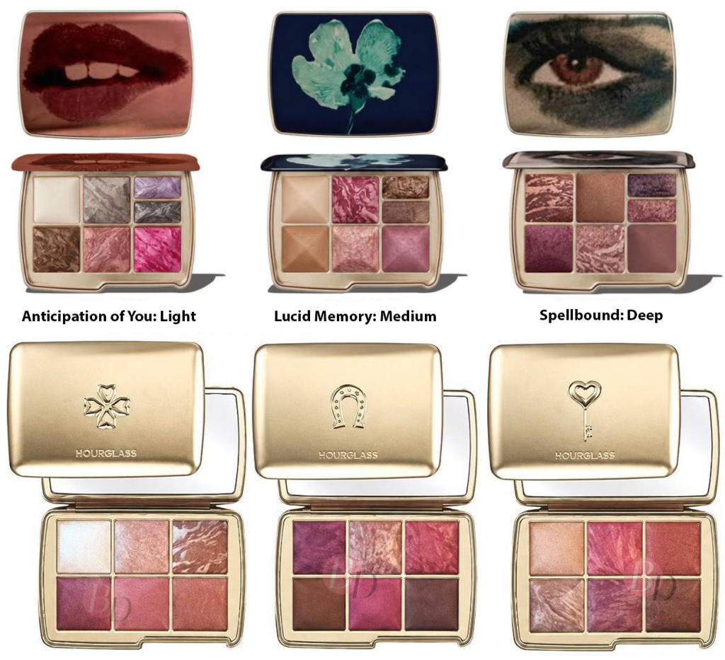
Although I missed the animal theme, the “Spellbound” art looked intriguing and the colors chosen were so different from what Hourglass usually produces. I was planning to buy it purely for it’s uniqueness among the range. It’s still unconfirmed whether those palettes will ever come out or if someone photoshopped those images (or used AI). If they end up being real and true-to -color, I would likely buy them, but not the ones we’ve gotten.
Unlike the other Charm palettes Hourglass has released, I heard these charms aren’t removeable. That’s the second strike after ditching the animal artwork. The gems look beautiful in photos and gold will always be chic to me, but the aesthetic doesn’t stand out enough to me to be worth the increased price.
That was the third strike, the increase from €91 to €108, although Hourglass readjusted their website prices to €89 at some point within the first few weeks of launch. Retailers in Germany kept that original price. This means I could eventually get the palette elsewhere for around €86, but last year I still paid less at €81 using a 10% discount code. For now, on the Hourglass website, any code that works prior to signing in is suddenly unavailable to me when I log in with my customer details. So, the price is technically still higher than before. I have no interest in paying more for something that I find less exciting.
The fourth strike, and perhaps the biggest, are the similarities of the blush shades in the Luck Palette. I have seen swatches of this palette on people with light, tan, and dark skin. All three colors look too similar to each other on the skin, even though they have obvious differences in the pan. Orchid Flush looks insanely beautiful in the marbling, but is essentially just a warm pink blush and Radiant Mauve is a cooler toned pink at the same depth level. Soft Dahlia might be less pigmented than the rest, but the end result is still another pink. To me, it looks like Radiant Mauve’s base color without the plum mélange/marble streak. We have enough pinks and purles/mauves. Where are the deep natural tones of blushes?
Eternal Light is great for me, but I have at least three of them already. Topaz Glow looks like a gorgeous highlighter shade, but I have long stopped liking the Hourglass strobe highlighter finish because of the emphasis on texture. Velvet Bronze fills the gap in terms of being a cool toned bronzer for dark skin tones, but the depth level is still not deep enough for most of the people I watch and follow online with deep-dark skin who are reviewing these palettes every year too. It’s like Hourglass only half-listened to the suggestions of their customers.
Hourglass reintroduced custom quads within the US, but still not the six-pan palettes. Is there really such a huge difference that the holiday palettes could not be fully customizable this year?
For all of these reasons and more, I have decided to pass on these palettes. This feels like too many steps backwards.
Another group of products that have released in the US, although not yet in Germany, are the two versions of YSL Beauty Couture Face Palette – Brewed Reflections.
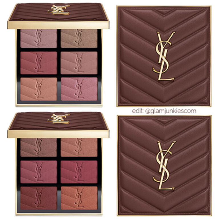
The Medium Deep version had me practically salivating in the beginning, but as time went on and the palette still hadn’t become available for me, I lost a lot of interest. Plus, the initial images look richer and darker than images I’ve seen from actual customers. Although these lighter shades are technically “blushlighters,” I’m not sure if they could pass as just blushes on my cheeks and I don’t want to only have to use them as highlighters or blush toppers. Plus, the middle blush on the right looks too similar to Berry Bang for my liking. I’m not as interested in the middle blush on the left either, so I don’t want to buy a whole palette for just two colors.
I’m also anti-hauling the Make Me Blush Longwear Natural Glow Cream Blushes they released recently too.
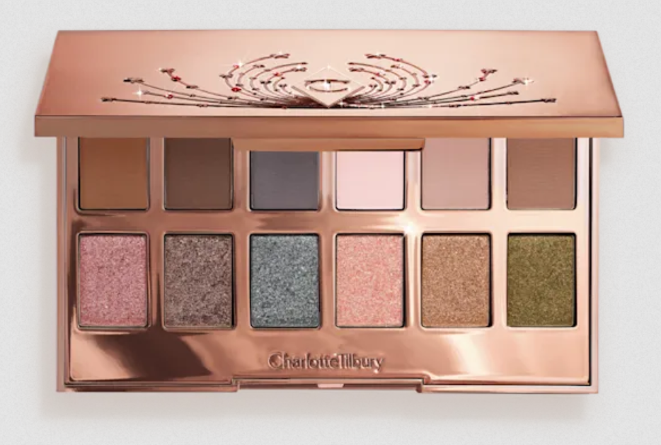
Charlotte Tilbury has launched gift sets galore for the holidays, but this is the only thing that has intrigued me. It’s the Hollywood Flawless Light Tricks Eye Palette for €68, which is a better deal than the 9-pan palettes for €60 (although with potentially smaller pans). Sure, I can use the neutrals, but I know myself. I know that it’s the green thrown into that palette that makes it so appealing. I don’t doubt that I could get use out of multiple shades, but take out the green and maybe one more color, then this palette would never have caught my interest in the first place. So, I’m going to try to do the sensible thing and skip it too.
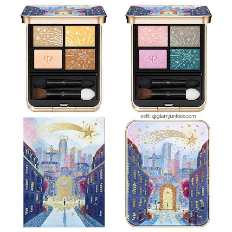
This one is going to be extremely tough to turn down. The selection of colors for both quads are completely unappealing for me, per usual with Clé de Peau Beauté holiday quads, but the compacts always get me. The artwork is always 10 out of 10. Last year, I was able to combine promo codes with reward points via Niche-Beauty to get them discounted to a price I was willing to pay, but I don’t think that’s going to be enough to sway me this year.
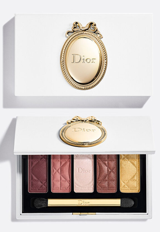
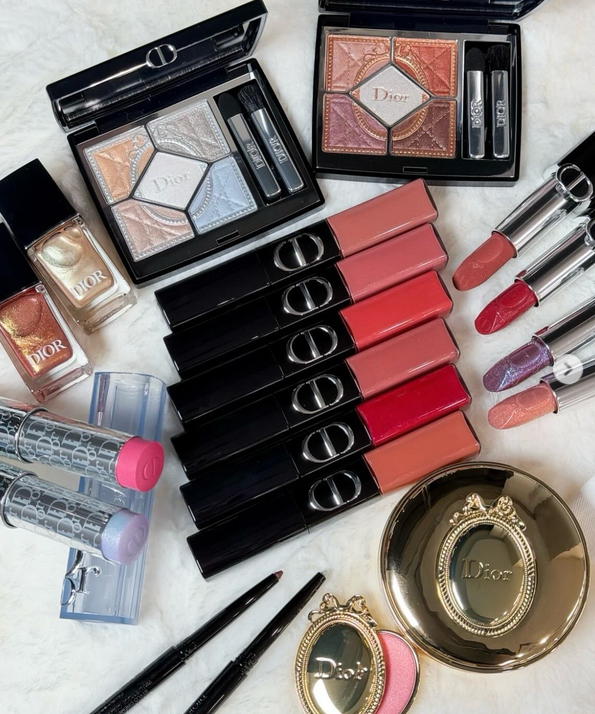
The Parisian Victorian-looking design for this year’s Dior holiday collection is very appealing to me, especially the eyeshadows, but I’m not a fan of the shades chosen. For example, the blue blush or highlighter stick is probably going to clash with the warmth of my skintone, and I’m not sure how that bright bubblegum pink would look on me either. The 623 Cinnamon Glaze quint in the top right corner has pretty colors, but I can’t see myself wearing the eyeshadows together, or at least not more than two within the same eye look. I like the classic and elegant theme, but there’s no point in buying anything if the makeup is something I don’t intend to use often enough to be worth the cost.
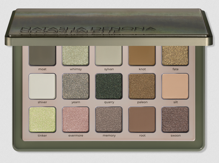
Natasha Denona released the mini Gloom first, which comprised of a very interesting color story. I was impressed with how fresh and different it looked compared all the neutral palettes released this year, but pink and blue can be a hard sell for me. I didn’t end up buying it.
The midi Gloom has another pleasantly unusual color story. Based on product photos, which could be different from reality, it looks like a highly desaturated version of a grunge palette. It’s also leaning cool-toned, which I don’t wear nearly as often. I’m always intrigued and excited by color stories that are different from what most brands are putting out, but my makeup collection is so large that I am trying hard to avoid buying anything that I already know I’m unlikely to use.
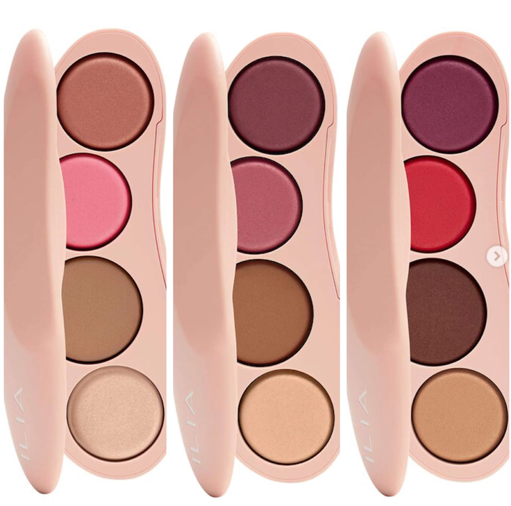
I have always wanted to purchase the Ilia Ethereal Baked Face Palettes, but the first one in the Deep range contained blush shades I didn’t like. Unfortunately, this is also the case for this year’s holiday face palette. I could be wrong and these two could manage to surprise me if I wore them as sheer veils of blush, but I have serious doubts about the undertone of that bronzer for me or how light the highlighter looks. I am instead waiting for them to launch baked bronzers individually so I can ensure I get a shade that is deep enough in depth and also the right undertone for me.
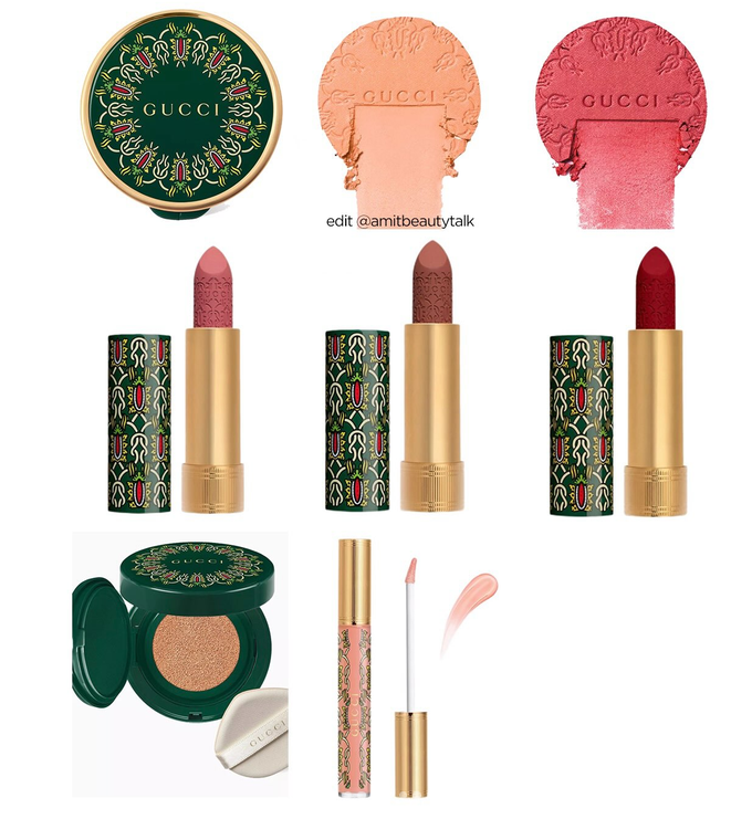
Would you look at that pattern! Gucci nails the designs they choose for their packaging. I want their limited edition products every year, but they either don’t have anything dark enough for me to wear or the colors are repetitive.
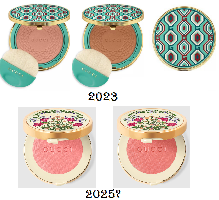
The light peachy blush would obviously not work on me and the red one is rumored to be called 14 Poppy Red. If it was on my face, I’m not certain if it would be noticeably different from 11 Intense Ruby, which looked a lot like 09 Intense Plum. I also own 03 Warm Peach in the glow line that looks quite reddish on me too.
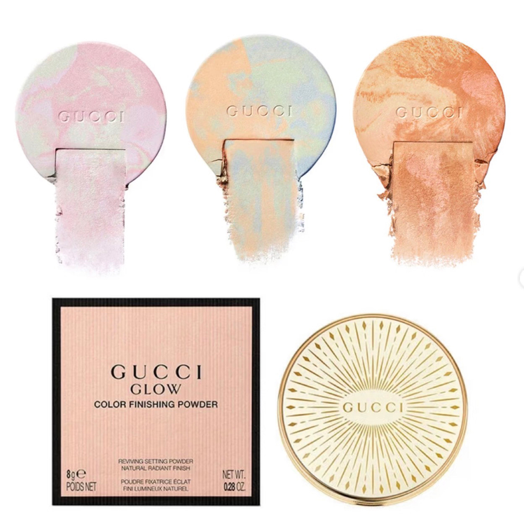
Now, this is the one launch I’m not going to be able to pass up! I did not buy the reformulated face powder from this year. I just own the original, which is matte but doesn’t actually mattify. For this reason, I feel Gucci is capable of creating a finishing powder I would enjoy on my dry skin, as long as it’s not too shimmery. The third shade of Glow Color Finishing Powder is the one I would get.
I definitely don’t need anymore face powders, and I made a point to ban myself from buying them this year, but I’ve bought significantly less makeup already this year that I don’t want to deny myself from something that actually excites me. So, when it becomes available in Germany (and hopefully not out of my budget), I will buy it.
That concludes with everything I wanted to talk about today! I have some new makeup purchases to review, but I have been unable to test makeup lately for various reasons. I apologize for not being able to stick to my own self-set posting schedule. I don’t know when I will return to a consistent schedule, but if you’re following via email, you will at least be notified whenever I do post.
Much love!
-Lili ❤

