
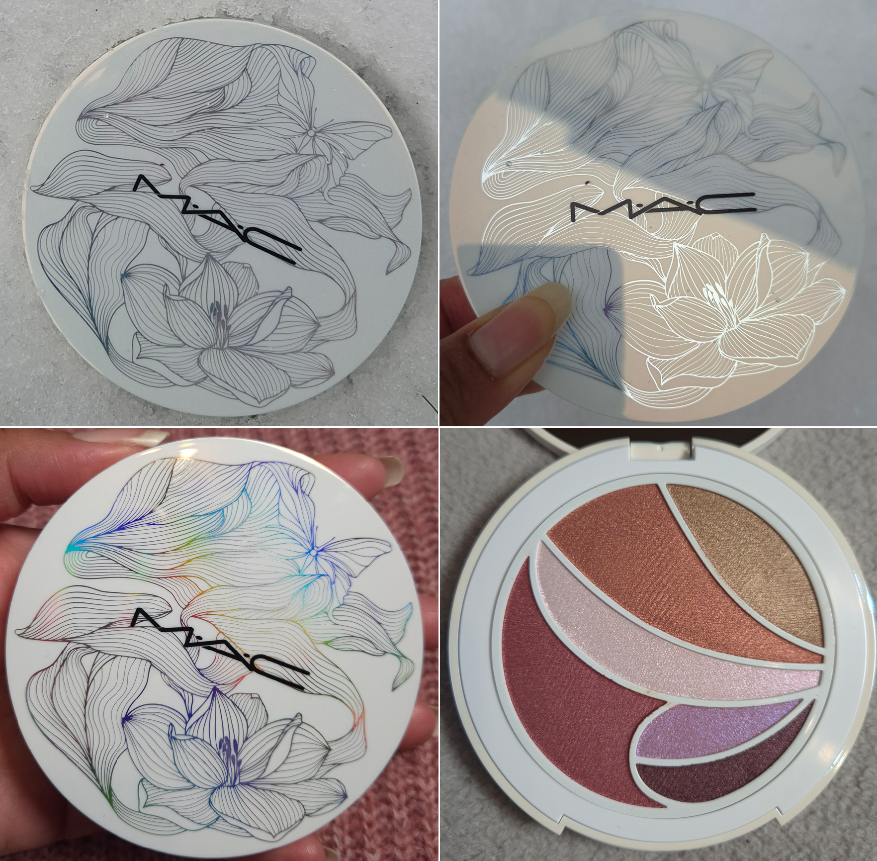
If you’re already familiar with my blog and my interests, you’ll know right away that I wanted this palette for the packaging. I love how the design appears to be a simple, yet pretty, black and white drawing until it is turned at different angles in the light, revealing all the colors of the rainbow.
MAC’s face and cheek products have always been among my favorites in my makeup collection, but I tend to be unimpressed by their eyeshadows. The last palette I tried from MAC was the Lunar Luck Made My Fortune Eyeshadow Palette from 2022. Since then, the brand has reformulated their eyeshadows. I hear they perform better than before, but I was unwilling to take that chance until now.
Technically, the latest single eyeshadow I’ve tried from MAC has been their Jelly Shine Eyeshadow, but it’s a new formula for them. So, I couldn’t use that as a gauge for whether or not I’d enjoy their standard eyeshadows.
Frankly, I can’t consider this palette an example of what MAC’s primary eyeshadow formula is like either because these are so different from anything I’ve previously experienced from them! To start with, these don’t feel like traditional powder eyeshadows. They all have a very slick and smooth feel to the touch that’s prevalent in dimethicone-heavy formulas.
Daft Pink, Lavender Lemonade, and Cherry Sangria in particular are more pliable as if they’re slightly stiffer Colourpop Super Shocks. Lavender Lemonade is the closest to having a Super Shock consistency because it’s the one that’s easy to push and move around.
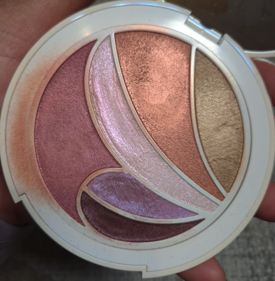
On the box, it’s written that the ingredients for Cherry Sangria and Daffodillionaire are supposed to be the same, and that Daft Pink, Hot Honey, Lavender Lemonade and Calypso Coral are the same. Considering the fact that I find Daffodillionaire, Hot Honey, and Calypso Coral to be the firmer ones instead, I cannot fathom why the slippery, yet more solidly pressed, eyeshadow is in the same category as the looser goopier one. The photo below shows how messy this gets after just one day.
I have to thank Nikki for pointing out that other than Synthetic Fluorphlogopite, this palette and MAC’s Shadeshift Chrome Eyeshadow formula seem to be the same.
What I found from checking a few ingredient lists on MAC’s website (which tend to be incomplete), is that the formula with the second-most ingredients in common to these are the Jelly Shine eyeshadows with 6 out of 13 shared. However, the Jelly Shine are still much more similar to MAC’s standard shimmer/metallic formula than the ones in the Metamorphosis Palette with around 12 out of 17 in common.
These eyeshadows are pigmented, but they blend out in such a way that I get some translucency and can see my skin underneath. I can build them up to be opaque if I want, but it takes a lot more effort with a brush. This formula is much more suited to finger-application.
Since none of these are matte, I instinctively want to apply them to my eyes with my fingers anyway. The problem is that the smallest petal-shaped pans are more difficult to get into. Plus, the blush type of shades (Hot Honey and Cherry Sangria) can look a bit patchy in the first layers with a brush, so the issue is exacerbated if I try to apply those to my cheeks with my fingers. The Singe Beauty FO-3 and Rephr LC02 are small cheek brushes, but I still have to be careful about accidentally picking up some of the neighboring eyeshadows.
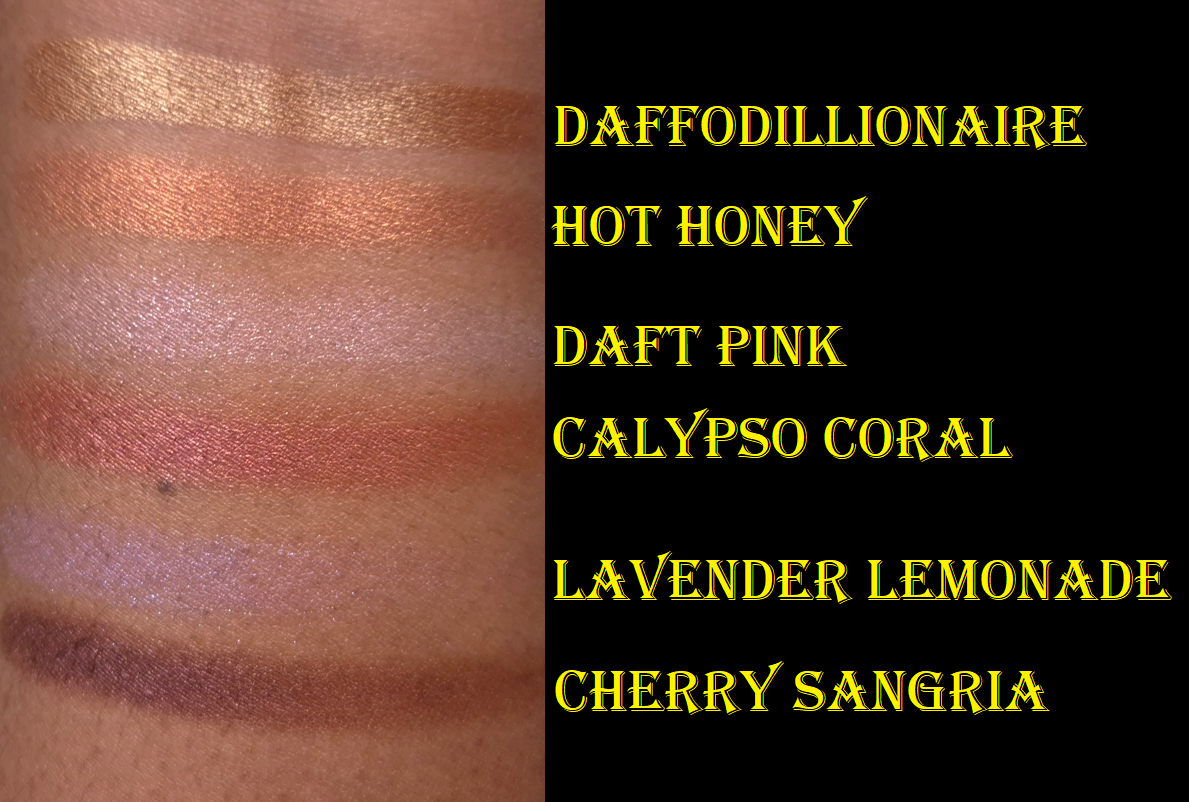
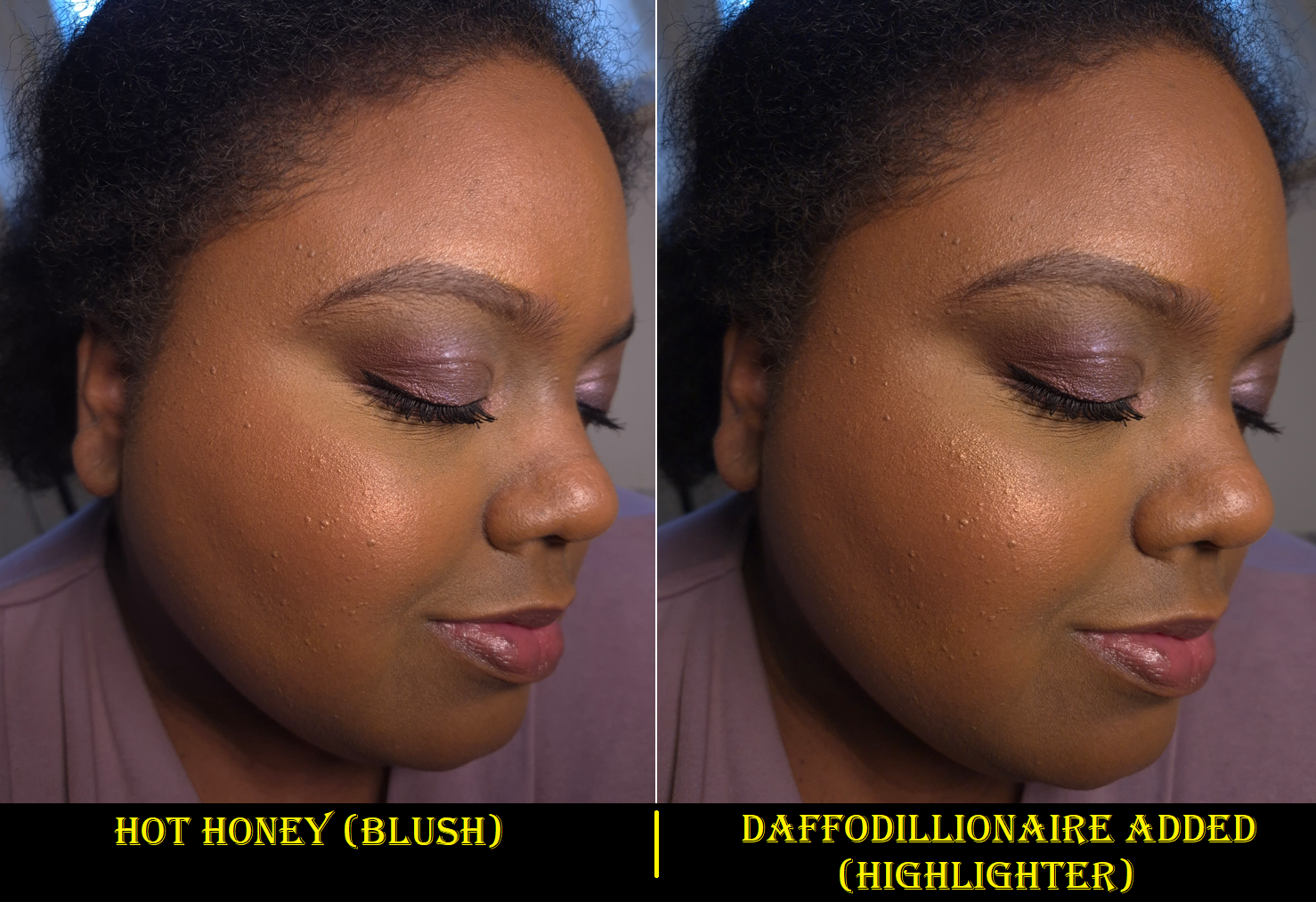
Daffodillionaire is my kind of highlighter shade, so I was pleased to know it suits me on my face and eyes. Even though these are buildable formulas that can be sheered out, I imagine this would be too dark for those with lighter skin and too warm for those with a cool undertone.
On my eyes, it’s just light enough to add brightness. On my face, it draws more attention to texture, but the lack of shimmer makes it still fairly smooth looking for a highlighter.
Hot Honey is easy to see on my eyes, but the color tone doesn’t stand out as vividly on my cheeks. I like this though, because too many orange blushes are bold and unnatural looking on me. That being said, I still prefer a flush of pink, so I either skip using this shade as blush altogether or I mix it with Calypso Coral.
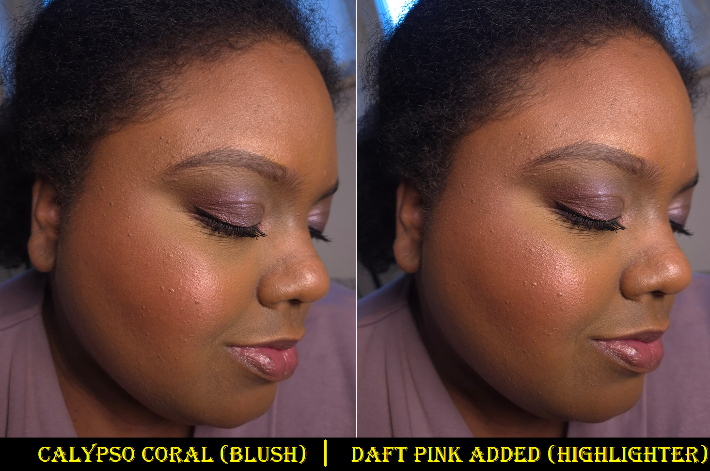
Daft Pink is an iridescent type of pink, along with being more topper-like than the other shades. It takes more effort to build it up on my eyes, and especially as a highlighter on my cheeks. This shade looks quite pretty paired with Calypso Coral, but if I add enough layers to see the color and have the shine from it stand out more than the amount Calypso Coral already has, then I start to notice a slightly frosty white cast on my skin.
Calypso Coral has a sheer quality to it that requires multiple layers, but over-applying this dark color will result in it looking too intense and metallic as well. So, finding that balance every time for blush usage can be a challenge. I have a similar problem with it showing up on my eyes, and though wetting my brush serves to make it easier to deposit the product, it doesn’t do much intensifying. When I accidentally covered some of Calypso Coral with Hot Honey on my eyes, it was very difficult to get that red tone back, as there is a maximum to how many layers can be built on each other. A wet brush helped, but not a lot.
Lavender Lemonade is the other topper-style shade, but it has more pigment than Daft Pink. Because it’s a light purple with blue-purple shimmer, I find it to be the most interesting pan of product in the palette. This and Cherry Sangria are the only ones I’d use exclusively as eyeshadows, and not face products, which is probably why MAC chose to put them in the smaller pans. I could see this being a cool highlighter for someone who likes more adventurous or avant garde type of looks. The official MAC website has some intriguing spring-inspired editorial looks that I might want to recreate when it’s actually spring time, but not right now.
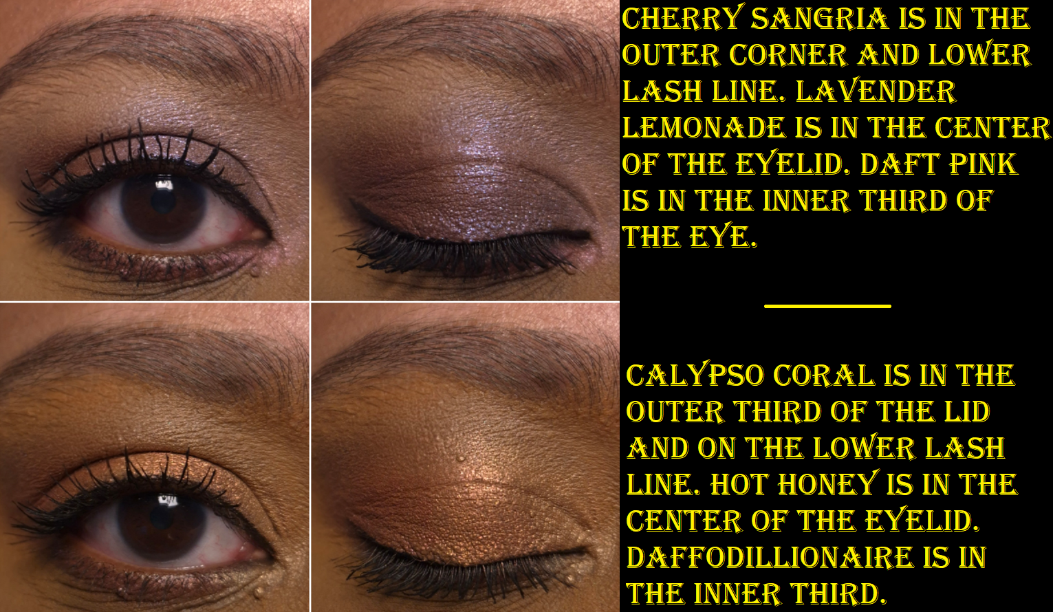
I like Cherry Sangria as a deepening shade for the outer corner in eye looks. It’s easier for me to use my finger with this as an eyeshadow, but when I’ve tried to wear it as eyeliner, it took too many passes over the lash lines with a dry liner brush. So, I go in right away with a damp brush to save time.
Wearing Hot Honey and Calypso Coral on my cheeks makes me think about how I really should start using my MAC Extra Dimension Blushes again. The Extra Dimension ones give more color payoff quicker, and have a similar amount of shine. However, the Metamorphosis shades have a subtler look overall because the consistency is creamier and blends better into my foundation. The reflect isn’t a natural-looking glow, but it looks better blended into my skin.
The Metamorphosis pigment level reminds me a bit of MAC’s discontinued Sheertone Shimmer Blush formula, but those had a more obvious powder look even if the shades themselves were more muted and less opaque.
I get at least six hours of wear time for the Metamorphosis products on my cheeks and eyes before the fading starts. It holds up better on my eyes if I use an eyeshadow primer, but I just accept that my makeup is going to look more muted before the day is over.
Also, at some point in the day, the product will be missing from the inner part of my crease line.
So, this doesn’t have the best longevity. The shades still need to be built up on me. I have to use specific brushes or dig my fingers in the pans, and it’s inevitable that I will dirty the outer rim and the edges that divide the shades. Despite these inconveniences, I’m happy with this product!
Typically, I don’t find spring collections to be appealing because light shades, especially pastels, are difficult for me to pull off. Springs shades also tend to be in cool or neutral tones, similar to the kind of spring looks I did in my Wedding Makeup post. However, there were enough warm shades in the Metamorphosis Palette, and deeper colors, to make me feel like this is actually suited to me. I thought for sure that the face and eye aspect would be a gimmick, but this really is quite versatile. I don’t think it’s going to be great for everyone, but maybe others will appreciate that it’s a little different from what is typically released for spring.
I had an unredeemed birthday discount code from Douglas (in January), so I figured it would be a nice gift to myself. I know for sure that I’m only going to reach for this palette in the winter to spring set of months, but I’ve never regretted getting the first set of Oden’s Eye holiday palettes that I now only really use in the month of December. That’s still more attention than I give plenty of other palettes in my makeup collection!
I hope this review has been helpful! Thank you for reading!
-Lili ❤
